Categories
Showcase 2023

The study of Japanese philosophy for Yu’s house design

The study of Japanese philosophy for Yu's house design

Ms. Kalunyoo Sipiyaruk

<span data-metadata=""><span data-buffer="">Introduction :

Yu’s house is a townhome at Sukhumvit 54, built with the philosophy of Japanese minimalism for a 4-member family with multi-function space that can be turned into various functions in the future, such as a tea room, workshop space for Japanese confections called Wakashi, and also a bedroom for a retired parent.

The owner of the house is a person who loves Japanese culture, especially tea ceremony (茶道, Chado) and making Japanese sweets (和菓子,Wagashi). The expectation is that this house could be a gathering place for those who love the same aesthetic tastes, where they can enjoy the Matcha ceremony and also learn to make Wagashi. As a result, the designers have taken account the Japanese way of life, which emphasizes coziness, simplicity, and also being timeless even in the future. Despite being a row house, it adheres to the Japanese minimalist style.

The philosophy of Japanese minimalism is a way of life, not just a design or decorating aesthetic. It’s a way of life that embraces austerity and simplicity via the use of the three key methods:

1.Zen: In term of design, removing unnecessary material possessions from our lives, we can begin to focus on what’s truly important.

2. Wabi-sabi: The way of this aesthetic emphasizes simplicity and minimalism and the use of natural materials like wood, stone, and metal.

3. Ma: The concept can be described as the space and time. It is applied to be multi-function room in Japanese house.


From the methods above, we can conclude that the most important aspect of Japanese minimalism is removing unnecessary material possessions from our lives to declutter our physical space, which allows us more room for what matters and helps us concentrate on what’s truly important. Therefore, the interior design, which creates a space to meet the need for efficient and functional design even in the future, is vital. This has resulted in the creation of many innovative and one-of-a-kind designs, as well as creative methods for organizing interior spaces to allow users to find happiness in the little things and live in the present moment.

<span data-metadata=""><span data-buffer="">Objectives:

1. To study the design philosophy of the Japanese way of living toward interior design.

2. To create multi-functions to reach customers’ behavior and requirements, especially for elderly use in the future.

3. To study the selection of budget-friendly alternative materials instead of using expensive natural materials.

<span data-metadata=""><span data-buffer="">Methodology:

1. Survey and Information Analysis: The process started with site surveying and competitive strategy analysis followed by gathering information from the owner then making a discussion with all designer parties for determining an overall initial conceptual design.

2. Conceptual and Preliminary Designs: After architectural drawings were issued by the architect team, interior design process continued with alternative furniture layout plans, initial design sketching, 3D perspective rendering, and presentation

3. Proposal Approval: A meeting with the owner would hold for conceptual presentation and taking the owner’s comments for further development.

4. Design Development: When the preliminary designs were approved by the owner, the interior design team would take all feedback from the owner and continued the Tender drawing for contractor bidding.

5. Construction Drawing and Specification Document: Construction drawing packages would be started after Value Engineering (VE) process.

Techniques and Materials:

– Hand sketch

– AutoCAD

– SketchUp

– 3D Max

– Photoshop

– 4 of A2 Presentation Boards


Based on the owner’s appreciation of Japanese tea ceremonies and confections, the concept of Japanese living would be applied to the interior design of this project, which mentions a simple life style to focus on the interesting topic. The design is inspired by the aesthetics of traditional Japanese Zen Buddhism. Also known as Japanese minimalism,

it is based on the following three practices: Picture 1: Diagram of minimalist living


Zen (禅)

Zen is a sect of Mahayana Buddhism that focuses on the practice of the truth, known as “satori” which is the attainment of enlightenment into a state of absence, “pure emptiness,” practiced by reducing one’s ego and leaving the desires and ranks that cause the mind to be distracted. As Wei Lang’s poem said, “How can the dust settle if there is no glass? Everything was empty from the beginning.”

The concept teaches that enlightenment comes when one sees things as they are, without the clouding influences of one’s ego. The design that conveys “Zen” is to reduce the additives. over-decoration the various forms of bragging that lead to ego or arrogance.


Wabi-Sabi (侘寂)

Wabi is about recognizing beauty in humble simplicity. It invites us to open our heart and detach from the vanity of materialism so we can experience spiritual richness instead. Sabi is concerned with the passage of time, the way all things grow, age, and decay, and how it manifests itself beautifully in objects. It suggests that beauty is hidden beneath the surface of what we actually see, even in what we initially perceive as broken. The concept is about accepting the natural cycle of life and finding beauty in the imperfections that come with it. The way of wabi-sabi aesthetics emphasizes simplicity and minimalism and the use of natural materials like wood, stone, and metal.


Ma (間)

Ma represents a period in time or an emptiness in space. It is a break time and place in your life to connect the body and consciousness in order to examine the cause of the action without relying solely on feelings. Ma can be described as the space between things or the interval of time between two events can be. It is applied to be multi-function room in Japanese house. All of the above concepts will lead to the design of a 2-storey row house with a layout that takes account changes in future use and emphasizes simple design that shows humility by selecting materials that are close to nature and attempting to bring the outside environment into the interior while maintaining privacy.


Function requirement

The owners require to have 2 bedrooms for couples and retired parents on the second floor. The ground floor is a living area with a pantry that can be converted into a space for a Japanese sweets class and tea ceremony. In addition, the ground floor must be able to have an area that can be converted into a bedroom for the elderly in the future.

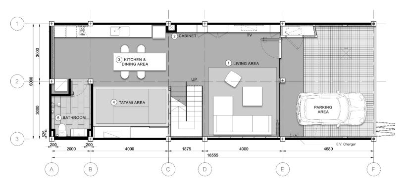
As a result, the ground floor plan is an open layout in order to connect the living areas, the dining area, and the kitchen, which are contiguous areas as follows:

1. The large living area can accommodate 4-6 people.

2. In order to create simple cabinet panels for neatness, equipment and appliances are arranged in cabinets along the length of the wall.

3. For convenience, the dining area is located next to the kitchen, with an open plan arrangement in case the dining table is expanded to accommodate more seats when doing workshop activities.

4. A multipurpose room was set up for tea ceremonies and can be converted into a bedroom for the elderly in the future.

5. The restroom is set up to eventually feature a senior-friendly shower space.


The 2nd floor area has 2 large bedrooms with a shared bathroom. The planning concept is as follows:

1. The parent’s bedroom is located at the front of the house. According to Feng Shui principles, the bedhead is facing north, and wardrobes run the entire length of the wall to create neatness. There is a space for television installation according to the mother’s needs.

2. The owner’s bedroom contains all of the elements found in the parents’ bedrooms, but it is slightly smaller and lacks a television. Moreover, this room is located at the back of the house, where it can see other buildings. Therefore, a steel grille is installed for more privacy, and it could be a place to plant a pergola in the future.

3. The bathroom is separated into dry and wet areas for hygiene, to prevent slipping during use, and to provide convenience for cleaning.


Material Selection

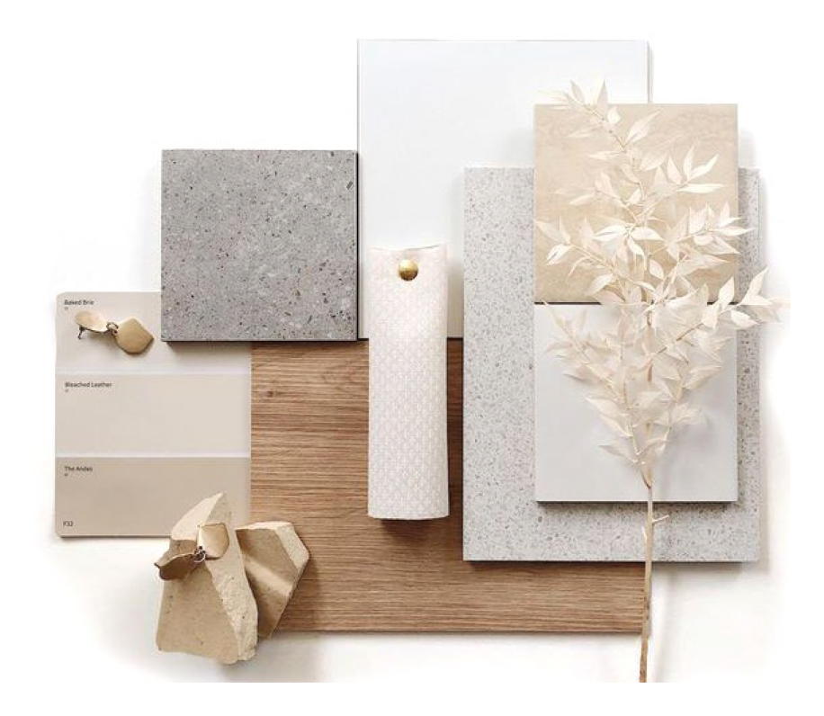
According to the concept, it emphasizes simplicity and minimalism with the use of natural materials like wood, stone, and metal. Due to the budget limit, the selection of materials will use substitute materials that have a texture that is close to nature, such as wood laminate panels, wood- patterned vinyl tiles, stone-patterned tiles, and terrazzo to save on construction costs but still feel natural.


Interior Design

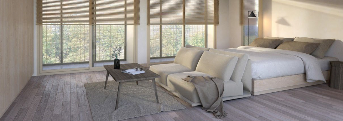
1. The living room is furnished with a low sofa, so the seat height is not significantly different when additional floor cushions are added if there are more guests than usual.

2. The dining table is chosen as a size for 6–8 seats in case it can be converted to a table for the Japanese confection workshop class. The table’s material will be solid wood for strength and durability. Moreover, the wall behind the building will be made of glass blocks to receive natural light during the day but still provide privacy.

3. Storage cabinets and kitchen cabinets’ door panels are finished with wood laminate without handles for simplicity. The matcha bowls are stored on a shelf that can be closed with a special fitting, so the door panels can be folded and hidden beside the cabinet. The shelf is usually closed for unpretentiousness, but it will be opened when there are tea ceremony events.

4. The multipurpose room is decorated in a traditional Japanese style for a tea ceremony. The platform is raised 40 centimeters high and covered with tatami mats. A cabinet has been prepared to store floor cushions and a folding table. This room could be converted into a bedroom for the elderly in the future by laying a Japanese futon and installing sliding doors for future privacy.

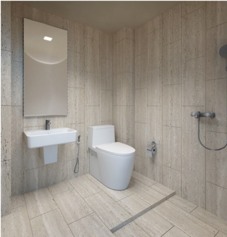
5. The bathroom will be finished with travertine stone pattern tiles that have a porous surface to create an atmosphere of Wabi-Sabi imperfections.

6. Both bedrooms provide built-in wardrobes along the wall with plain finishes (wood laminate) and without handles for a minimalist look. Other pieces of furniture in the room will be loose and adjustable for future use.

7. The design of the 2nd floor bathroom is identical to that of the 1st floor bathroom but has more detail in the shelf design. It will make a base 10 centimeters deep, covered with travertine pattern tiles as well as the wall.

Conclusion:

Overall, the design of this project is minimalist, not Japanese style, but it is inspired by Japanese philosophy, including Zen, Wabi-Sabi, and Ma. Firstly, the layout planning creates a space to meet the requirement for an efficient and functional event in the future. Then make the design simple by removing unnecessary material from the construction to help the dwellers concentrate on what’s truly important, as well as by using creative methods for organizing furniture to allow users to find happiness in the present moment.

References:

Junichiro Tanizaki, (2022). In Praise of Shadows. (3rd ed.). Bangkok: Openbooks Publishing Inc.

Beth Kempton, (June, 2020). Wabi-Sabi. (1st ed.). Bangkok: Be(ing) Publishing Inc.

Leonard Koren, (2018). Wabi-Sabi. (2nd ed.). Bangkok: Openbooks Publishing Inc.

Foyr, (2018). Japanese Interior Design: Minimalist Sophistication. Retrieved January 6, 2023.

Website:  https://foyr.com/learn/japanese-interior-design/
Categories
Showcase 2023

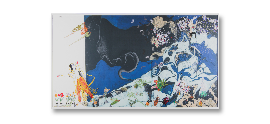
“Stormy Night and Features”

“Stormy Night and Features”

Assist. Prof. Danaya Chiewwattakee

<span data-metadata=""><span data-buffer="">Introduction :

Ragamala or the Garland of Ragas was first created in the 13th century. It was a set of illustrative painting accompanied with poem and music which have connection to feelings and especially preferences. it depicted the illus- tration of hero, heroine and gods and also the names and symbols of love which coordinates time, seasons and aesthetic in the framework of Hinduism. The Mongol Empire and Islamic nobles would assign artists to create work which depicted the !taste” of music as Indian philosophers thought that music was the higher art form. The philosophers were interested in Malik (the aes- thetic of sound), Mittal (dance music), incantation and the telling of the story (called Kaushul).

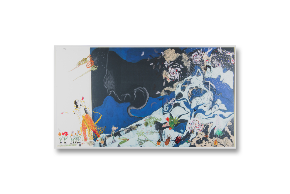
The work of Madhmadhavi Ragini of Hindola Raga depicted a young woman who devoted herself to love. She did not afraid on the dark and men- acing storm. She walked through all these dangers to see her lover at the trysting spot. The creator of this work created this painting with not just only a perspective of love but also the perspective of bravery of living an honorable life and the right to fight for freedom under the oppressed world.

Because all the characters were fictional so they could be more real than the reality. The scene of the woman fighting with the dark and menacing storm was the symbol of the fighting against the higher power. The woman overcame the obstacles by the hands of the woman from the present who used the spider web to manipulate and orchestrate things with confidence.

70% of the work used dark colors to represent mystery, fright and dan- ger. The storm also depicted obstacles and the lurking power. 30% of the painting is the standing position of Madhmadhavi Ragini. Even though it is just a small and leaning space, it is the symbol of liberation and conquering. The other details such as vegetation, flowers and insects were merging together to represent the support given the woman’s boldness. The woman with spider web is representing the present-day women who are ready to fight for what they want.

<span data-metadata=""><span data-buffer="">Objectives:

Two women from two generation were merged together by using the cultural medium, abstraction, representation and reenactment with new per- spectives. The use of the illustrations of vegetation, insect, feather, the Gar- den of Eden, view of the east and cyclone to create a dream-like image which gives the feeling of eeriness, fright, and mystification in contrast with the feel- ing of not being alone, hope and will to fight.

<span data-metadata=""><span data-buffer="">Methodology:

The research on satellite image of the cloud over Namib desert, the humidity of the south western African sea breeze and the river near Maelifellssandur, Myrdalsjokull region, Iceland.

The Deconstruction of images from the red sea dust storm, hurricane Madeline and Lester (which happened simultaneously in Hawaii), Cyclones over the Mediterranean Sea. The deconstructed images were colored and printed by inkjet printer onto canvas.

The research of RAGAMALA painting from India. The hyperrealist im- age and the hand-made animation on the image create the feeling of eeri- ness, fright, and the back and forth between the mysteriousness and the feel- ing of not being alone.

Images of female models from BAZARR magazine. The models are the representative of the modern world who manipulate and spin the spider web.

The usage of embroidery over the shapes and images of vegetation, flower, insect, feather, spider web, cyclone, and hurricane. This method creat- ed sense of chaos from the storm. Additionally, it added the complexity, movement, splashing, and ripple in some parts of the work.

Techniques and Materials:

– Use of acrylic Color on paper

– Inkjet printing of Canvas

– Complex embroidery and other decoration with various materials

Photos (2-5 images):

Conclusion:

The content of this work is a combination of abstract background and the hyperreal image of 2 women from the different times. The work was created with inkjet printing technique on canvas. Because of the length of the canvas a limitation of this method, the difficulty of adding textures onto the work, when adding every texture onto the work the creator had to be very careful and pre- cise. The creator also experimented on the work by cutting the canvas into pieces and combined it, used the combination of wet colors and materials. In addition, the creator was trying various ways on creating patterns and dimen- sions on the work.

References:

H.Water Lack, (2001) Garden Eden. TASCHEN GMBH, Italy.

Catherine Glynn, Robert Skelton, Annal. Dallapiccola, 2011 RAGAMALA paintings from India, Philip Wilson Publisher, London, UK.

https://www.baanjomyut.com/Library/Indianaesthetics https://www.Lesa.biz/earth/atmosphere/phenomenom https://www.nstda.orth/th/Insta-Knowlege/3011_acerLaPhotograph

Categories
Showcase 2023

Sea (e)scape

Sea (e)scape

Ms. Laddawan Sarapat

<span data-metadata=""><span data-buffer="">Introduction :

The world of work in today’s era has changed in various areas, whether it is technology, society, politics, claims for various rights, also the spread of disease that affects living and working. People must develop themselves to keep pace with various trends in society, especially educational organizations. Both the organizations system and the students. All of those situations sometimes cause stress at work. This may cause physical and mental effects. Stress management is therefore necessary. which has a variety of methods. For me, going to the beach is another thing that can help reduce stress.

Humans are part of nature. Beach travel is also a way to connect with the beauty of nature. The vastness of the horizon and water, the beach, the wind, the sun, the sound of the rhythmic waves crashing against the shore. walking on the beach Take a deep breath of fresh air. These all make us feel free, relaxed, calm. The color of the sunrise and the horizon also inspires us to understand the truth, no matter what happens in each day, at the end of the day even the sun is setting, it will rise again the morning with warm light, creating positive energy and hopeful feeling. Bringing the beach atmosphere and beautiful natural elements into our daily lives is another option that will help us relax as well.

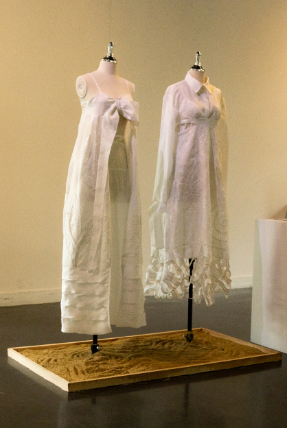
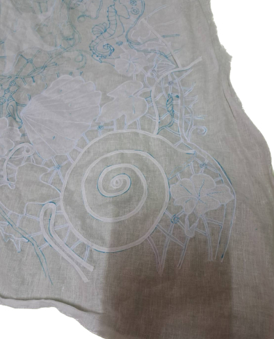
This project is aim to create the works by using natural elements such as marine forms, surfaces of ripples, wind, marine animals such as shells, fish, corals, etc., as well as plants. Seaside flowers such as morning glory and the Bird of paradise. The clothes decorated with crafts that make you feel relaxed, calm and comfortable feeling like relaxing by the sea. Creating the works that can be worn in everyday life and working day in a seaside atmosphere. With project title “Sea (e)cape, Represent the desire to escape hard working day to a peaceful feeling by sea scape atmosphere.

<span data-metadata=""><span data-buffer="">Objectives:

1. To develop and create fashion works using the atmosphere of a beach vacation.

2. To study the physical characteristics of plants, marine animals and surrounding things along the beach.

3. To study fashion techniques such as whitework embroidery to interpret physical features of the sea. Marine animals and the seaside environment to create new surface techniques.

4. To develop the potential of learning techniques and methods of creating fashion works which will be helpful in further teaching and learning development.

<span data-metadata=""><span data-buffer="">Methodology:

1. Study and gather information about the atmosphere and feeling of vacationing by the sea.

2. Study fashion techniques especially whitework embroidery

which can be used to create new surface shapes from the collected data, including ocean waves, marine animals, and plants at seaside area.

3. Analyzing data to use as design direction such as the shape of clothes that are popular for beach vacation. shape of waves, surface shapes of sea creatures and seaside plants.

4. Design an outfit mood comfortable as a day on the beach, but can be worn on a working day to create a relaxed atmosphere at work.

5. Experiment on surface techniques and sample fitting before developing to actual production

6. Analyze problems in terms of both styles and fabric texture manipulation techniques to develop and create an actual 2 outfits

Techniques and Materials:

Techniques

The technique used in this project base on various crafts and whitework embroidery that can be seen in the seaside atmosphere

with comfort and relax mood. Create a feeling of happiness and relaxation. Representing with animal shapes and surface, Flowers and plants by the sea such as fish, shells, morning glory, the nature of sea waves. which is rippled and swaying, etc.

– Shadow applique Finishing with fabric overlays gives varying amounts of layers to create light and shadow.

– Fagoting stitch It is a decorative stitch in a zigzag pattern (herringbone, twisted stitch fagoting) to connect two pieces of fabric together, either as a large piece of fabric or using bias tape hem. It is a decoration used in underwear. often seen in vintage clothing, Home furnishings such as tablecloths, placemats or underwear

– Drawn work It is a decoration made by removing weft and warp threads from the fabric. Then tie the threads together to form a pattern similar to a net. Originally, it was made on white fabric that often combined many decorative techniques by sewing patterns together by hand. (whitework) drawn thread parts are their most distinctive element. It is also grouped with whitework embroidery because it was traditionally done in white thread on white fabric and is often combined with other whitework techniques.) It is the basic decoration of lace making which usually done on white linen.

– Cut work In Italian, “punto tagliato” is a decoration in which part of the fabric is embroidered and cut off, leaving a hole on fabric or embroider the pattern on the cut out of the fabric. It is commonly made on white cotton or linen. People often confuse it with lace.

– Crochet lace create decoration with crochet flower and leaf pattern


Materials

– Linen, a natural fiber fabric, gives comfortable feeling and ventilates well. It is commonly used to decorate whitework.

– Embroidery thread (cotton)

 
Color
The color used in this project is white which gives a feeling of purity, cleanliness, cheerfulness, comfort, simplicity and calmness, adding free space for new ideas. Overlapping fabric into various layer to create uneven opacity weights.

Conclusion:

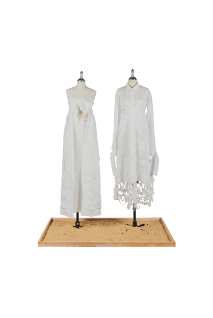
Creative work on the topic of “Sea (e)scape” with the objective of creating fashion works that can be used in daily working life. Bringing the “going on a beach trip” vibes and atmosphere that gives you a comfortable and bright feeling through the design process from my personal traveling experiences. I have experimented and developed both concepts and techniques for decorating surfaces and content that correspond to emotions and feelings of peace and comfort. Focusing on the use of whitework embroidery technique, a traditional decorative technique which became popular in the late 1800s. It is commonly used instead of lace, but I have adapted some hand work techniques to use the machine instead of hand embroidery, such as tying yarn according to changes over time with the development of technology but still have a flair. The style of whitework is still the same. All of the above representing the idea of “transgenerational” through white work embroidery Using natural shapes and surfaces to create 2 set of wearable outfits that can be worn both at work and on vacation.

Categories
Showcase 2023

Cerulean Odyssey: A Surreal Dive Into the Deep Blue Sea

Cerulean Odyssey: A Surreal Dive Into the Deep Blue Sea

Mrs. Lalita Seemontara

<span data-metadata=""><span data-buffer="">Introduction :

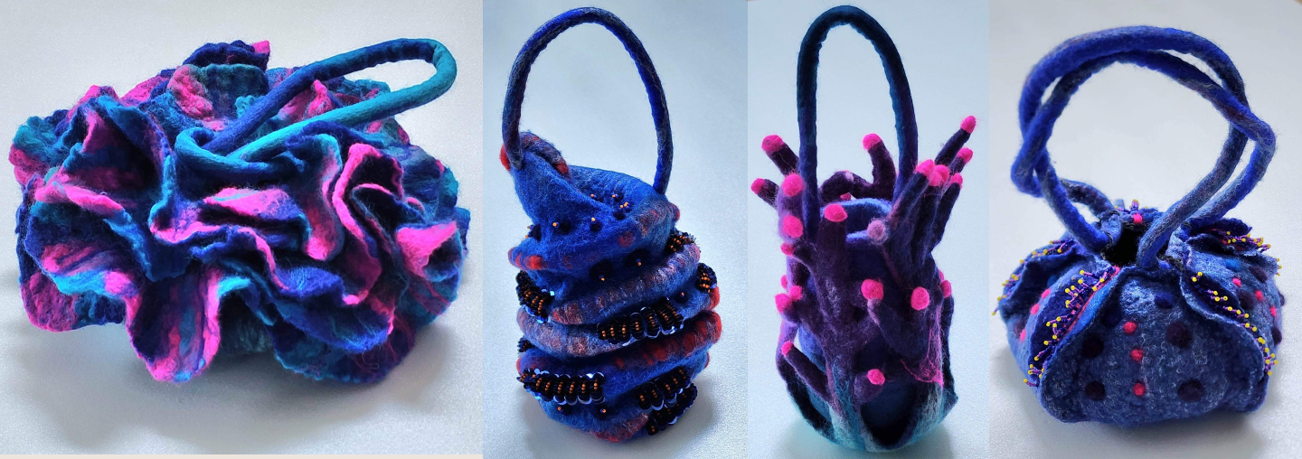
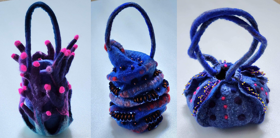
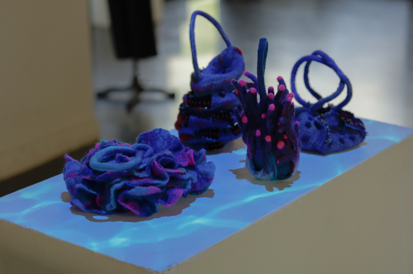
As an artist I am endlessly captivated by the stunning beauty and boundless diversity of the ocean and its creatures. The textures and hues of marine life, from the silky smoothness of seashell to the mesmerizing patterns of a coral reef, enthrall me and stir my creative passion Through the magical medium of wet felting, I am able to transmute these natural textures and forms into three-dimensional masterpieces that embody the very essence of the sea.

With each piece, I strive to embody the fluid grace and vitality of the ocean, whether it be the curved contours of a shell or the angular brilliance of a coral reef. The process of felting itself allows me to emulate the organic textures of the sea, layering merino wool fibers to create cohesive, durable material that echoes the beauty of nature.

To further elevate my creations, the beading decoration that adorns each of my work is inspired by the mesmerizing sparkle of sunlight on the surface of the ocean. The glimmering beads reflect the natural light with a celestial radiance, emulating the dance of light and the shadow that graces the skin of sea creatures. Each bead is carefully hand sewn into the felted material, creating a delicate and intricate mosaic that infuses each piece with a unique character and personality. These sparking adornments bestow upon each creation an ethereal and transcendent quality, and evoke the playful, joyful sprit of the sea.

Through my art, I aspire to engender a profound sense of appreciation and reverence for the ocean’s awe-inspiring

magnificence, and to inspire a passionate commitment to safeguarding our precious planet for generation to come.

<span data-metadata=""><span data-buffer="">Objectives:

To express the deep admiration and fascination for the ocean and its inhabitants, as well as their desire to capture the beauty of marine life through art works

<span data-metadata=""><span data-buffer="">Methodology:

1. Draft the artwork.

2. Create a pattern.

3. Make wet felting techniques from the pattern.

4. Create separate parts of the handbag and other details

5. Use needle-felting techniques to apply a decorative pattern.

6. Finish details with embroidery techniques.


Concept

To celebrate the incredible diversity and beauty of sea creature through the art of wet felting and mixed media. Each piece is a testament to the power of art to inspire wonder and appreciation for the natural world.

Techniques and Materials:

Wet felting , needle felting and embroidery with wool Material : Wool and Beads

Conclusion:

In conclusion, the art of felting techniques inspired by undersea creatures is fascinating and creative form of art that allows me to explore the beauty and diversity of marine world. Through the use of various felting techniques, I can create unique and visually stunning pieces that capture the vibrant colors of coral reef or the intricate details of seashell, felting techniques can bring these elements to life in a way that is both tactile and visually appealing. Overall, felting techniques inspired by undersea creatures offer a wonderful opportunity to explore the beauty and diversity of the ocean, while also promoting conservation and environmental awareness.

Categories
Showcase 2023

JEDI – WIHARN – LARNTHAM

JEDI – WIHARN – LARNTHAM

Mr.Tawan Wongsawan

<span data-metadata=""><span data-buffer="">Introduction :

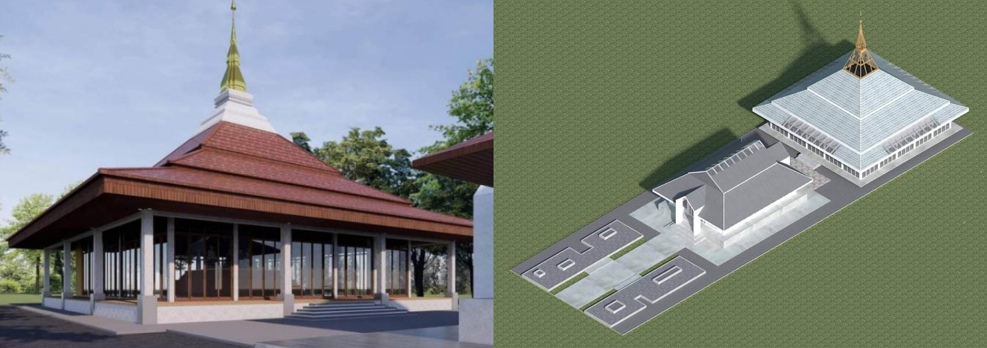
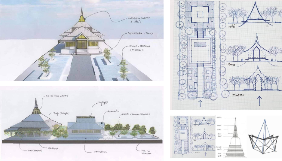
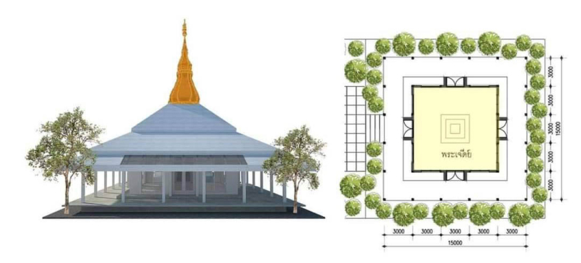
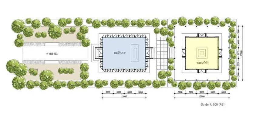
From the need to build a pagoda temple for enshrine the Jadeite Buddha, including the improvement of the Wiharn of Somdej Ong Pathom along with adjusting the front entrance courtyard area. It is the origin of the Chedi – Wihan – Lan Tham design project. The design concept aims to create Buddhist architecture that reflects Thainess in a universal way & Thainess is so simple.

<span data-metadata=""><span data-buffer="">Objectives:

From the need to build a pagoda temple for enshrine the Jadeite Buddha, including the improvement of the Wiharn of Somdej Ong Pathom along with adjusting the front entrance courtyard area. It is the origin of the Chedi – Wihan – Lan Tham design project.

<span data-metadata=""><span data-buffer="">Methodology:

The design concept aims to create Buddhist architecture that reflects Thainess in a universal way and shows Dharma – Nature – Ordinary.

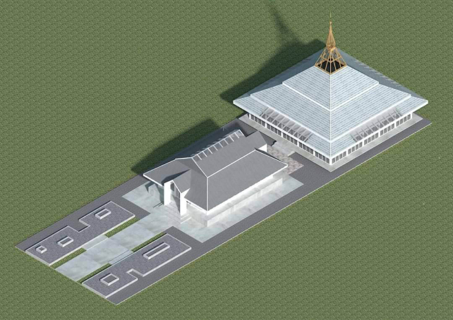
– The front courtyard has been renovated into a meditation courtyard that is simple and harmoniously with nature.

– Wihan Ong Somdet Phra Pathom use the original layout. The entrance is a contemporary simple gable shape.

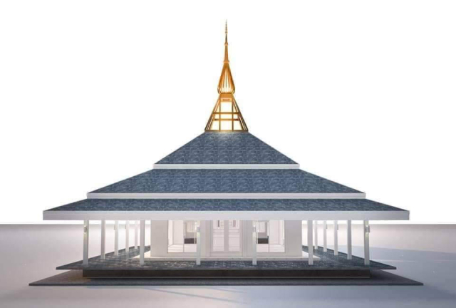
– Temple of the Jade Buddha designed to be accessible from all directions. The top is a replica of Phra That Kham Kaen which is a priceless pagoda of Khon Kaen Province.

 
Categories
Showcase 2023

Sunshine Vibes: Sharing Happiness Through Motion Graphics

Sunshine Vibes: Sharing Happiness Through Motion Graphics

Assist. Prof. Jinabhadr Kantaputra

<span data-metadata=""><span data-buffer="">Introduction :

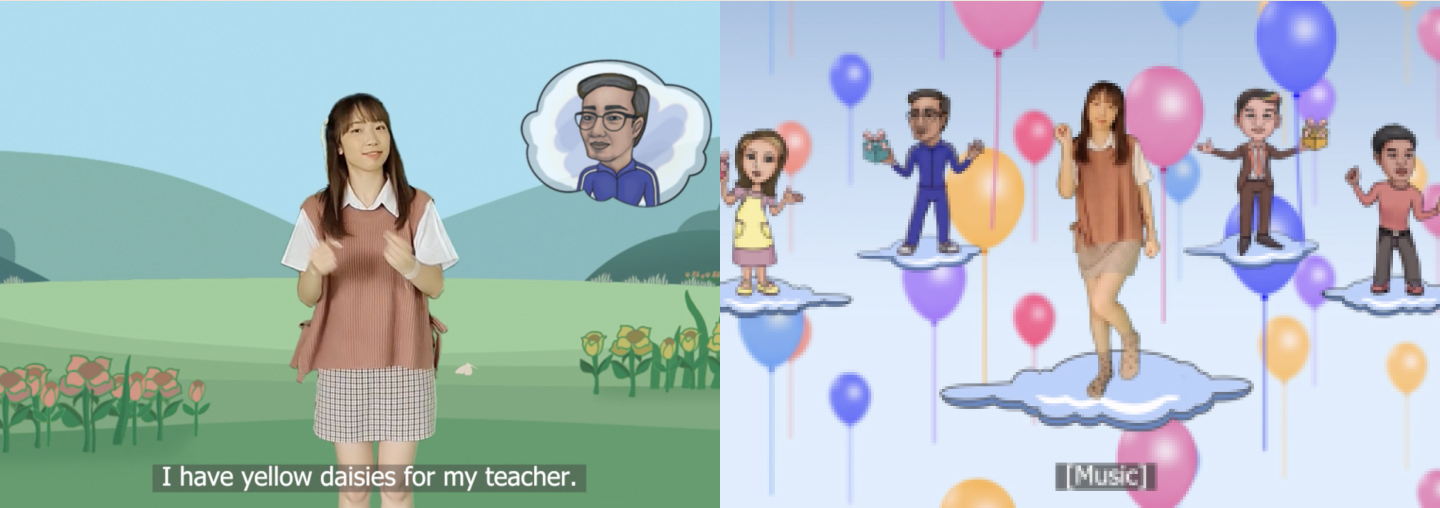
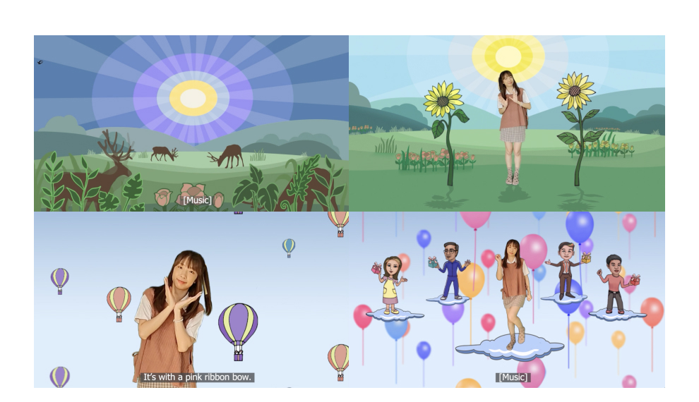
The creative research project on motion graphic design titled “Sunshine” aims to share happiness to everyone. This project is an innovative interdisciplinary media of visual communication design and music. The goal is to create an engaging and visually stunning motion graphic that captures the essence of happiness and radiates positivity. This project seeks to explore the use of motion graphics as means to communicate positive emotions and inspire joy in audiences. This is also for them to enjoy the rhythmic activities. The main character was a young lady who is the dance leader for everybody throughout the song. Also, the two-dimensional characters engaged with the motion graphics against the background of natural scenery.

This motion graphic was divided into three parts as follows: Part one, the first part started with morning glories of the day with fresh and beautiful natural atmosphere such as sunrise, blooming flowers, fresh trees and singing birds in the middle of the valley. Part two, the second part presented sharing of happiness in the international festival days by giving foreign flowers instead of Thai flowers to mothers, fathers, teachers, and the loved ones. This part depicts today’s multicultural society. Part three, the last part presented the giving of happiness to everyone. Animation of colorful balloons floating into the skies symbolized happiness, joyfulness, and cheerfulness.

The researcher has conducted this research project by studying related topics as follows: Happiness, Meditation, Nature, Music, Rhythmic Activities, and Motion Graphic. To design a quality motion graphic media project, the researcher prepared a survey questionnaire to collect responses and feedbacks from first-year students on the influence of colors and related graphics to their feelings of happiness. As a result, the 3rd scenes were designed by using colorful balloons floating into the skies to demonstrate the

atmosphere of happiness in many aspects such as Love, Freshness, Cheerfulness, Fun, and Mindfulness. Eventually, the “Sunshine” was used as a part of teaching medium in the course named, “Life Design and Happy Society.” The satisfaction assessment results were analyzed and used as inputs successively to this motion graphic design.

By sharing this creative work with the world, it hopes to bring a smile to the faces of all who see it, and to remind people of the beauty and joy that surrounds them. With “Sunshine,” it aims to inspire others to embrace positivity. It is believed that by sharing our own happiness, we can create a ripple effect of joy that touches the lives of everyone around us.

<span data-metadata=""><span data-buffer="">Objectives:

1. To create innovative interdisciplinary motion graphic designs of visual communication design and music as media in communicating the sharing of happiness efficiently;

2. To support the use of musical rhythms in body movements of mindfulness and happiness;

3. To represent multicultural communities for students and the interested public, both Thai and foreigners.

<span data-metadata=""><span data-buffer="">Methodology:

1. Studying on Meditation, Happiness, Nature, Music, Rhythmic Activities, and Motion Graphic;

2. Composing an English song titled, “Sunshine”

3. Recording the lyrics and completing the musical arrangement;

4. Recording the motion pictures of the lead dancer;

5. Surveying of color influence to human emotion and feeling.

6. Drawing cartoons based on four prototype characters in the story;

7. Creating graphics about happiness;

8. Placing the lead dancer and the graphics in each scene, making movements to match the rhythm of the music and adding transitions to combine all scenes.

9. Designing the title and graphics symbol for this motion graphic.

10. Evaluating satisfaction surveys of this media.

Areas of Creative Works / Techniques and Materials: Writing the lyric

The researcher and a sound designer have co-studied the music about happiness. We agree with the arrangement of musical harmony using melody of musical notes in the Key of G that created beautiful sounds, heart-felt satisfactions, and suitable tone for the meaning of the lyrics about happiness. The time signature of “Simple quadruple time” or “4/4” was selected because of its easy listening, not-too-fast rhythms. “Cubase Pro” computer music application was used to help the music composer appropriately. We have learned from the orchestra band and chosen various musical instruments for matching the music with the meaning of the song, “Sunshine.”

The orchestra musical instruments are selected as follows:

String Instruments: 2 Violins, 1 Cello, 1 Viola, 1 Guitar, and 1 Piano

Brass Instruments: 1 Trombone and 1 Trumpet

Woodwind instruments: 1 Flute

Percussion Instruments: 1 Tambourine and 1 Bongo Drum

Creating the characters and graphics with Illustrator application


Designing the characters

Mother: The beautiful mother is putting on the yellow apron to represent a woman who enjoys cooking for her family.

Teacher: The aged teacher is wearing a brown suit and tie to represent a respectable person.

Darling: The young man is wearing pink t-shirt and black jeans to represent a teenager falling in love.


Designing the graphic images of festival-day flower

Pink Carnation: For our mom on the International Mother’s Day.

White Rose: For our dad on the International Father’s Day.

Yellow Daisy: For our teacher on the International Teacher’s Day

Red Rose: For our darling on the Valentine’s Day


Designing the other graphic images

Parrots: They are colorful pets that have beatiful sound and be able to imitate human voice. The are friendly and always make us happy. This image is used for the scene of “Birds are singing at sunrise.”

Sun Flowers: They are elegant and strong flowers that always face the

sun for encountering a new day. This image is used the scene of “Leaves are dancing to say hello.”

Heart Image is the symbol of love. I make the pattern of them for representing the scene of “I give you with all my Heart.”

Balloons: In the Balloon Festivals, people are full of harmony, unity, and friendship. I design a balloon attaching a gift box floating in the sky for the scene of “I have a little box for everyone”.

Airplane: When we were young, we always looked at an airplane in the sky. This gave us a lot of imagination and happiness. Since an airplane usually full of passengers, so I use it for representing the scene of “Join anyone share anyone.”

Clouds: Clouds in the sky give the feeling of comfortable, imagination and freedom, so I put them in all sky scenes.

Colorful balloons flying out of the gift box: When we love and care someone, we will let them know by giving a gift on the festival day. This is a way to share the happiness to others. In fact, you can always give a box of happiness to people around you. In this motion, I compare many colorful balloons to happiness. This

image perfectly represents the scene of “Open the box. Open the Happiness”

Taddy bear: The lovely pink Taddy bear with Santra hat is holding colorful sweet Lollipop. She is sitting on the green box with letter “H” and “N” on each side. And the box is floating in the sky by two pink balloons. This image be able to represent the scene of

“A Little Box of Happiness” very well.

Fire Works: As we know, the fireworks in the sky are best display for the final show of festival. Then I design the fireworks to get along well with other graphics for the final scene of this motion to enrich the happiness.


Final Scene

– To get rid of green color and animate all graphics with After Effect Application.

– Then the girl clips are ready for using with any scenes.

– The dancing girl with valley scene


Design title and graphics symbol for the motion graphic

“Sunshine” is the title of this motion graphic to convey clear and concise meanings of morning sunrise in the middle of a valley. This gives the men and women powers to train themselves well and forward the gift of happiness to others.


Choosing a typeface for the title

This researcher chose the typeface, “Coconut Beach” for the title, “Sunshine” because the font has delicate fine-looking lines that are compatible to the background music accompanied by the singing of a young lady who was the lead dancer. In addition, the typeface has contemporary characters, casual and not too conventional, consistent with the style of graphics and background images used.

Graphic Symbol

The researcher presented the graphic symbol using scenery of the valley in the morning sunrise, to show the powers of Nature that is the foundation of happiness for men and women. Simplified graphic lines of the images were used to support the memories of the viewers and be a remarkable symbol.

Modifier words for “Sunshine”

The words, “Happy Dance for Everyone” were used to place under the title, “Sunshine” for a better understanding of the theme. The researcher chose the typeface, “Tahoma,” for the modifier words because it is a popular font on computer screens and other digital devices. Even in small letters, the font is clear and easy to read.

Conclusion:

While the researcher was working on music composition, the severe COVID-19 outbreak continued. The pandemic was a huge obstacle for the production. The researcher solved the problem by asking the sound designer to create a prototype singing sounds in the English language using computer-aid programming. The singer practiced the singing sounds from the prototype. The team producer organized online meetings to remotely mix and revise sound in a recording studio.

The researcher prepared a survey questionnaire on emotions and feelings of colors (Power of Color). Feedback responses were received from first-year students of Visual Communication Arts, College of Design, and Faculty of Physical Therapy and Sport Medicine. The survey found that bright and beautiful colors provoked a wide range of emotions and feelings. As a result, the 2nd and 3rd scenes, related to sharing happiness, were designed using colorful balloons floating up into the skies to demonstrate the atmosphere of happiness in many aspects such as Love, Freshness, Cheerfulness, Fun, and Mindfulness.

The satisfaction survey questionnaire aimed to assess the completed motion graphic media. Two groups of the students evaluated the motion graphic design duly. Four assessment topics

included: 1. Image and Motion, 2. Sound and Music, 3. Overall Feedback, and 4. Usefulness of the Media. The satisfaction assessment resulted at an average score of 4.43, equivalent to a very good level.

The researcher truly hopes that this motion graphic media will encourage the public and anyone interested to participate in the activities. Audiences and viewers are happy and entertained. In addition, the media will create an inspiration for the gift of happiness to mothers, fathers, teachers, loved ones, and fellow men and women. Our society will be a better living place filled with love and peace.


References:

Kulachai Kulatavanich. (2018) Motion Graphic: Knowledge 4.0, searched 25 June 2020,

from file:///C:/Users/SONY/Downloads/STOU_Kulachai.pdf

Attawut Laichuthai. (2010) Synchronization between motion and music using motion graphic, searched 25 June 2020,

from http://cuir.car.chula.ac.th/handle/123456789/19476

Nuttee Chengchana and Somchai Trakanrung. (2010) music therapy interventions from music therapy research, searched 20 May 2020,

from https://he02.tci-thaijo.org/index.php/jph/article/view/43715

Arunee Mingpraseart. (2014), A study of Mental Health and the Stress of undergraduate Students in Faculty of Pharmacy at Rangsit University, searched 12 July 2020,

from https://so04.tci-thaijo.org/index.php/socku/article/view/79720

Categories
Showcase 2023

HUMAN RULE

HUMAN RULE

Asst.Prof. Vichai Mekkerdchoo

<span data-metadata=""><span data-buffer="">Introduction :

Man-made rules, regulations or laws are regulations to prevent damage and to make order. Regulations are rules that humans set up to prevent people from doing things that are dangerous to life, work and property in order to create order peacefully in social life.

Man-made rules, regulations or laws determine human behavior that’s related to human life from birth to death. Rules or laws are arising from the ideas or beliefs of human beings as a

basis. Therefore, it has the concept of a philosopher in many eras, provide the meaning of rules or laws…

Man-made rules, regulations or laws are important to life, work and human relations. No matter where you live and what you do, there must be more or less rules in order for life, work, existence and relationships to be smooth.

But how confident can we be? For man-made rules, regulations or laws that state that it is there to protect us from the dangers that may occur in our lives. Some are for asset protection. Or in fact in reverse Man-made rules, regulations, or laws are there to keep others and society safe from ourselves….

<span data-metadata=""><span data-buffer="">Objectives:

Man-made rules, regulations or laws regulate human

behavior. It is related to human life from birth to death. It is a result of human thoughts or beliefs as a basis.

But the problem is the loophole in man-made rules, regulations or laws and Ignorance of the law may not be an excuse. Even in the real world, ignorance is not wrong, with vulnerabilities, or such ignorance brought about influential people and have more knowledge of man-made rules, regulations or laws, take advantage and abuse and rob things unfairly from fellow human beings.

<span data-metadata=""><span data-buffer="">Methodology:

From that concept, the creator of the work wants to present Works for general audiences to realize and question society how can we be confident with man-made rules, regulations or laws and ignoring these loopholes.

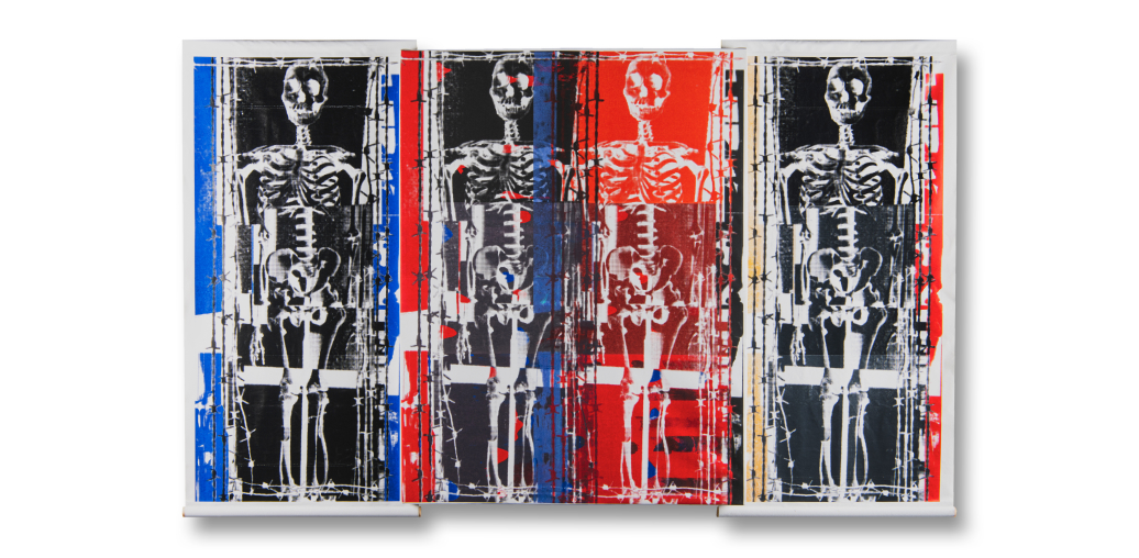
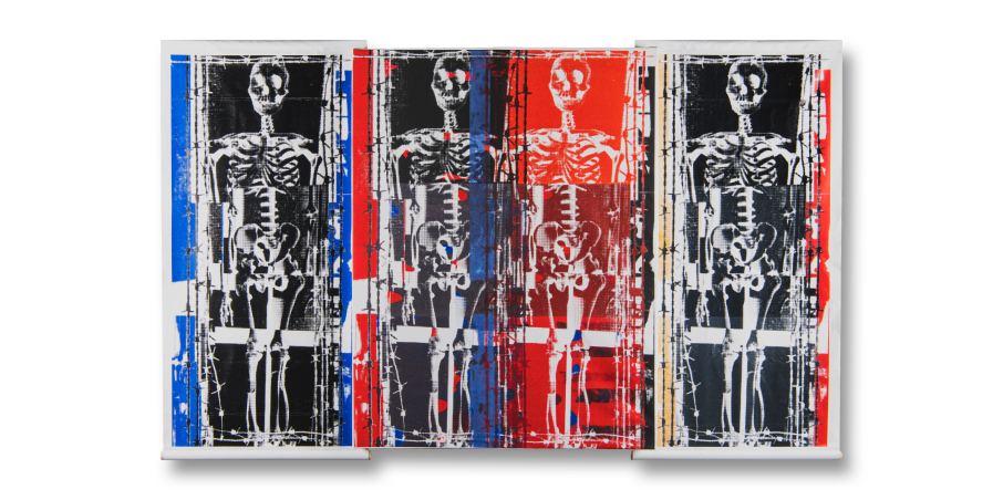
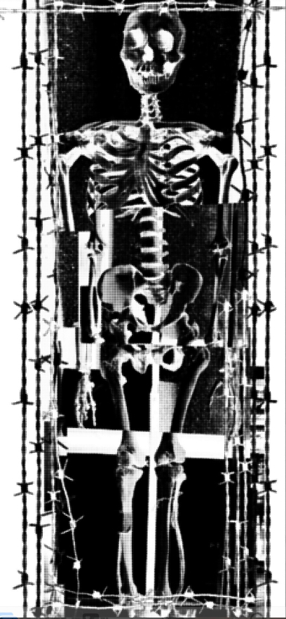
In its form, it depicts a bizarre, incomplete skeleton. This is presented in a symbolic sense. Not all humans in society are perfect both mind and thought.

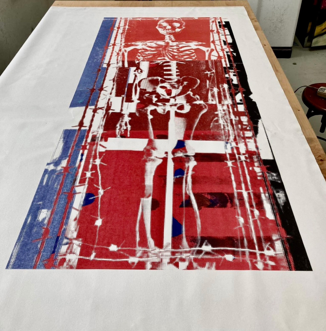
And there is a dense barbed wire fence surrounding it. Barbed wire is symbolic that is a man-made rule, regulation or law to protect both concepts and ways of performing in daily life to be stable and safe. Or look at it in another way, a densely enclosed barbed wire fence will possibly be like a bond that human beings in society cannot escape from the faults of rules and laws, including loopholes and imperfect or not.

Techniques and Materials:

From this concept, the creator takes Photos & Retouching technique and finish by silkscreen on canvas(75cm. x 150 cm.) that could be respond such concept.

Conclusion:

Man-made rules, regulations or laws to protect both concepts, property and ways of doing things in daily life to be stable and safe, regardless of the other side of the rules, loopholes of Man- made that is the right thing or not. Or should we let it continue like this? Not dare to step away from what is like a barbed wire fence that binds us

References:

https://law.dpu.ac.th/upload/content/files/3.doc Meaning and nature of the law

http://www.rnrnewlife.com/%E0%B8%81%E0%B8%8E%E0%B 8%A3%E0%B8%B0%E0%B9%80%E0%B8%9A%E0%B8%B5

%E0%B8%A2%E0%B8%9A/

Rules, Regulations and Schemes

Categories
Showcase 2023

Glass Drops 01

Glass Drops 01

Assist. Prof. Siripen Thananantakit

<span data-metadata=""><span data-buffer="">Introduction :

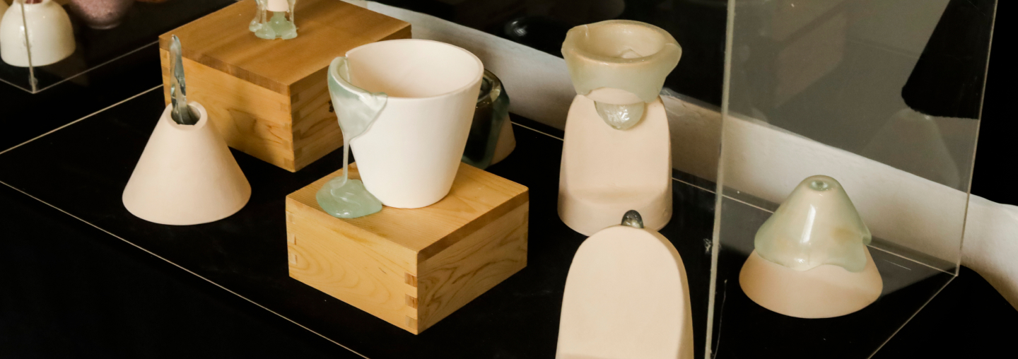
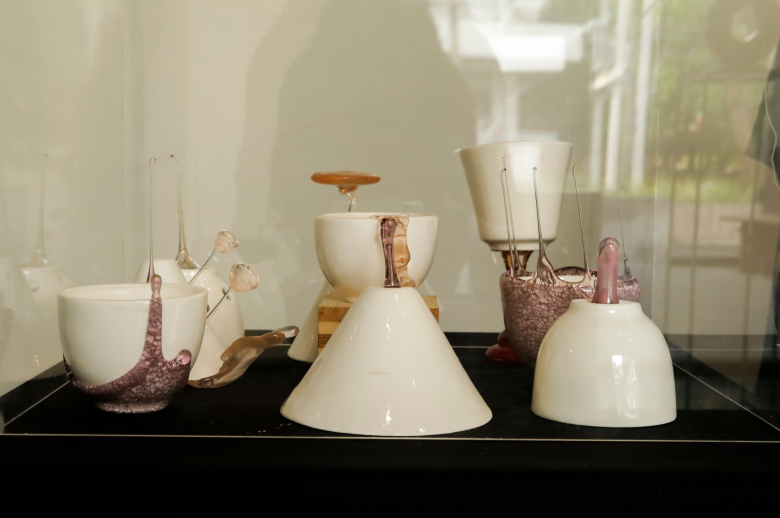
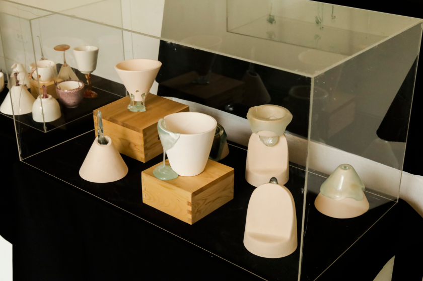
“Glass Drops 01” This creative work of Practice based together with experimental research. The tool is experimental leading to discover a new knowledge in ceramics by emphasizing the knowledge gained from the creative experimental process and the study of the relationship between ceramic and wase .

Thailand has approximately 40 ,000 tons of waste glass and glass waste per year. Glass waste and glass are melted into new products. This will save energy in melting the glass. But there are some glass cullet that are not reused in the glass production process. Because the glass production formula is not the same. cullet glass from various sources Trash from the glass shop , Colored glass from second-hand dishes and broken glass.

Upcycling that brings waste materials through the ceramic process into creative works. By using industrial waste materials,

glass fragments, to create creativity through the incineration process that creates a flowing charm glass drop also use simplicity using porcelain ware.

Aesthetics achieved by reversing the flow in opposite directions. The sudden beauty of the droplets that lingered at that moment attracted attention in a variety of ways.

<span data-metadata=""><span data-buffer="">Objectives:

To create ceramic works inspired by the relationship between firing ceramic and glass together. To reform the free ceramic process Do not adhere to conventional patterns or unconventional practices.

<span data-metadata=""><span data-buffer="">Methodology:

Broken glass from various sources Trash from the glass shop colored glass from second-hand dishes, broken glass, arranged in different directions on porcelain ware. Firing at temperature of 820 – 850 degrees Celsius.

Techniques and Materials:

Body – Porcelain

Temperature – 1100c -1230 c

Techniques – Transparent Glaze and glass 

Forming – Slip casting and Hand forming

Conclusion:

Aesthetics achieved by reversing the flow in opposite directions. The sudden beauty of the droplets that lingered at that moment attracted attention in a variety of ways.

As a reminder of the creative utilization of waste To create an exchange of knowledge and waste management methods to preserve the global environment.

The experiment of the relationship of ceramic and cullet glass can creates new knowledge encourage the potteries to fire ceramic by mixing ceramics and other materials with various techniques. The Technique can be used to create works and develop further into innovative art.

References:

ไพจิตร อิงศิริวัฒน์.(2537) . รวมสูตรเคลือบเซรามิกส์ . กรุงเทพ ฯ : โอเดียนสโตร์ .

ความหมายของ พื้นผิว .สืบค้นเมื่อวันที่ 19 มีนาคม 2565. จาก

http://www.ideazign.com/port/graphic/content0302_07.htm

Ellis, H. (2006). Clinical Anatomy: Applied Anatomy for Students and

Junior Doctors. New York: Wiley. ISBN 1-4051-3804-1.

Categories
Showcase 2023

Wang Zhao Jun: so beautiful as to make flying geese fall

Wang Zhao Jun: so beautiful as to make flying geese fall

Assist. Prof. Lojana Manodhaya

<span data-metadata=""><span data-buffer="">Introduction :

Wang Zhao Jun is one of the four most beautiful women in the history of China. She was praised for having the courage to sacrifice herself by marrying the leader of the Xiongnu clan, a rugged region located in northern China during the Western Han Dynasty. bring peace to both lands without invasion for a hundred years The story of her devotion to the country is a memorable story that has been recorded in history and passed down to the present day. people to publish make a play as well as being an inspiration for painting for painters of all ages as well.

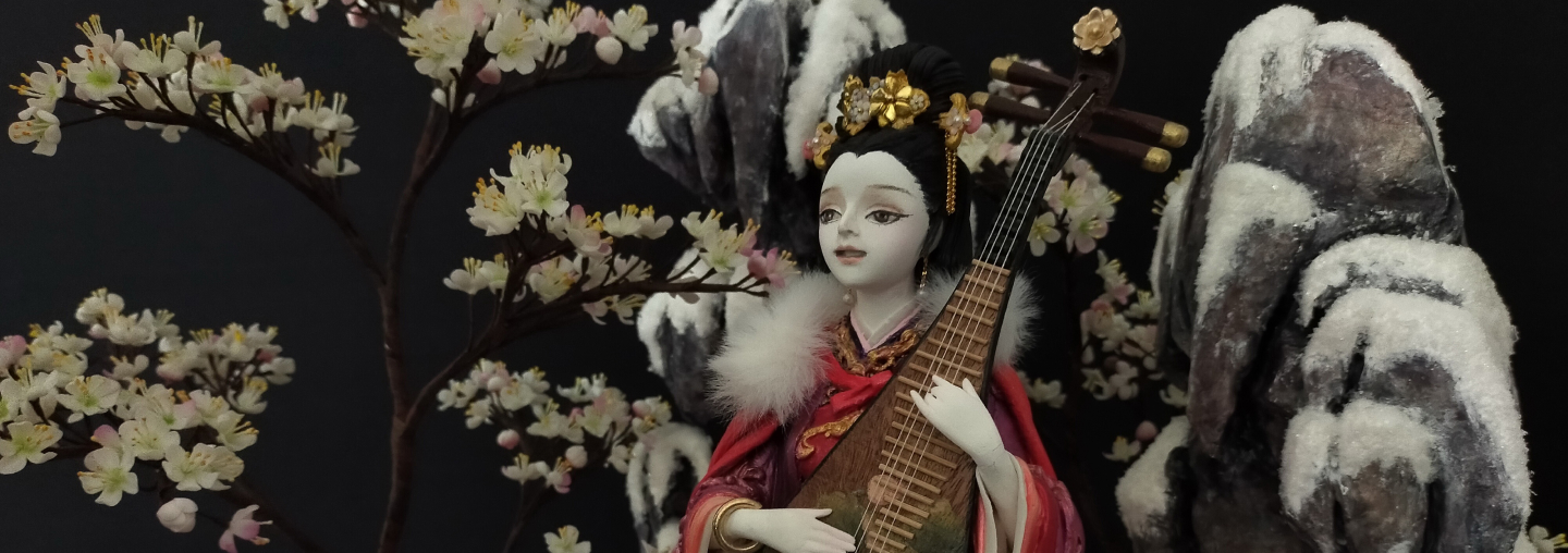
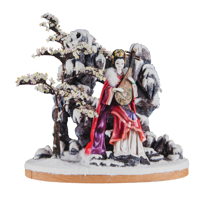
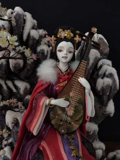
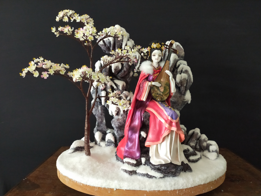
Wang Zhao Jun’s story impressed and inspired the artist who create this 3D artwork work called so beautiful as to make “Wang Zhao Jun: flying geese fall” The methodology of creating by studying her biographer. Study the characteristics of Han Dynasty women’s dress from many sources such as books, YouTube, and various websites, including her paintings that the painters like to paint her. It can be said that she was symbolic of a young woman with a beautiful face wearing a long red robe, in both hands she holds the pipa, a type of Chinese stringed musical instrument. When studying and analyzing data, in summary, A crystallized idea is a sketch based on imagination. It is a picture of Wang Zhao Jun sitting down on the rock to play the pipa, a trusted musical instrument, to alleviate her longing for her relatives mourning for the homeland that she had to leave her homeland in a state of servitude. To live in a Xiongnu land that she was unfamiliar with.

The techniques used in the creation of this work bring sculpture and painting methods together by using paper clay as the main material, flower clay, various sizes of wire, and synthetic materials such  as  foam,  artificial  gold  chains,  and  artificial  snow  as

components. Achievements that are complete, and beautiful, artistic aesthetics according to the objectives.

<span data-metadata=""><span data-buffer="">Objectives:

1. To present the image of Wang Zhao Jun, who is regarded as one of the four beautiful women imagined by the artist who created the artwork.

2. To develop creative artworks with paper clay by using sculptural methods to create shapes together with painting methods to convey the feelings and realism of the work.

<span data-metadata=""><span data-buffer="">Methodology:

Study the information analysis from the web page related to Wang Zhao Jun’s biography, appearance, behavior, and clothing style of women in the Han Dynasty to provide inspiration that develops into the concept of drafting as follows.

Biography, Appearance, and Behavior of Wang Zhao Jun

Wang Zhao Jun was named, “so beautiful as to make flying geese fall down” even flocks of birds had to fall from the sky because they forgot to flap their wings when they saw her beauty. Wang Zhao Jun was born during the reign of Emperor Han Yuandi of the Western Han Dynasty and she was recruited as a palace maid. At that time painters were bribed to paint their beautiful pictures to have a chance to meet the emperor but Wang Zhao Jun didn’t think so. At that time, Hu Hanxia, the head of the Xiongnu clan in northern China, approached the emperor to ask the princess to join him in marriage. The emperor had volunteered the maids to go and he would establish her as a princess but since the Xiongnu tribe was so far away, It is also a rugged area with a desert and a cold climate. Only Wang Zhao Jun was willing to leave. As for the emperor, seeing her for the first time, he was greatly disappointed by her beauty and rhetorical intelligence. but reluctantly gave it to her. Her devotion this time allowed the two lands to live together in peace for a hundred years. At present, there is a monument to her and Hu Hanxia, the head of the Xiongnu clan. Her own tomb still exists in Mongolia. Including the

dubbed of her additional that “Wang Zhao Jun, the great warrior who sacrificed to a distant land”.

Han Dynasty women’s clothing information

The clothes of this era consisted of long coats, short blouses, short mittens, and skirts. In this era, woven fabrics were very popular, so people who had money in those days wore clothes made of fabric, satin, women’s dresses, and clothing ranging from shirts and skirts together and separate the skirt into 2 pieces.(Figure 1)

There is a processing of the use of elements, the use of colors, and the meaning of colors. and the meaning of the tree flowers in the works. Then the creative process follows.

Techniques and Materials:

1. Creative production process

Forming: To build up the structure, a 2 mm, aluminum wire was bent into a frame and pinned onto the base, which was a glass bottle. Then start sculpting the figure according to the sketch. (Figure 6) When the sculpture has dried well, polish the surface with sandpaper.

Stone platforms use foam-cutting tools for the desired shape. Then covered with paper clay. The Pipa instrument is molded with veneer and cedar wood, stretching the thread to make a tendon. (Figure 7) The pattern of Pipa uses acrylic paint painted in a lotus shape with lotus leaves. Then decorated with gold beads, gold jewelry and rhinestones, then painted in color.

Coloring process: The painting uses acrylic paints, which the paint will add a lighter weight to create more dimensions, decorated with faux fur details on the upper part of the coat, and jewelry made. The plants, the flowers are made using flower clay mixed with light oil paints, wrapping the branches and trunk with flora tape. Then put them together and attach the work floor with glue. Use paper clay to cover the floor over the foam base on the wooden base to help close the gap between the work floor. Then glue it over and stick the artificial snow as the final step. (Figure 8)

Techniques:

Using sculptural methods to create shapes combined with painting methods to convey emotion and realism.

Materials

Use paper clay as the main material for sculpting the works. Use a glass bottle as a base for Wang Zhao Jun’s stone bench. All of the rocks are molded with foam. The structure of the tree shape uses wire of various sizes to make the trunk and branches, flower clay is used to make flowers and ornaments. In addition, artificial fur, artificial gold chains, and artificial snow were also used to decorate the details of the works.

Conclusion:

“Wang Zhao Jun: so beautiful as to make flying geese fall” aims to present the image of Wang Zhao Jun, regarded as one of the four most beautiful women in Chinese history as imagined by the Creative Artist. In addition, Wang Zhao Jun’s beauty was also regarded as a sacrifice who was willing to devote herself to protecting the peace of the country by being willing to get married in Xiongnu; far away barbarian land.The Creative Artist imagined the image of Wang Zhao Jun while she was hitchhiking, to be a young woman with a beautiful face dressed in the robes of a nobleman in the style of the Han Dynasty and a long, bright red shawl adorned with fur over another layer. She was sitting and playing a song from Pipa; her trusty musical instrument, to alleviate the loneliness of being distant from her relatives and homeland without knowing the time to return. The scenery behind her was a rock and the entire area was covered with white snow to convey a lonely and cold atmosphere but around her, Mei flower trees were blooming with pale pinkish-white flowers all around her. The creator intends to compare Wang Zhao Jun and Mei flowers because Mei is a symbol that conveys elegance, purity, and perseverance. The meaning of Mei flowers also means to inspire people to fight through hardships and be determined to face obstacles with strength.

creating the artwork “Wang Zhao Jun: “She is so beautiful as to make flying geese fall” with paper clay material, it can respond well to the work with its easy-to-shape properties. Able to invent work to be complex, delicate, and able to easily paint acrylic over the work surface. You can also use materials such as artificial gold necklaces or other synthetic materials such as faux fur, artificial snow, and flower clay can be decorated to add detail to the work.

References:

นางสาวศรีสมัย. (2556).เรื่องราวน่ารู้..ประวัติการแต่งกายของแต่ละประเทศ ตอนที่ 3 .. จีน . สืบค้น 1 มีนาคม 2566, จาก https://pantip.com/topic/30339534

ภาษาและวัฒนธรรม. (2019 ). หวางเจาจวินหญิงงามที่เสียสละเพื่อประเทศชาติ.สืบค้น 3 มีนาคม 2566, จากhttps:// www.blockdit.com/ posts/5d3bedbdcd56a73454a 86699

รพีพร โรจน์แสงเรือง. (ม.ป.ป). 4 สาวงามของประวัติศาสตร์จีน. สืบค้น 1 มีนาคม 2566, จาก https://wongkarnpat.com/viewpat.php?id=994

ศิลปวัฒนธรรม. (2561). หวังเจาจวิน นางกานัลสวย ฉลาด แต่ฮ่องเต้ฮั่นพลาด จายอมยกให้ผู้นาเผ่าซงหนู. สืบค้น 1 มีนาคม 2566, จาก https://www.silpa-mag.com/history/article_24202

หยางมี่ Yang Mi Thailand FC. (2016), 6 มิถุนายน ). หวังเจาจวิน ( Legend Of Wang Zhao Jun ) 2007. Facebook. https://www. facebook.com/ media/ set/?set=a.989303801138144&type=3

Abdulthaitube. 13 เมษายน 2022. หญิงงามที่โด่งดังในประวัติศาสตร์จีนโบราณ. [วิดีโอ]. ยูทูป. https://www.youtube.com/watch?v=LYCsNIQsEII

Chainatalks.(2019). เหมยและมู่ตัน ดอกไม้ประจาชาติจีน. สืบค้น 4 มีนาคม 2566, จาก http://www.chinatalks.co/chinatalks/%E0%B9%80%E0%B8%AB%E0%B8%A1%E0%B8%A2%E0%B9%81%E0%B8%A5%E0%B8%B0%E0%B8%A1%E0%B8%B9%E0%B9%88%E0%B8%95%E0%B8%B1%E0%B8%99

%E0%B8%94%E0%B8%AD%E0%B8%81%E0%B9%84%E0%B8%A1%E0%B9%89%E0%B8%9B%E0%B8%A3%E0%B8%B0%E0%B8%88%E0%B8%B3%E0%B8%8A%E0%B8%B2%E0%B8%95%E0%B8%B4%E0%B8%88%E0%B8%B5%E0%B8%99/

Ponpun ThongJun. (2022). Four Beauty of China สี่หญิงงามในประวัติศาสตร์จีน. https://www.bareo-isyss.com/2019/living-young/four-beauty-of-china-%E0%B8%AA%E0%B8%B5%E0%B9%88% E0% B8%AB%E0%B8%8D%E0%B8%B4%E0%B8%87%E0%B8% 87% E0%B8%B2%E0%B8%A1/

Yuwadee. (2018). 4 สุดยอดหญิงงามในตานานของจีน. สืบค้น 1 มีนาคม 2566, จาก https://teen.mthai.com/variety/67033.html

Categories
Showcase 2023 ไม่มีหมวดหมู่

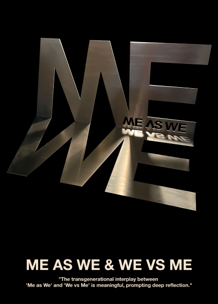
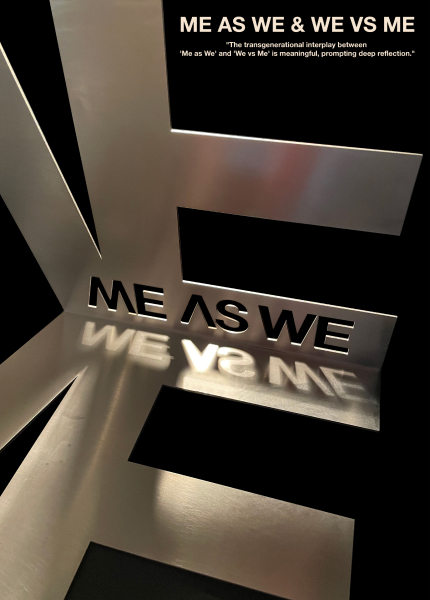
“Me as We” & “We vs Me”

“Me as We” & “We vs Me”

Asst.Prof Dr. Arttawut Changvittaya

<span data-metadata=""><span data-buffer="">Introduction :

The principles of “Me as We” and “We vs Me” are two mirror concepts that reflect how we view ourselves in relation to the wider society and fellowship. Through Design Thinking and an understanding of transgenerational issues, these concepts can be used to promote resilience, empathy, sympathy, and a growth mindset.

“Me as We” emphasizes the interconnectedness of individuals and the wider society and fellowship, promoting shared values and common goals that lead to a more harmonious and connected society. Using Design Thinking to approach problems through this lens, we can create solutions that address the unique needs of individuals while promoting the well-being of the wider society and fellowship. The phrase “one for all, all for one” can serve as a guiding principle for this process, emphasizing the importance of a collective approach that balances the needs of the individual and the wider society and fellowship.

In contrast, the “We vs Me” abstract can perpetuate transgenerational issues by prioritizing the needs of the individual over those of the wider society and fellowship. This approach can lead to a lack of empathy and understanding, resulting in solutions that do not address the needs of the wider society and fellowship.

The convergence of “Me as We” and “We vs Me” through Design Thinking can promote resilience, empathy, sympathy, and a growth mindset. By recognizing the interconnectedness of individuals and the wider society and fellowship, we can create solutions that promote healing and resilience across generations, breaking down the barriers that arise from an individualistic approach. This approach fosters a sense of collective responsibility and promotes the well-being of all members of the society and fellowship, fostering empathy and a growth mindset that leads to personal and collective growth.

Overall, the concepts of “Me as We” and “We vs Me” represent two different perspectives on the role of the individual in the wider society and fellowship. By exploring the ideas of Design Thinking, transgenerational issues, and the principles of “one for all, all for one,” these concepts can be used to promote a more compassionate, empathetic, and resilient society and fellowship. By recognizing the interconnectedness of individuals and the wider society and fellowship, we can create solutions that promote healing and resilience across generations, working towards building a society and fellowship where individuals can thrive.

“Embracing a Growth Mindset and promoting Convergence between ‘Me as We’ and ‘We vs Me’ reflects our relationship with society and fellowship. With Design Thinking and transgenerational awareness, we can foster resilience, empathy, and shared goals. ‘Me as We’ values interconnectedness, while ‘We vs Me’ can perpetuate transgenerational issues. Converging these concepts through Design Thinking promotes collective responsibility and well-being. Recognizing our interconnectedness, we can create solutions that promote healing and growth across generations, building a society and fellowship where individuals thrive.”

<span data-metadata=""><span data-buffer="">Objectives:

In conclusion, the objective of exploring the mirror concepts of “Me as We” and “We vs Me” through the lens of Design Thinking and a transgenerational understanding is to promote a more interconnected, compassionate, and resilient society and fellowship.

By recognizing the importance of a collective approach that balances the needs of the individual and the wider society and fellowship, we can create solutions that promote healing and growth across generations. With a focus on empathy, sympathy, and a growth mindset, we can break down the barriers that arise from an individualistic approach and foster a sense of collective responsibility for the well-being of all members of the society and fellowship.

<span data-metadata=""><span data-buffer="">Methodology:

Design Thinking is a problem-solving methodology that focuses on user-centered design, creativity, and experimentation. The methodology involves the following steps:

1.Empathy: The first step of Design Thinking involves understanding the users’ needs and pain points. Through research and observation, designers gain insight into the users’ experiences and perspectives.

2. Define: Based on the insights from the empathy stage, designers define the problem they are trying to solve, often by crafting a problem statement.

3. Ideate: In this stage, designers generate a large number of possible solutions without judgment, allowing for free-flowing creativity and brainstorming.

4. Prototype: Using the best ideas from the ideation stage, designers create a tangible representation of the solution in the form of a prototype. The prototype can be low-fidelity, such as a sketch or diagram, or high-fidelity, such as a working model.

5, Test: Finally, the prototype is tested with users, and feedback is gathered to evaluate the effectiveness of the solution. This feedback is then used to refine the solution and create a more effective prototype.

The iterative nature of Design Thinking allows designers to continuously refine and improve the solution, based on feedback from users. By focusing on empathy, creativity, experimentation, and user- centered design, Design Thinking provides a structured approach to problem-solving that can be applied to a wide range of fields and industries.

Techniques and Materials:

Visual Communication Design.

A metal sheet with a thickness of 2.5 mm that has been laser cut and given a hairline polish finishing.

Conclusion:

The principles of “Me as We” and “We vs Me” can be transformative, promoting empathy, sympathy, and resilience in individuals and communities. “Me as We” emphasizes the interconnectedness of individuals and the community, promoting shared values and common goals that lead to a more harmonious and connected society. By contrast, the “We vs Me” abstract can perpetuate transgenerational issues by prioritizing the needs of the individual over those of the community, leading to a more divided and individualistic society.

Overall, the result of applying the principles of “Me as We” is a more compassionate, empathetic, and resilient society, while the result of “We vs Me” is a society that lacks empathy and understanding, perpetuating transgenerational issues. By recognizing the interconnectedness of individuals and the community, we can create solutions that promote healing and resilience across generations, breaking down the barriers that arise from an individualistic approach.

References:

Khasnabish, A. (2017). “Me” and “we”: Imagining the collective in the age of neoliberalism. Organization, 24(1), 98-116.

Brown, T. (2008). Design Thinking. Harvard Business Review, 86(6), 84- 92.

Stoller, E. P. (2011). Transgenerational Trauma and the Other: A Contribution to Clinical Work with Survivors of Political Violence. Psychoanalytic Inquiry, 31(3), 244-257.

Schuler, S., Schuler, P. J., & Schuler, P. (2019). The Collective Mindset: How Groups Shape Our Mind, Our Choices, and Our Lives. The MIT Press.

Fagnani, C. (2014). “Me vs. We” in the Sustainable Design Curriculum. International Journal of Sustainability in Higher Education, 15(1), 97-108.

Pillemer, D. B., & White, S. H. (1989). Understanding generations: Demographic and historical influences. The Gerontologist, 29(4), 396- 402.