Cheese as Semiotic: Navigating Fine Art and Commercial Space in "The SEA-CRET SpreadCheese+"
Faculty of Digital Art, Rangsit University, Thailand
Suttichart Sarapaiwanich

Abstract :
The boundaries between fine art and commercial art have long been debated among artists and theorists. This project explores how a single semiotic element — cheese — can serve as a meaningful bridge between these two worlds. Beginning in 2024 with an invitation to exhibit at KennyBKK, a pizza restaurant in Bangkok, Thailand, the artist initially conceived a short comic narrative featuring the character JOE from “JOE the SEA-CRET Agent.” After reconsidering the directness of using pizza as the central visual element, the concept shifted to cheese — discovered through the cream-colored tone of art paper — as a more nuanced and layered symbol.
The resulting body of work, titled “The SEA-CRET SpreadCheese,” comprised thirty A4-sized original ink artworks on cream-colored paper, framed and exhibited across two KennyBKK branches in Bangkok (Ari and Sukhumvit) in 2024. This placement revealed a practical tension: art collectors were required to visit both locations, while restaurant patrons were not necessarily oriented toward fine art viewing, creating an audience mismatch that the artist identified as a key learning point.
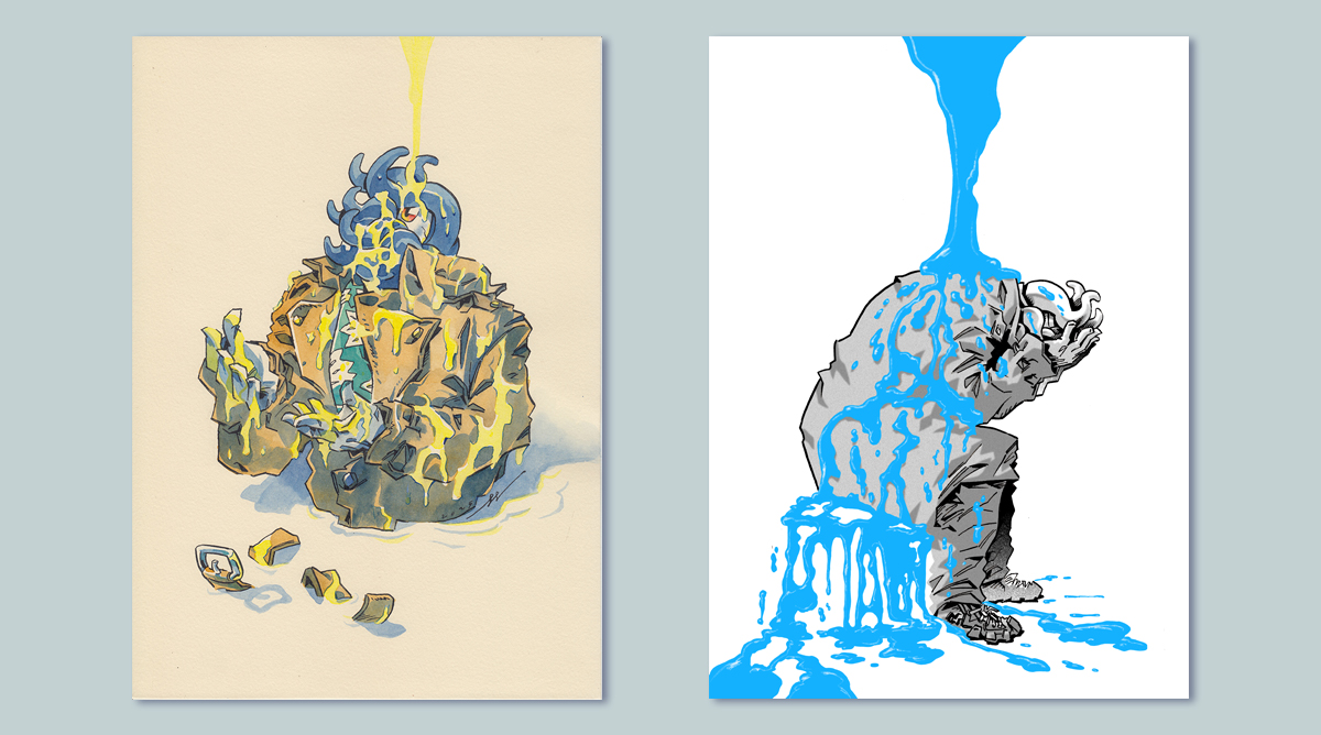
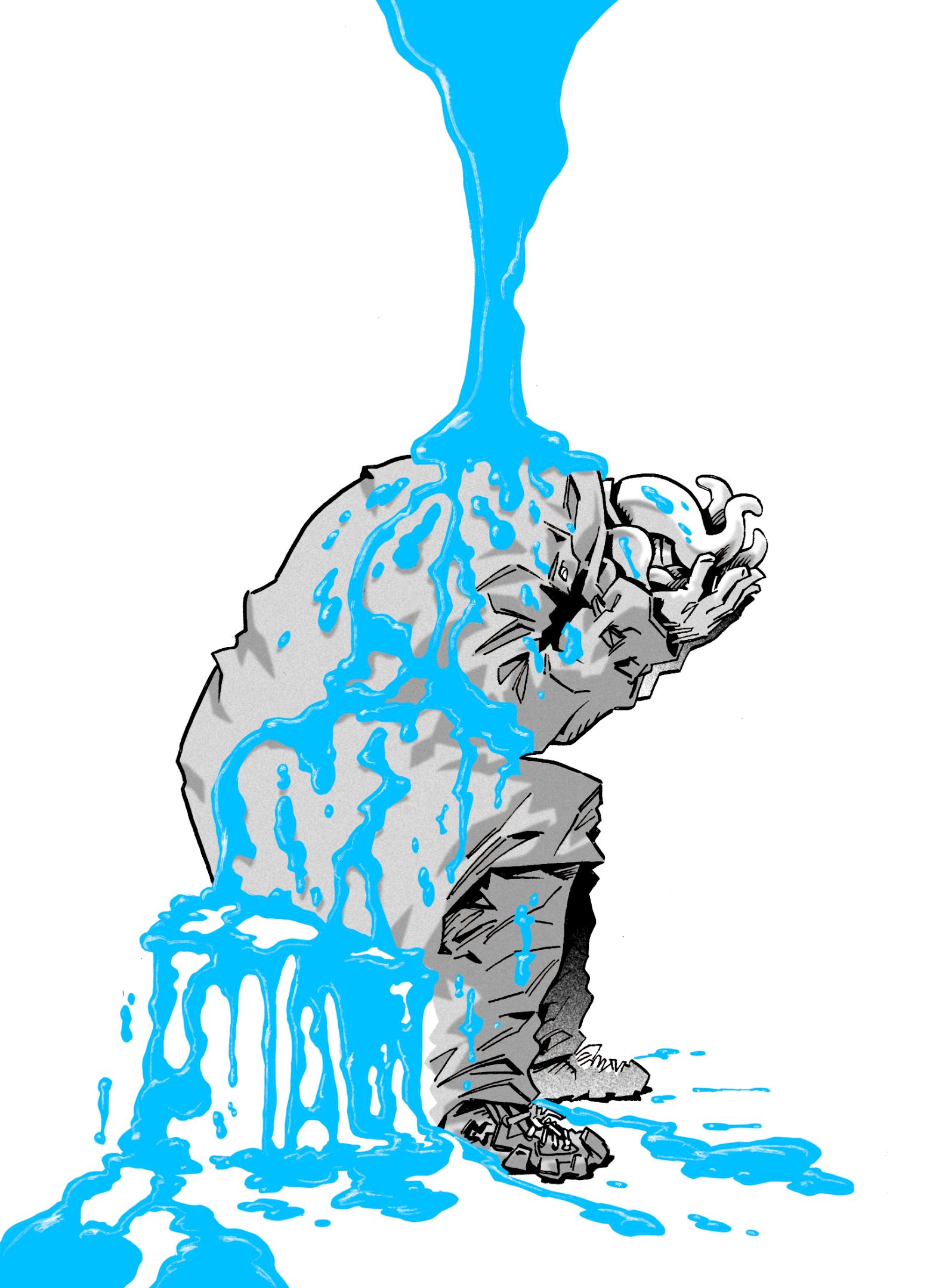
Following the Bangkok exhibition, the project was selected for the 100+ Fair Asia Art Fair 2026 in Shenzhen, China, prompting an expansion of the concept. The updated series, “The SEA-CRET SpreadCheese+,” deepened the semiotic framework: yellow cheese came to symbolize happiness and artistic achievement, expressed through traditional hand-drawn ink techniques, while blue cheese symbolized sadness and periods of creative difficulty, realized through digital techniques and fine art print. The total collection grew to approximately 43 artworks across both series.
Through the cheese semiotic, this project demonstrates that a familiar, everyday object can carry sufficient symbolic weight to anchor a conceptual fine art body of work within a commercial context. While commercial success in terms of artwork sales was limited, the project generated new collaborative opportunities — including an invitation to the ARTdig project — affirming that artistic integrity and commercial space can coexist through deliberate symbolic choice.
Objectives :
Objectives:
- To investigate the potential of cheese as a semiotic symbol bridging fine art and commercial art contexts.
- To experiment with the JOE the SEA-CRET Agent IP as a vehicle for conceptual fine art exhibition in non-gallery spaces.
- To explore the challenges and opportunities of exhibiting fine art within commercial dining environments across multiple locations.
Conceptual Framework :
Semiotics, the study of signs and symbols, provides the theoretical foundation for this project. Ferdinand de Saussure defined the sign as the relationship between a signifier (the form or image) and the signified (the concept it represents), establishing that signs derive their meaning from cultural convention rather than natural resemblance (Saussure, 1959). Charles Sanders Peirce further developed semiotic theory by classifying signs into icons (resembling their referent), indices (causally connected), and symbols (connected by convention alone) (Peirce, 1931). In this project, cheese operates primarily as a symbol: its cultural associations with richness, pleasure, and the enhancement of other foods provide the vehicle through which the artist communicates the texture and flavor of creative life.
The title “SpreadCheese” functions as a layered sign in itself. “Spread” simultaneously references the physical act of spreading cheese and the spreadsheet — a structure associated with commercial and organizational thinking. This double meaning positions the project at the intersection of fine art and commercial practice without privileging either. Daniel Chandler notes that puns and wordplay are productive semiotic devices because they activate multiple signifieds simultaneously, enriching the interpretive possibilities of a sign (Chandler, 2007). Here, the pun invites reflection on the grid-like, sequential structure of both spreadsheets and comic-panel layouts, linking the artist’s commercial and artistic identities.
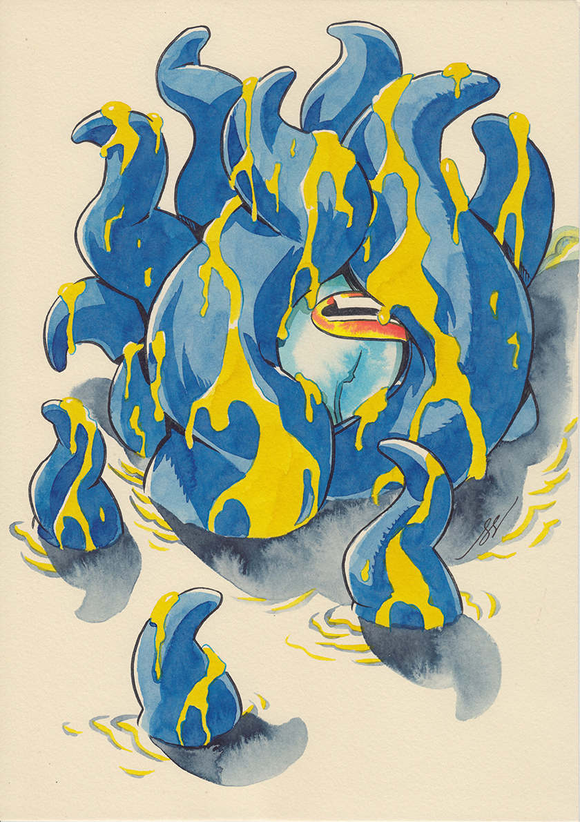
The two-color system that emerged in the expanded series — yellow cheese for joy and achievement, blue cheese for difficulty and setback — draws on the established use of color as symbolic language in visual art and semiotics. Umberto Eco observed that colors function as cultural codes, carrying differential meanings that vary by context but remain interpretable within shared visual traditions (Eco, 1976). The choice of yellow and blue builds on an internationally legible color vocabulary: warmth and positivity versus coolness and melancholy.
The tension between fine art and commercial art has historical precedent. Andy Warhol’s appropriation of commercial imagery as fine art subject matter demonstrated that the two fields could engage productively rather than remain in opposition (Warhol, 1968). This project does not advocate for either side but uses cheese as a literal and metaphorical ingredient that belongs simultaneously to both — a material found in commercial pizza restaurants that is also capable of carrying the weight of personal artistic narrative.
Process / Methodology :
Phase 1 — Initial Concept and KennyBKK Ari Exhibition (2024):
This project began with an invitation to exhibit at KennyBKK, a pizza restaurant at its inaugural branch in the Ari neighborhood of Bangkok. The initial concept was a short comic story set in the JOE the SEA-CRET Agent universe, featuring a KennyBKK delivery man who encounters JOE at a crime scene. The delivery man initially suspects JOE of criminal involvement after finding him covered in what appears to be blood; through the confrontation with the villain, the delivery man witnesses JOE’s heroism and, recognizing him as a good person, rewards him with a pizza. This narrative was developed to storyboard completion, with plans to print it in A5 format as a customer giveaway during the exhibition period and to frame the original comic manuscript pages on the restaurant walls over a 1.5-month period.
When KennyBKK announced the completion of a second, larger branch (approximately double the scale) in Sukhumvit, the scope expanded to cover both locations simultaneously. This development prompted a reconsideration of the original concept: using pizza as the direct visual subject felt too literal for an expanded fine art exhibition across multiple spaces. The completed comic storyboard was set aside, and attention shifted to creating framed ink artworks better suited to both contexts.
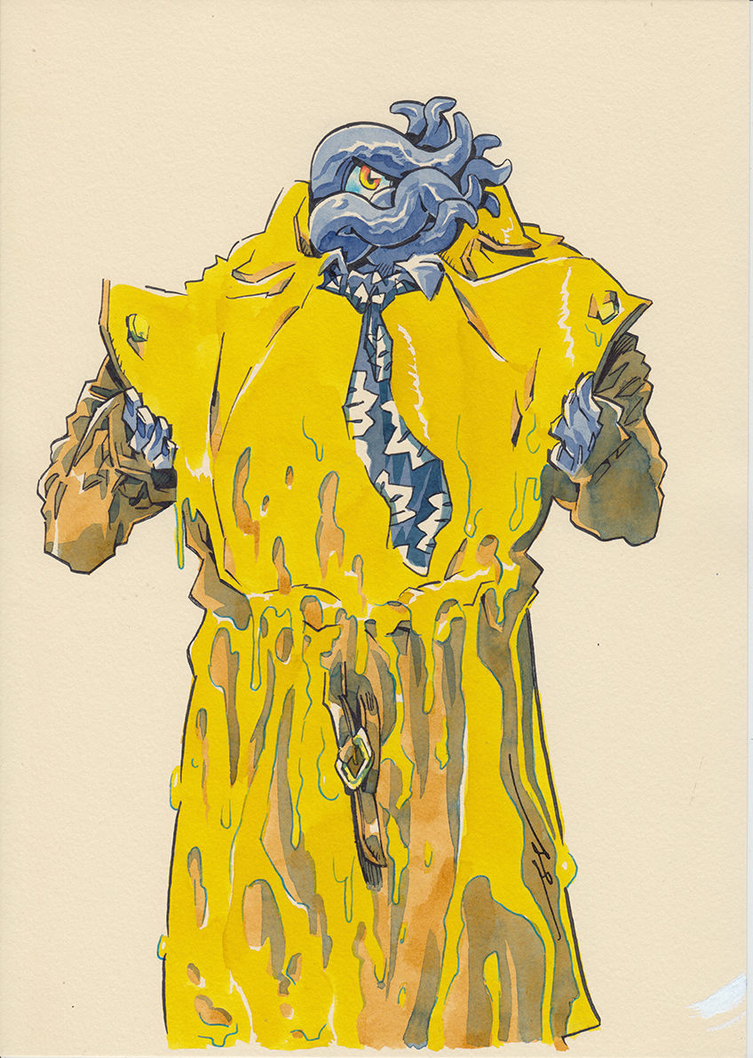
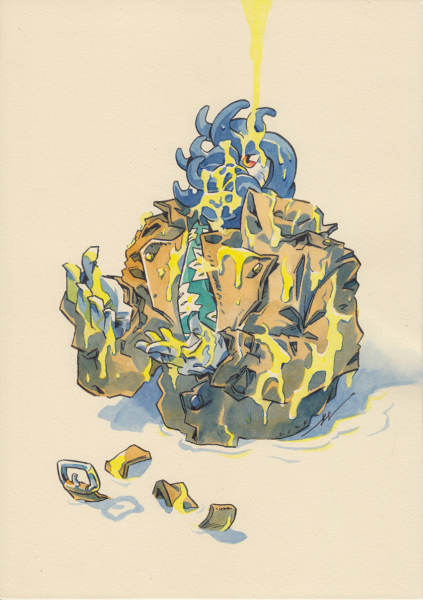
The cheese concept emerged through a material discovery: cream-colored fine paper at an art supply store. The warm tone of the paper evoked the visual quality of cheese, and this association developed into a full conceptual framework. Rather than depicting pizza — the restaurant’s product — the work would depict cheese dripping on the character JOE in various angles and compositions. Cheese provided a more abstract, semiotically rich connection to the restaurant context while preserving the playfulness appropriate to the JOE the SEA-CRET Agent universe.
Thirty original artworks (A4 size, 21 x 29.7 cm) were created using traditional ink technique on cream-colored paper and framed with white frames. The exhibition “The SEA-CRET SpreadCheese” ran across both KennyBKK branches in 2024.
Phase 2 — Audience Reflection and Spatial Analysis:
After the exhibition, the artist conducted a self-analysis of the experience and identified a structural tension: dedicated art collectors who wished to see the complete body of work were required to visit two separate commercial dining locations, while the restaurant’s regular clientele — focused on dining — was not necessarily inclined toward sustained art engagement. The gallery function and the restaurant function competed for the same limited space. This observation highlighted the inherent challenge of exhibiting fine art in commercial spaces and became a central concern for subsequent development of the project.
Phase 3 — Expansion to The SEA-CRET SpreadCheese+ (2025):
An invitation to submit work for the 100+ Fair Asia Art Fair 2026 in Shenzhen, China provided an opportunity to expand the project beyond the original Bangkok context. A new conceptual layer was introduced: Blue Cheese, representing periods of sadness, creative difficulty, and personal setback in the artist’s life, was developed as a complementary series to the original Yellow Cheese series (representing happiness and achievement). The Blue Cheese series was realized using digital techniques combined with fine art printing, introducing a different visual texture alongside the hand-drawn Yellow Cheese works. The project title was updated to “The SEA-CRET SpreadCheese+” to reflect this expanded symbolic range. The total body of work grew to approximately 43 artworks across the two series.
Techniques and Materials :
Yellow Spread Series (YS_01–YS_23) — 23 artworks: Materials: Ink on cream-colored paper. Size: 21 x 29.7 cm (framed: 30 x 40 cm with white frame). Year: 2025. Technique: Traditional hand-drawn ink line art, following the artist’s established comic manuscript technique. The cream-colored paper was selected specifically for its visual resemblance to yellow cheese, integrating the material support into the semiotic meaning of the work. The warm tone of the paper creates continuity between the character JOE and the cheese imagery, reinforcing the symbol of happiness, abundance, and artistic achievement.
Blue Spread Series (BS_01–BS_20) — 20 artworks: Materials: Ink and digital technique on fine art paper. Size: 21 x 29.7 cm (framed: 30 x 40 cm with white frame). Year: 2025. Technique: Original ink line work combined with digital color processes and fine art inkjet printing. The integration of digital methods introduces cooler visual qualities and a higher degree of tonal precision, appropriate to the series’ symbolic focus on reflection, melancholy, and the difficulty of creative periods. The use of digital printing also distinguishes this series technically from the hand-drawn Yellow Cheese works, reinforcing the contrast between the two symbolic registers.
The standardized A4 format across all 43 works ensures visual cohesion in multi-piece exhibition contexts and implicitly references the spreadsheet grid suggested by the “SpreadCheese” pun — positioning the series not only as a fine art statement but as a structured, organized body of work with the systematic quality associated with commercial practice.
Result / Conclusion :
This project demonstrated that a carefully selected semiotic element — in this case, cheese — can generate sufficient symbolic resonance to bridge fine art concepts with commercial exhibition environments. The cheese motif provided an organic visual connection to the pizza restaurant context while simultaneously operating as a layered personal symbol: nourishment, enhancement, and the coexistence of contrasting qualities.
The two-phase, two-color semiotic system that developed across the project — yellow cheese for positive creative periods, blue cheese for difficult ones — offered a personal yet accessible framework for communicating the artist’s inner creative life to a general audience. The visual familiarity of cheese as an everyday food lowered the interpretive barrier without reducing the conceptual depth of the work.
The Bangkok exhibitions (2024) surfaced practical limitations in exhibiting fine art across multiple commercial locations: the audience mismatch between art collectors and restaurant patrons, and the spatial limitations of dining spaces as gallery contexts, were identified as structural challenges rather than incidental failures. These reflections directly informed the development of the expanded SpreadCheese+ series and its more focused gallery presentation at the 100+ Fair Asia Art Fair 2026 in Shenzhen.
In commercial terms, sales of artworks were not the primary outcome. However, the strong conceptual foundation of the project generated new collaborative opportunities — including an invitation to participate in the ARTdig project — affirming that a clear semiotic framework can sustain an art practice beyond any single exhibition, opening pathways not otherwise accessible through traditional gallery circuits.
The project ultimately supports the position that fine art and commercial contexts need not be mutually exclusive when mediated by a semiotic element that resonates with both artistic depth and everyday familiarity. Cheese, in this case, proved capable of carrying both registers simultaneously.
References :
Chandler, D. (2007). Semiotics: The basics (2nd ed.). Routledge.
Eco, U. (1976). A theory of semiotics. Indiana University Press.
Peirce, C. S. (1931). Collected papers of Charles Sanders Peirce (Vol. 2). Harvard University Press.
Saussure, F. de. (1959). Course in general linguistics (W. Baskin, Trans.). Philosophical Library. (Original work published 1916)
Warhol, A. (1968). Andy Warhol. Moderna Museet.
Share :
Facebook
Twitter
LinkedIn
WhatsApp
Email
Print