SOP PRAP EARTH: Synthesising Postmemory through a Natural Dye Colour System from Sop Prap, Lampang
Thammasat University, Thailand
Nalinee Netithammakorn
Abstract :
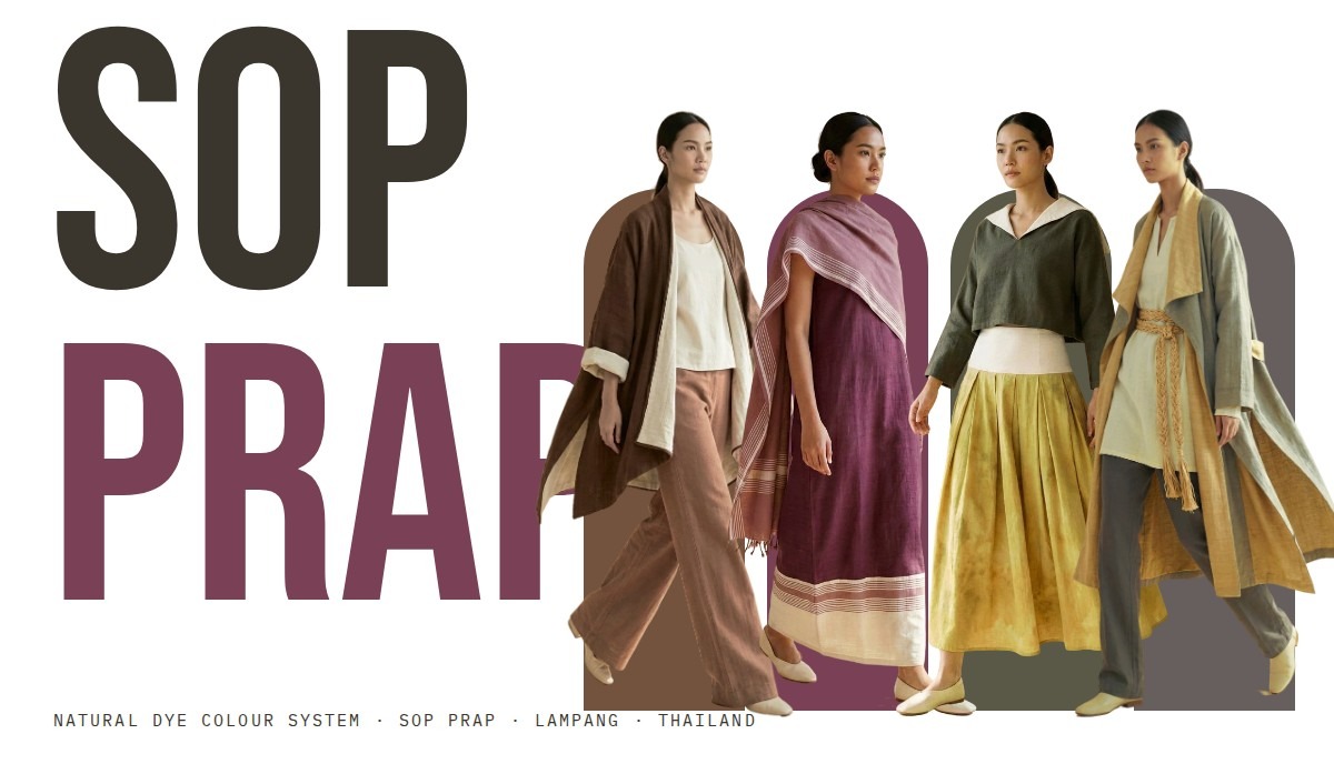
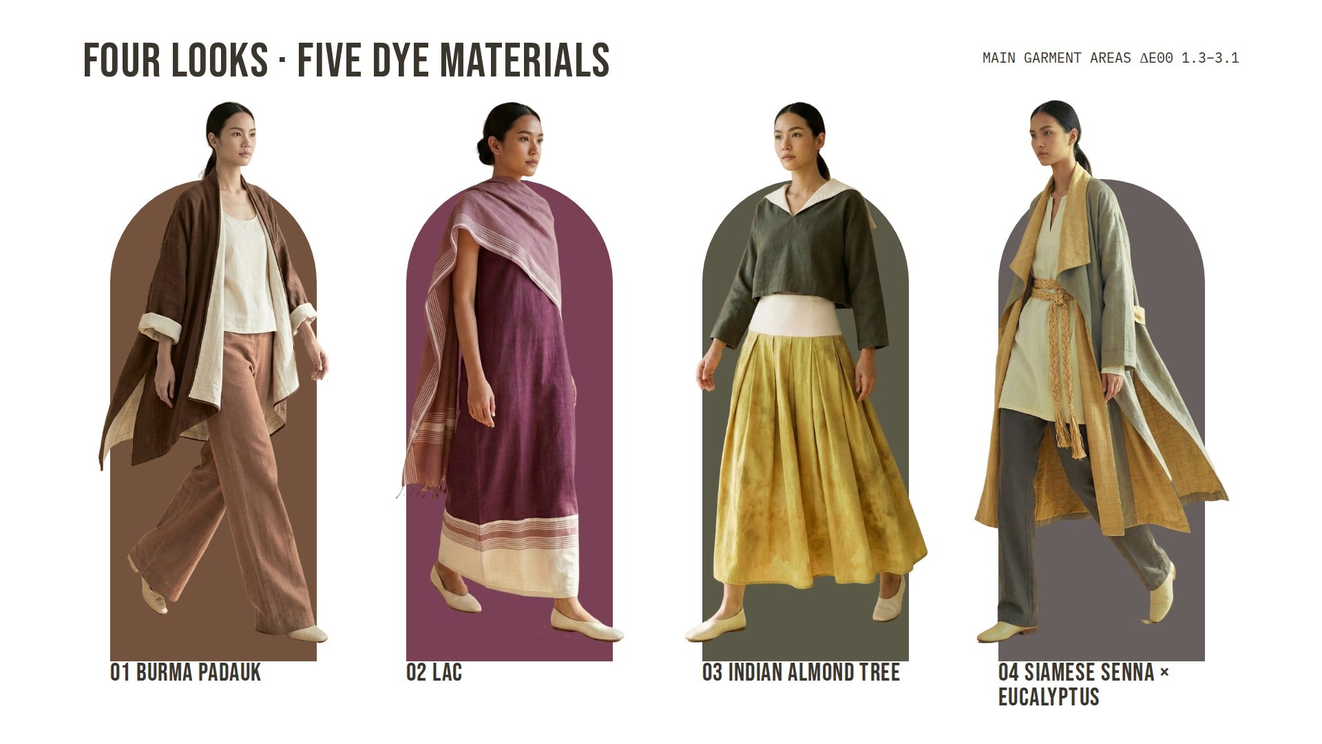
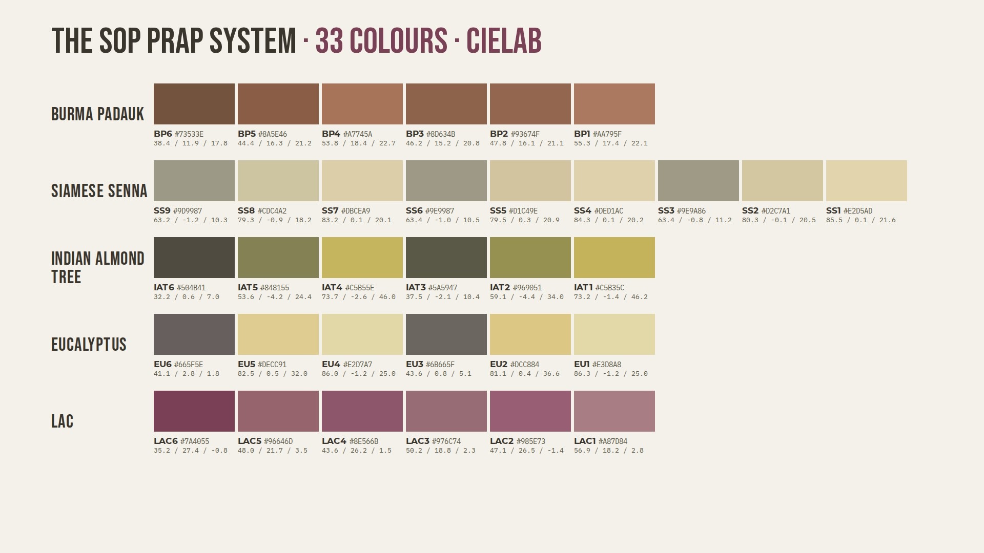
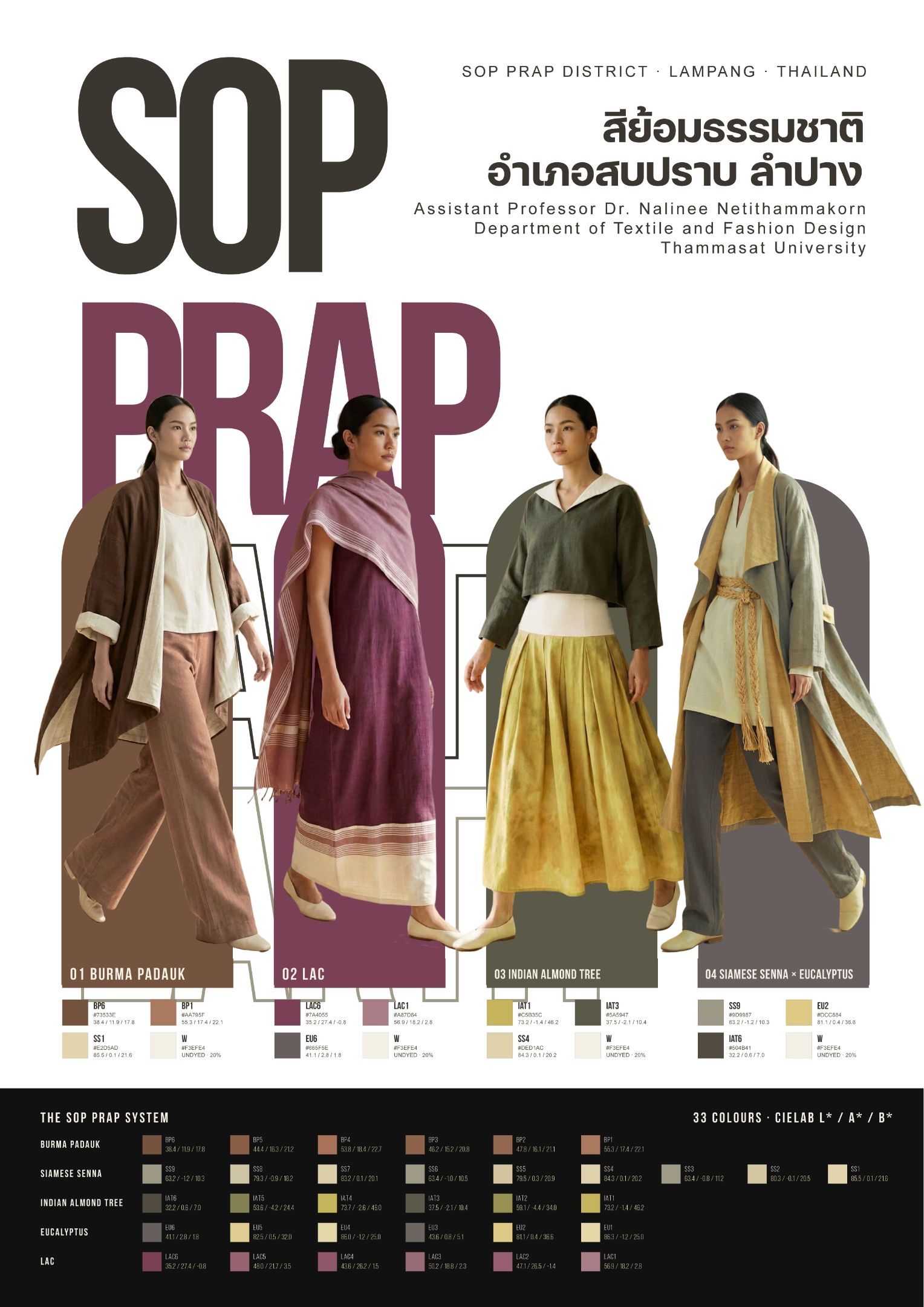
SOP PRAP EARTH is a fashion poster and a set of four looks developed from the Natural Dye Color Palette of Sop Prap District, Lampang Province, Thailand. The palette records 33 colours in five tones, Pradoo, Keelex, Hookhang, Yoocar and Fai, each measured and documented in CIELAB (L*, a*, b*), RGB, CMYK and HEX. In local practice these colours are held as embodied knowledge: dyers remember them through plants, seasons, mordants and the hand, rather than through numbers. Once that practice thins across generations, what remains for younger makers is not the experience itself but its traces: swatches, cloth and images. This condition resonates with Hirsch’s (2008, 2012) notion of postmemory, in which a later generation relates to an inherited past through mediated images rather than direct recollection. The work responds to the symposium theme by treating the measured palette as such a trace and asking how it can be synthesised back into contemporary wearable form. Each of four looks is led by one tone family: 01 Pradoo, 02 Fai, 03 Hookhang and 04 Keelex × Yoocar. Every look combines roughly 80% dyed handwoven cotton with 20% undyed natural cotton, so that the natural fibre, the ground from which all dye colour emerges, remains visible. The looks were first explored as watercolour line-and-wash illustrations and then translated into editorial studio images, using generative image tools as one stage of the design process. The colour of every garment was then corrected in CIELAB and verified with the CIEDE2000 colour-difference formula (Sharma et al., 2005) against the documented palette values, bringing the main garment areas to ΔE00 of 1.3 to 3.1. The poster presents the four looks standing over large-scale typography, with each tone assigned an arch-shaped colour field and a specimen band showing all 33 colours with their L*a*b* values. The result argues that a measured colour system can act as a transferable and reproducible carrier of craft memory: it allows a place-based dye heritage to be translated into new design outcomes while keeping an explicit, checkable link to the colours actually produced in the community.
Objectives :
The work has four objectives, linking Synthesis: Postmemory to how local natural dye knowledge can be carried forward.
- To reinterpret a measured colour palette as an inherited memory. The Natural Dye Color Palette of Sop Prap District documents 33 colours in five tone families, Pradoo, Keelex, Hookhang, Yoocar and Fai. The first objective is to read this palette not only as technical data but as a record of community dye practice (Cardon, 2007), a trace through which later generations and outside designers can relate to a craft they did not directly experience. This follows Hirsch’s (2008) account of postmemory as a connection to the past that is mediated by images and objects, and Assmann and Czaplicka’s (1995) view that cultural memory is sustained through material forms.
- To synthesise the palette into contemporary wearable form. The second objective is to design four looks, each led by one tone family, that show how the palette can function in present-day slow fashion (Clark, 2008; Fletcher, 2014). Loose silhouettes, handwoven cotton and a fixed proportion of about 20% undyed natural cotton are used so that the material origin of the colour stays visible in each look.
- To maintain a verifiable link between image and source colour. Because illustrations and generated images tend to drift in colour, the third objective is to keep every garment colour traceable to the documented CIELAB values. Colour correction and CIEDE2000 checking (CIE, 2018; Sharma et al., 2005) are used so that the visual outcome remains a faithful translation of the measured palette rather than a loose impression of it.
- To communicate the colour system as a transferable design resource. The final objective is to present the work as an A2 poster that combines the four looks with a full specimen of the 33 colours and their L*a*b* values. The poster is intended both as an exhibition piece and as a reference that designers, students and dye communities can reuse, supporting interoperability between craft knowledge, colour science and fashion design practice.
Together, they frame a reproducible model for remembering and translating place-based dye heritage.
Conceptual Framework :
The work is built on three connected ideas. Firstly, postmemory describes how a later generation relates to a past it did not live through, by way of photographs, objects and stories (Hirsch, 2008, 2012). Here the inherited object is the measured dye palette of Sop Prap: a set of swatches and numbers that stands in for seasons of plant gathering, dyeing and weaving. Secondly, cultural memory is kept alive when it is given stable material and symbolic forms (Assmann & Czaplicka, 1995). The CIELAB colour system (CIE, 2018) supplies such a form, because it describes each dye colour in device-independent values that can be exchanged across media without losing identity. Thirdly, slow fashion (Clark, 2008; Fletcher, 2014) gives the design direction: local materials, long-life garments and visible making.
The framework therefore moves in three steps: (1) memory (community dye practice), (2) record (measured CIELAB palette), and (3) synthesis (new looks and poster), with a feedback loop in which every new image is checked against the record using CIEDE2000 (Sharma et al., 2005). This loop is what keeps the translation reproducible.
Process / Methodology :
- Palette review. The Sop Prap palette (33 colours, five tones) was checked for internal consistency by converting each HEX value to CIELAB and comparing it with the recorded L*a*b* values. Label and data errors were corrected before design (e.g., duplicate codes; one swatch whose HEX value had been copied from another).
- Tone mapping. One tone family was assigned to each look, with two to three dye colours per look, one dark tone for the background field, and undyed cotton (#F3EFE4) at about 20% of the garment area.
- Visual development. The looks were explored as watercolour line-and-wash fashion illustrations and then translated into editorial studio images with a generative image tool (Magnific, Nano Banana Pro model), using the approved illustrations as references so that silhouettes and colour placement were kept.
- Colour correction and verification. Garment regions were clustered in CIELAB, and the a* and b* values of each dyed area were shifted towards its target palette colour while preserving lightness structure. Results were checked with CIEDE2000.
- Layout. The poster (A2, portrait) was composed with large-scale typography, tone-coloured arch fields, per-look colour chips and a full 33-colour specimen band; all text and colour values were set by the designer, not generated.
Techniques and Materials :
Materials: The work draws on 33 colours from cotton yarn dyed by the Ban Nam Long weaving group, Sop Prap District, Lampang, using Burma Padauk bark (BP1–BP6), Siamese Senna leaves (SS1–SS9), Indian Almond Tree leaves (IAT1–IAT6), Eucalyptus leaves (EU1–EU6) and Lac (LAC1–LAC6), with salt, alum and rust as mordants (Netithammakorn et al., 2025). Each look combines about 80% dyed handwoven cotton with 20% undyed natural cotton (W #F3EFE4).
Techniques: Colour values were taken from CIE L*a*b* measurements (D65/10°) and their HEX conversions. Looks were developed as watercolour line-and-wash fashion illustrations, then translated into editorial studio images with a generative image tool (Magnific, Nano Banana Pro). Garment colours were corrected in CIELAB and verified with the CIEDE2000 formula. The A2 poster was composed digitally with vector typography, colour chips and a full 33-colour specimen band, and exported as print-ready PDF and editable.
Result / Conclusion :
The outcome is an A2 poster, SOP PRAP EARTH, presenting four looks, 01 Pradoo, 02 Fai, 03 Hookhang and 04 Keelex × Yoocar, together with the full 33-colour Sop Prap system and its CIELAB values. Colour verification showed that uncorrected generated images drifted from the palette by up to ΔE00 12.6. After correction, the main garment areas reached ΔE00 1.3 to 3.1, within the range usually treated as a close visual match. One braided sash remains at ΔE00 8.6 because of strong shading in the rope, and is reported as a limitation.
The work suggests three conclusions. First, a measured palette can serve as a practical vehicle for postmemory: it lets designers who did not take part in the original dyeing still build a precise, respectful relation to it. Second, generative image tools are useful in the design process only when a stable colour record and a verification step keep them anchored; without the CIELAB check, the looks would have represented the dyes inaccurately. Third, the method of palette, tone mapping, image development and CIEDE2000 checking is reproducible and transferable to other dye communities. Future work will test the looks with real fabrics dyed in Sop Prap and compare the printed poster with measured textile samples.
References :
Assmann, J., & Czaplicka, J. (1995). Collective memory and cultural identity. New German Critique, (65), 125–133. https://doi.org/10.2307/488538
Cardon, D. (2007). Natural dyes: Sources, tradition, technology and science. Archetype Publications.
CIE. (2018). Colorimetry (4th ed.; CIE 015:2018). International Commission on Illumination. https://doi.org/10.25039/TR.015.2018
Clark, H. (2008). SLOW + FASHION—an oxymoron—or a promise for the future …? Fashion Theory, 12(4), 427–446. https://doi.org/10.2752/175174108X346922
Fletcher, K. (2014). Sustainable fashion and textiles: Design journeys (2nd ed.). Routledge.
Hirsch, M. (2008). The generation of postmemory. Poetics Today, 29(1), 103–128. https://doi.org/10.1215/03335372-2007-019
Hirsch, M. (2012). The generation of postmemory: Writing and visual culture after the Holocaust. Columbia University Press.
Sharma, G., Wu, W., & Dalal, E. N. (2005). The CIEDE2000 color-difference formula: Implementation notes, supplementary test data, and mathematical observations. Color Research & Application, 30(1), 21–30. https://doi.org/10.1002/col.20070
Share :
Facebook
Twitter
LinkedIn
WhatsApp
Email
Print