Guidelines for Illustrations Design that Develop Positive Emotions Using Neuro Design Principles for Generation Z Ages 18-24
Mahidol University International College
Mahidol University International College
Ploy Nikadanont
Abstract :
In today’s BANI world (Brittle, Anxious, Non-linear, Incomprehensible), people struggle with constant change and uncertainty. We process approximately 74 GB of information daily from digital sources (Heim & Keil, 2017), contributing to stress and anxiety that harm long-term health and well-being.
According to research, visual art can help reduce these negative impacts. Mastandrea et al. (2019) found that museum visits significantly reduce stress. One study determined that visitors to a London art gallery had lower cortisol levels (Clow & Fredhoi, 2006), while another discovered that figurative art especially reduced blood pressure in participants (Mastandrea et al., 2018). These physiological responses indicate art’s ability to trigger positive feelings. According to neuroscience study, brains experience more pleasure when they can readily process and understand visual information. Leder et al. (2004) found that minimum ambiguity in art promotes aesthetic satisfaction, stimulating the brain’s reward centers and improving overall mood (Scherer, 2005).
However, no specific study has been conducted to determine which types of images elicit the most positive sensations in different age groups. This research will investigate certain styles of illustrations that appeal to a specific group beginning with Gen Z aged 18-24, since these group reported higher rates of mental health difficulties, including stress, anxiety, and depression, which could be attributed to variables such as increased stresses and changes in cultural norms (Col et al.,2023).
This project will apply these insights utilizing neuro design principles to create illustrations that are specifically optimized for brain processing. By conducting a literature review and analyzing best practice projects, the researcher will identify the visual elements that most effectively elicit positive emotions. The resulting visual prototypes will aim to improve emotional well-being in our complex modern environment.
Objectives :
To create guidelines for illustration design that elicit positive emotions by using neuro design principles for gen Z age 18-24.
Conceptual Framework :
According to Mastandrea et al. (2019), better understanding of visual information decreases confusion and boosts positive emotional reactions. This occurs because the brain’s reward system engages when we correctly process and comprehend what we see. Studies demonstrate that making art more understandable directly increases positive feelings (Gerger and Leder, 2015).
Therefore, in this project, the researcher will apply neuro design principles focusing on how the brain responds to stimuli, with 2D design principles to increase design effectiveness. This will be achieved by organizing visual compositions with low complexity to facilitate brain decoding. The term “low complexity” does not refer to basic visuals, but rather to the arrangement of visual elements in predictable patterns that the brain can anticipate or compute. When images have “low complexity,” the brain can process visual signals more fluently, leading to easier comprehension which generates positive feelings as described by Mastandrea et al. (2019).
This project also applied research on angular and curved shapes that correspond with emotional processing (Balzhenkova and Kumar, 2018) and color psychology (Mohr & Jonauskaite, 2022) to develop two sets of illustration prototypes. These prototypes will be used to collect preference data from the target audiences.
Process / Methodology :
1. Literature Review:
1.1 Examine the literature on neurodesign principles, particularly with a focus on creating low-complexity designs.
1.2 Review literature on 2D design principles that promote positive emotions, with an emphasis on shapes, forms, and color psychology.
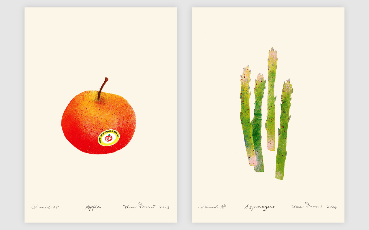
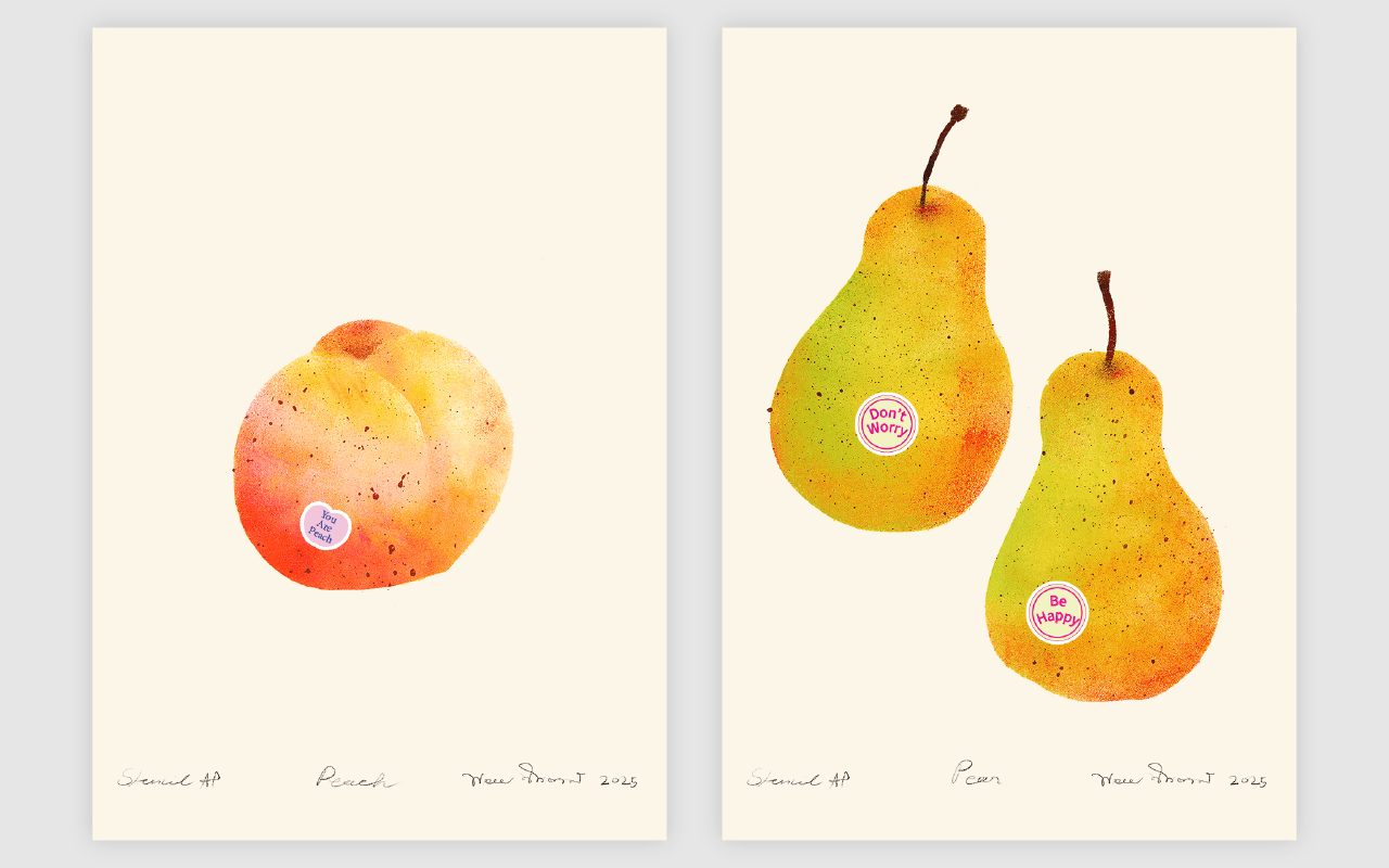
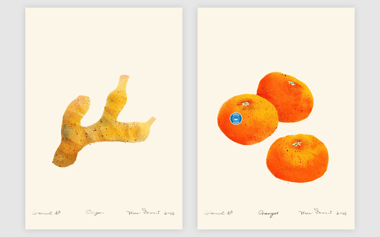
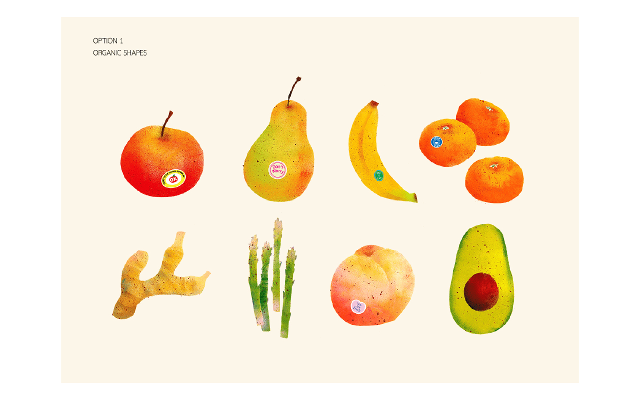
2. Create prototypes based on information gathered from the literature review. The outcomes will be two sets of fruit illustrations, the first being organic shapes and the second formed by geometric shapes.
3. Prepare an interview guide and a questionnaire, including two sets of fruit illustrations (organic shapes and geometric shapes) for collecting preferences data from target audiences.
4. Conduct surveys and group interviews with the target audience, which are Gen Z aged 18 to 24 at Mahidol University International College.
5. Analyze and summarize the results using frequency distribution counting methods to determine the most effective visuals for promoting positive emotions among target audiences.
Techniques and Materials :
According to Ocvirk et al. (2012) classify images into five abstraction levels:
level 1 Naturalism: reality as seen.
level 2 Realism: emotional focus with identifiable subjects.
level 3 Semi-Abstraction: reduced details with identifiable structures.
level 4 Objective Abstraction: minimum link to the originals.
level 5 Non-Objective Abstraction: total abstraction. Based on Mastandrea et al. (2019), brains experience more pleasure when they can easily process and understand visual information. It is obvious that levels 1, 2, and 3 have more potential than levels 4, and 5. However, this project will only focus on levels 2 and 3, as level 1 is more likely to be photographed which has a different creation method, whereas levels 4 and 5 are abstract.
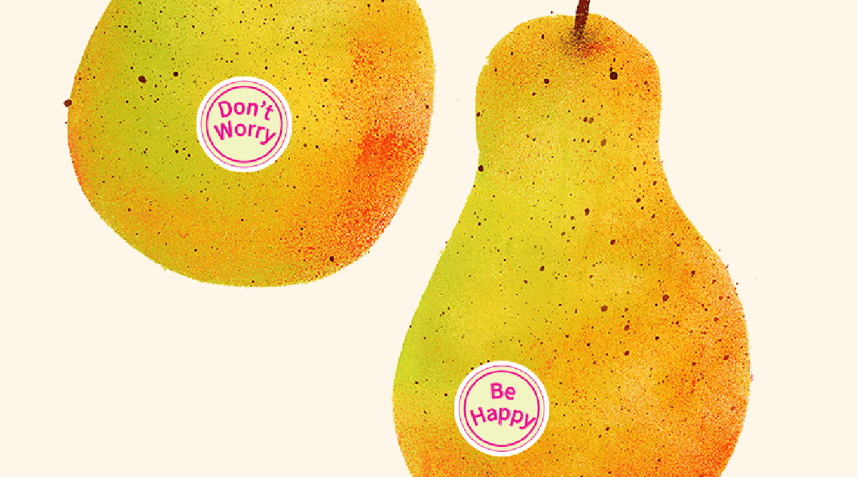
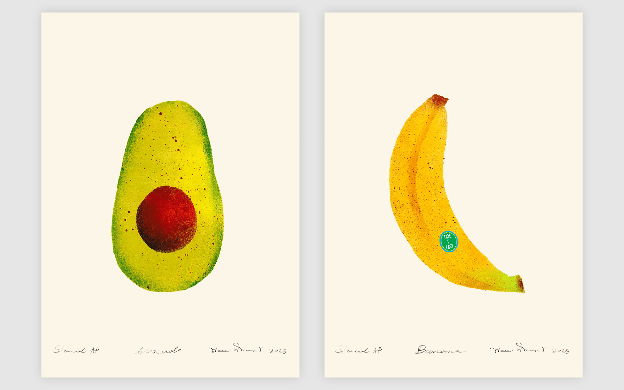
In order to create visuals representing “realism” and “semi-abstraction” (the second and third levels in the five-level abstraction spectrum), this project employs stencil technique which began by cutting holes in the forms of selected fruits on paper to produce templates. Then place a template on the watercolor paper, and using sponges applying acrylic paint through the cut-out fruit shapes.
This project also employs digital techniques; sticker labels on fruit illustrations are created using digital techniques that combine Adobe Photoshop and Adobe Illustrator. Also the illustration of fruits in geometric shapes are created by scanning the original stencil artworks and manipulated files in Adobe Photoshop.
For creating low-complexity illustrations using neuro design principles (Bridger, 2017). The designs was developed using Berger’s ten key components, which included:
1. Use familiar elements with interesting details.
2. Clear contrast for distinct focal points.
3. Apply golden ratio proportions.
4. Symmetry (especially vertical).
5. Left-side images, right-side text.
6. Create visual hierarchy.
7. Familiar contexts that leverage existing memories.
8. Exaggerate key features.
9. Limit visual elements.
10. 30-degree angles for a diagonal composition.
Result / Conclusion :
According to a survey of 140 Generation Z participants (ages 18-24) conducted at Mahidol University International College in March 2025, 85% (119 participants) chose the illustration of fruits in organic shapes over geometric designs. Among the 119 participants, 88 were from Arts and Humanities departments (including Communication Design, Business Administration, Media Communication, and Cultural Studies), and 31 from Science departments (including Creative Technologies, Dentistry, Biological Science, and Computer Science). Only 15% (21 participants) have positive emotions with geometric designs. Of the 21 participants, 17 were from Arts and Humanities departments, with only 4 from Science departments.
It is obvious that the target audience, Gen Z individuals aged 18-24, generally prefer organic shapes over geometric ones. Students from both Art and Humanities and Science departments seem to share this preference. This aligns with Balzhenkova and Kuumar’s 2018 study, which found that organic shapes are more effective at evoking positive emotions than geometric shapes.
Furthermore, data collected group interviews indicate that warm tones such as yellow, orange, red, magenta, and pink elicit a positive emotion, whereas earth tones such as brown, beige, dark green, and grey do not. Complementary color combinations, such as blue and orange or bright green and pink, are seen as cheerful. In contrast, light blue, navy blue, and sap green tend to convey a sense of tranquility. The effects of the stencil technique also contribute to the creation of a welcoming atmosphere when viewing.
References :
Ocvirk, Otto G., Robert E. Stinson, Philip R. Wigg, Robert O. Bone, and David L. Cayton. Art Fundamentals: Theory and Practice. 12th ed. New York: McGraw-Hill Companies, Inc., 2012. ISBN 978-0-07-337927-2.
Bridger, Darren. Neuro Design. London: Kogan Page Limited, 2017. ISBN 978749478889.
Graf, L. K., & Landwehr, J. R. (2015). A dual-process perspective on fluency-based aesthetics: The pleasure-interest model of aesthetic liking. Personality and Social Psychology Review, 19(4), 395-410. https://doi.org/10.1177/1088868315574978
Mohr, C., & Jonauskaite, D. (2022). Why links between colors and emotions may be universal. Psychology Today. https://www.psychologytoday.com/us/blog/color-psychology/202202/why-links-between-colors-and-emotions-may-be-universal
Mastandrea, S., Fagioli, S., & Biasi, V. (2019). Art and psychological well-being: Linking the brain to the aesthetic emotion. Frontiers in Psychology, 10, Article 739. https://doi.org/10.3389/fpsyg.2019.00739
Blazhenkova, O., & Kumar, M. M. (2018). Angular versus curved shapes: Correspondences and emotional processing.Perception, 47(1), 67–89. 1 https://doi.org/10.1177/0301006617731048
Coe, E., Doy, A., Enomoto, K., & Healy, C. (2023). Gen Z mental health: The impact of tech and social media. McKinsey Health Institute. https://www.mckinsey.com/mhi/our-insights/gen-z-mental-health-the-impact-of-tech-and-social-media
Museum of Modern Art. (n.d.). Stencil. MoMA Collection Terms. Retrieved [March 27, 2025], from https://www.moma.org/collection/terms/stencil
Share :
Facebook
Twitter
LinkedIn
WhatsApp
Email
Print