Tracing Radiance: A Stellar Visualization of Thai National Artists
Dr. Prang Tharawanich
Introduction :
Data visualization is a crucial tool for analyzing big data, utilizing visual elements like graphs and charts to represent complex data relationships and provide insights. It simplifies the understanding of data that would otherwise be challenging to comprehend. Given the COVID-19 pandemic’s impact on visual communication through screens, advanced data visualization technologies are necessary to enable effective communication of complex data for a new generation.
While data visualization is relatively new in the art industry, some sectors have adopted it to analyze artistic data, such as art conservation in museums and galleries, art curators and historians analyzing art history, and the creation of interactive art installations. In Thailand, data visualization is also used in various design and art areas, such as graphic design, and by the government to develop more effective policies and plans.
This study explores the National Artist Project’s data of The Office of the National Culture Commission, including visual communication types, the design process, and implementation concepts for data visualization design. The case study uses the National Artist data, examining qualitative information of the artists and the categories data set from 1984 to 2020. The study incorporates a range of perspectives to balance design in explanatory, conceptual, declarative, and data-driven information.
The researchers utilized the metaphor of an artist as a star, commonly used in the art world, to describe an artist’s fame or celebrity status associated with recognition and renown. The
researchers applied this metaphor to the qualitative information to create a conceptual data visualization that describes an artist’s creativity using symbols of inspiration and imagination.
Objectives:
The primary aim of this project is to explore the data of the National Artist Project of The Office of the National Culture Commission, spanning qualitative information from 1984 to 2020. Additionally, it also aims to encourage younger generations to appreciate and understand this data, irrespective of their level of expertise. As the younger generation often finds an excessive amount of information in textual form unappealing, the project uses data visualization to make the data more accessible.
While traditional education emphasizes a clear division between creative storytelling and technical analysis, the modern world values those who can integrate these two disciplines. Data visualization, which sits at the intersection of analysis and visual storytelling, is a prime example of this.
Methodology:
For this study, a literature review was conducted that examined the history of data visualization, its advantages and disadvantages, and different types of data visualization. Additionally, information was collected regarding The National Artist Program of The Office of the National Culture Commission, including its purpose, criteria, and categories. The study also included a comprehensive list of artists who have received national recognition under the program, covering past and present honorees.
Following the completion of the literature review, the next step involved procuring data from a reputable and reliable source, namely the Open Government Data of Thailand, which is made accessible by the Digital Government Development Agency (Public Organization) (DGA). The data obtained covered information related to National Artists from 1984 to 2020, as part of The National Artist Program of The Office of the National Culture Commission. As the data was in a raw format, it was necessary to clean and process it for analysis. Cleaning involved the elimination of duplicates, error-checking, and ensuring consistency in the data. Once the data had been cleaned, it was organized and formatted in a manner that enabled straightforward analysis and visualization.
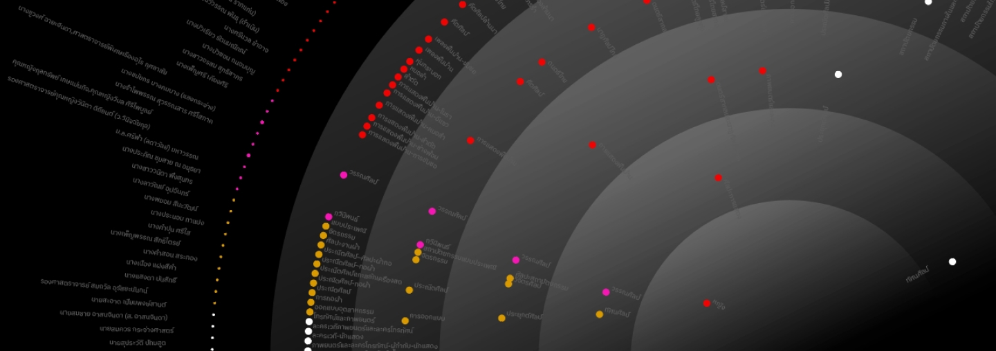
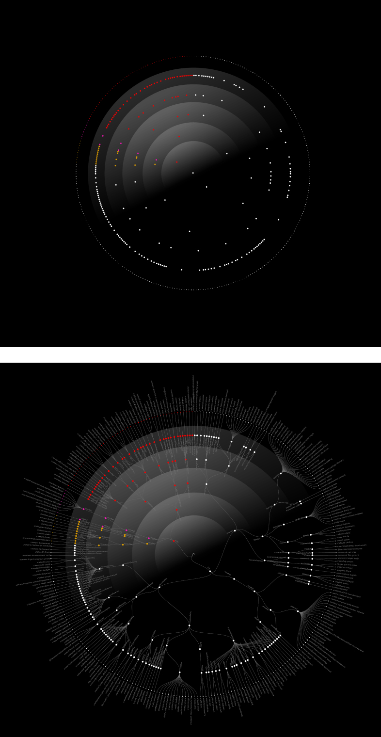
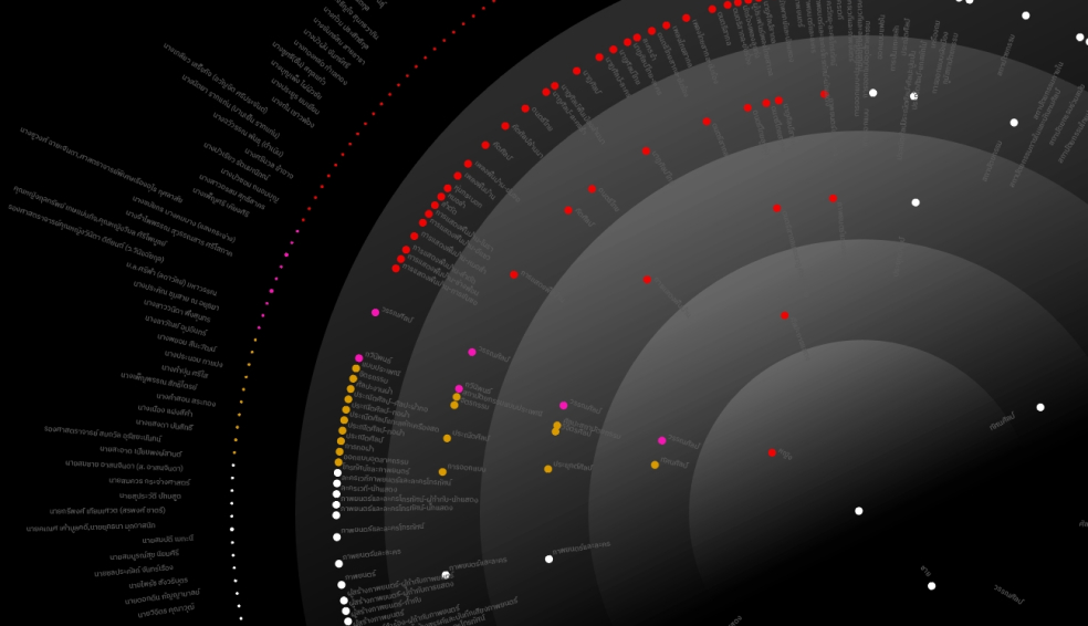
After completing the data preparation phase, the next step involved selecting the most suitable data visualization type. Given the nature of the National Artist data and the research objectives, a circular dendrogram was deemed the most effective visualization type. This choice was based on the data’s characteristics, as well as the ability of a dendrogram to display hierarchical relationships among data points, which was important for the analysis. Once the visualization type was determined, the creation of the visualizations could commence.
Following the selection of the circular dendrogram as the optimal data visualization type, the subsequent step entailed creating the shape utilizing the rawgraphs.io platform. This web-based platform was chosen for its user-friendly interface and capability to generate high-quality visualizations. The National Artist data was uploaded to the platform, and the relevant parameters were configured to construct the circular dendrogram. Upon completion of the shape, it was exported in a suitable format to facilitate further analysis and interpretation.
Once the circular dendrogram was exported, the visualization design and implementation process were initiated. The circular dendrogram was imported into a graphic software, where colors were applied to the data plots. The color palette was selected to enhance the visual appeal of the visualization and to emphasize significant data points. Additionally, the star chart concept was incorporated into the circular dendrogram layout, with the data plots resembling the shape of a star chart. This approach was chosen to symbolize the artistic creativity of the National Artists and to highlight their significant contributions to the nation’s cultural heritage.
The final stage of this case study involved producing the works in a digital format, following the design execution process.
Techniques and Materials:
This methodology involved a combination of data collection, cleaning, and visualization using rawgraphs.io, as well as customization in graphic design software. The study placed a strong emphasis on the effective communication of data through conceptual design.
The process consisted of the following steps:
Data collection: The study collected data on National Artists of The Office of the National Culture Commission from 1984 onwards.
Data cleaning and organization: The data was carefully cleaned and organized to ensure its accuracy and consistency.
Data visualization using rawgraphs.io: The cleaned data was uploaded to rawgraphs.io, an online tool used to create dynamic data visualizations.
Graphic design software customization: The rawgraphs.io visualizations were refined and customized using graphic design software.
Design: The visualizations were designed with a focus on explanatory, conceptual, declarative, and data-driven information, using a star map concept applied to the layout. The circular dendrogram contains several inner and outer rings, each represented by a different set of dots. The first inner ring is dedicated to representing genders; male and female, with a single dot used to represent each gender. The second inner ring features dots that correspond to the number of categories, while the third to fifth rings contain dots that represent sub-categories. Finally, the outermost ring is used to represent the number of artists. In addition, only female artists and their categories were given distinct colors for easy identification.
Export: The final designs were exported to a digital format for easy sharing with the intended audience.
Conclusion:
This case study has demonstrated the effective use of data visualization techniques in exploring and communicating complex information in the field of art. By utilizing the circular dendrogram and incorporating the star chart concept, the National Artist data was effectively visualized in a way that was both aesthetically pleasing and informative. This study has provided valuable insights into the process of creating effective data visualizations, including data preparation, selection of appropriate visualization types, and implementation. The findings of this case study may serve as a valuable reference for other researchers and practitioners seeking to use data visualization in the arts and cultural industries.
In addition to the insights gained from the process of creating a circular dendrogram using the National Artist data, further analysis revealed interesting information regarding the representation of Gender balance in the National Artist population, as well as the unequal distribution of artists across the different categories. This case study sheds light on these issues and provides valuable information for future research and policymaking in the art industry.