The Aesthetics of Insects Using Neuro Design for Visual Communication of Super Food Packaging Choices
Mahidol University International College
Mahidol University International College
Dr. Dynaya Bhutipunthu and Asst. Prof. Dale Konstanz


Abstract :
The investigators of this project focus on a counter response to the BANI world concept introduced by Jamais Cascio (Cascio, J., 2022) by considering the security of food options, using insects as alternative ingredients in human food for nutritional benefits in which crickets are identified as one of the top options (Soares de, J, R., Ohara, A, C., Aguilar, S, G, J., Domingues, F, A, M., 2018). The linkage of the insect’s food alterations can be correlated to the United Nations Sustainable Development Goals (UN SDG) which Thailand applied to one area of the nation’s strategic planning; No.2 and No.3 for Zero Hunger, Good Health, and Wellbeing (UN SDG, 2015) (Ministry of Foreign Affairs, 2021). However, the challenge lies upon the audiences’ perceptions of insect consumption. Leading to the aim of this project, which is to apply Neuro Design key practices (Bridger, D., 2017) in designing visuals to trigger a sense of aesthetic appreciation to increase the number of insects in food consumption users. Applying Mahidol University International College’s research relating to functional food, as well as “Super Food” from the Food Science and Technology Program’s faculty and students’ studies on microbial quality, protein yield, and antioxidant properties of frozen edible insects as a case study to be applied to branding and package design.
Objectives :
The aim of this project is to apply Neuro Design key practices (Bridger, D., 2017) in designing visuals to trigger a sense of aesthetic appreciation to increase the number of insects in food consumption users.
Conceptual Framework :
The process of this study covers; 1.) Literature Review and the review of best practice projects, 2.) Experts’ discussions on the insect’s consumption and user’s pain points to draw conclusions from the findings, 3.) The creation process of a brand identity for a series of key visuals for packaging design of one of the sets of products made with “cricket” as a main ingredient, and 4.) The conclusions and suggestions will be drawn for future development.
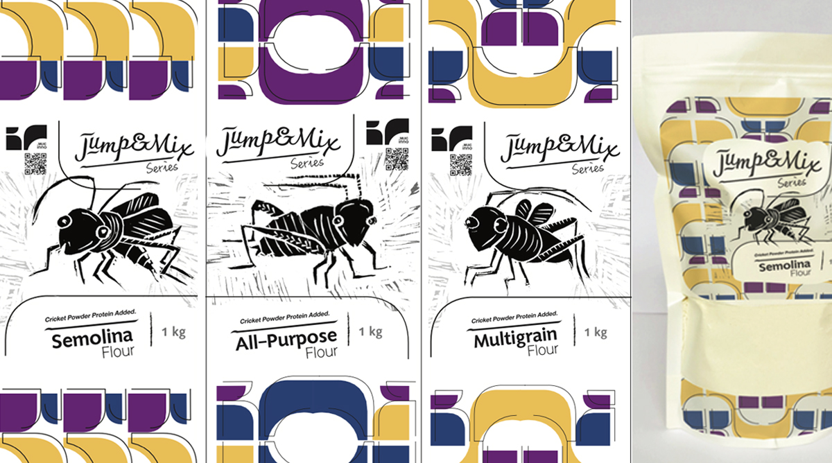
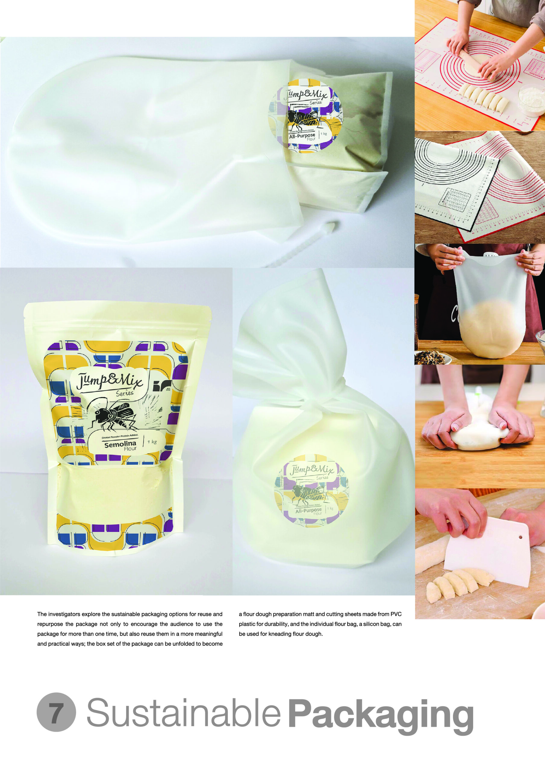
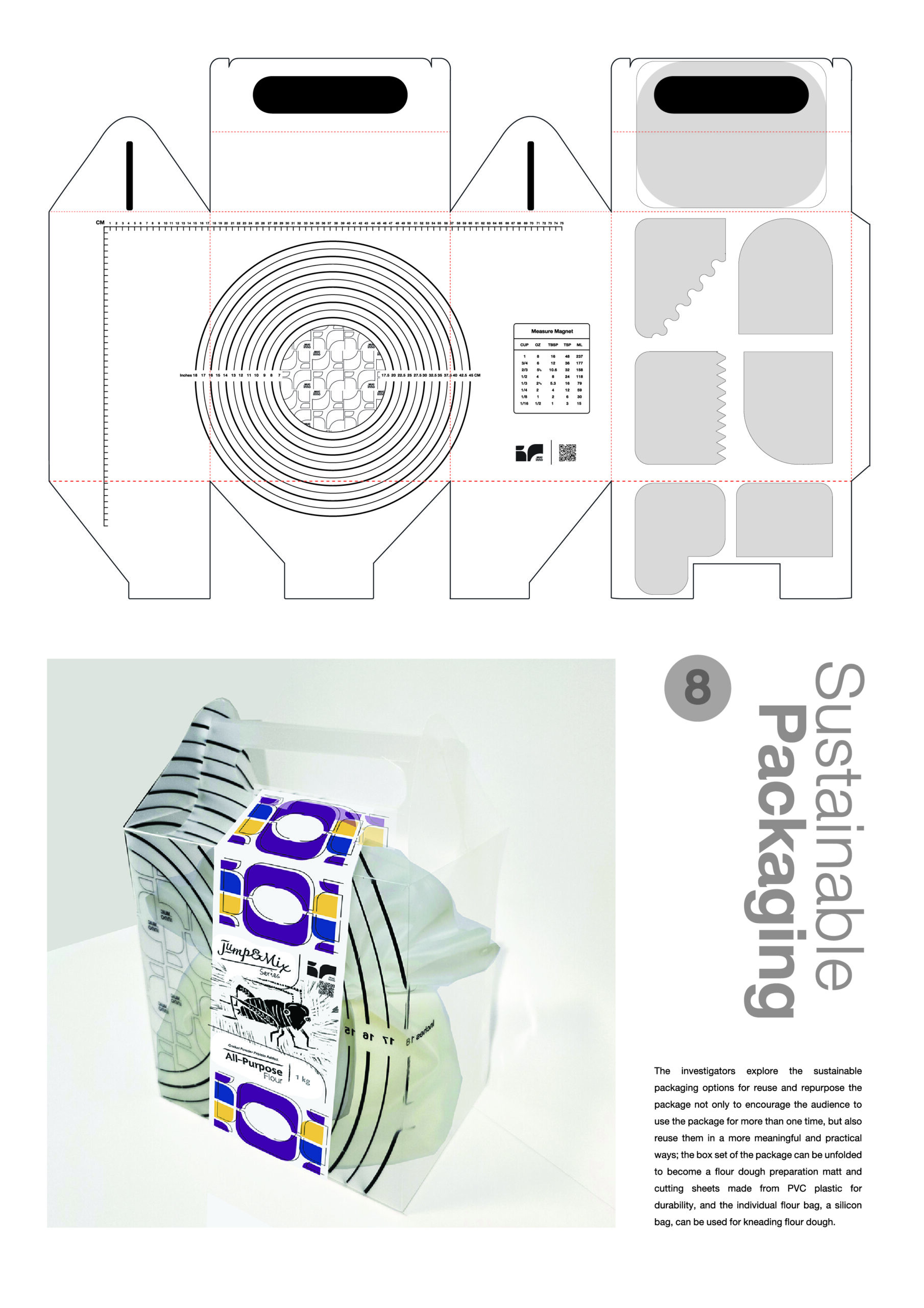
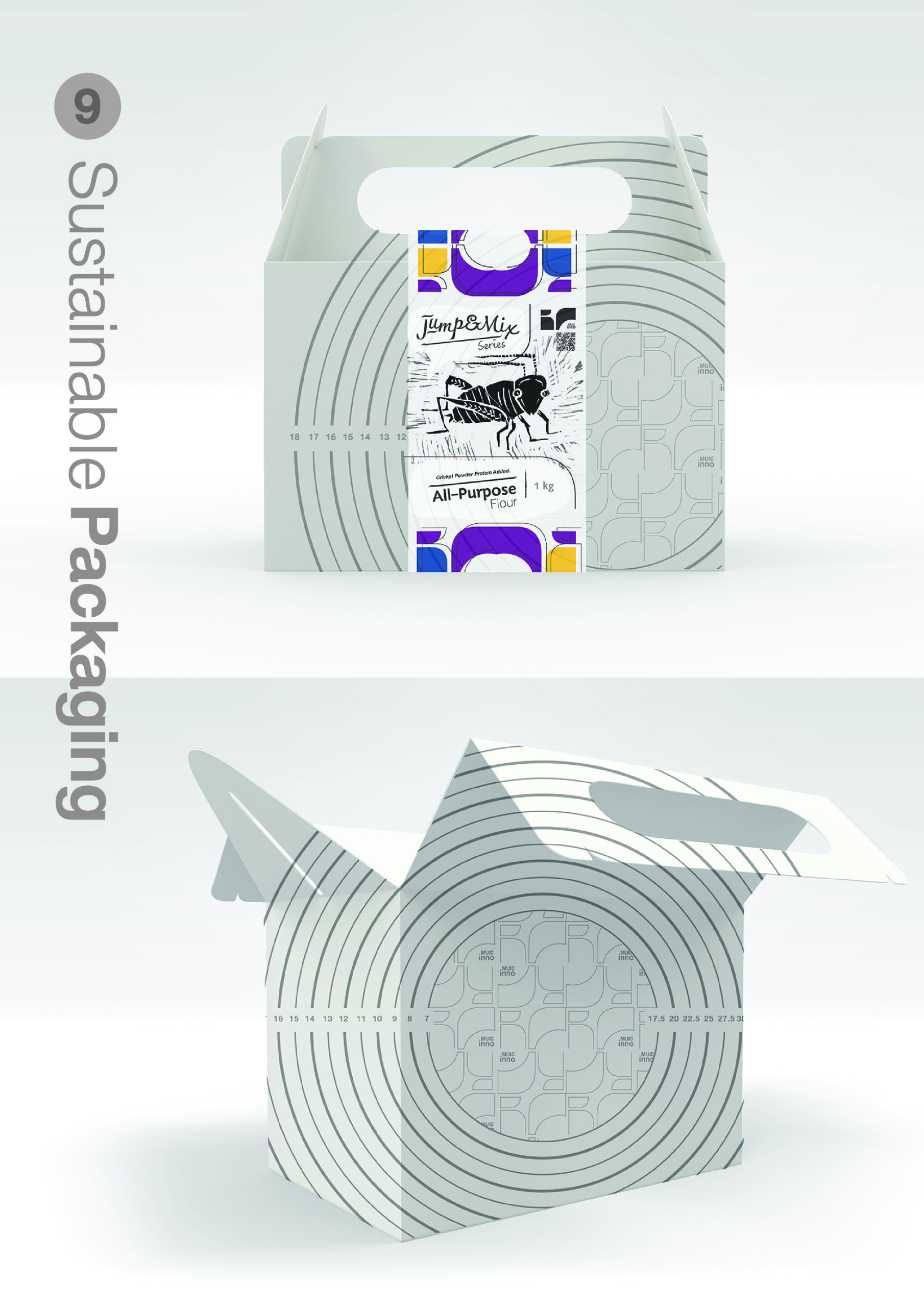
The study of functional food, “Super Food” research with the experts’ discussions assist the investigators to select and group the products made with crickets as a main ingredient. A set of three types of flours named “Jump & Mix” were selected for brand identity and package design cover; 1.) Multigrain, 2.) All-Purpose, and 3.) Semolina for making dough with flour. With the review of best practice award winning projects, package design, from “The One Club for Creativity” (ADC 99th Annual Awards 2024) and “The Dieline” (The Best in Packaging 2024) (The One Club for Creativity, 2024) (The Dieline, 2024) supports the design elements creations and execution directions of the final works with sustainability packaging design approach to reuse and/or re-purpose all parts of the package. The box set can be unfolded to be used as a non-stick flour dough preparation surface with cutting sheets and flour bags made from silicon for kneading dough.
According to Darren Bridger, there are five key practices of Neuro Design; 1.) Processing Fluency, 2.) First impressions, 3.) Visual Saliency, 4.) Nonconscious Emotional Drivers, and 5.) Behavioral Economics (Bridger, D., 2017). Creating a series of cricket illustrations from the traditional technique of relief printing and bold brand identity’s graphics are the reply to the Neuro Design keys number 2 and 4. For number 1 and 3, the investigators applied design principles for the composition arrangement of the works affecting hierarchy of information and eye movements using the “Golden Ratio” and the “Rule of Thirds” for the executions. The execution direction of the final works lead to key practice number 5; Behavioral Economics, expecting more engagements and participations with the products (2017).
Process / Methodology :
The creation process of the design work starts from the integration of the information received from reviews of best practice projects and the conclusion of the findings from the experts’ discussion and users’ insights. Followed by the creation of the key visuals, relief printmaking and the creation process of the brand identity, key graphics, and packaging design of the product.
The key visuals in the cricket flour package design focus on three playful cricket characters, each created through a traditional relief printing technique. The design process involved detailed visual research to capture the form, movement, and personality of crickets, ensuring that each character feels dynamic and engaging. These crickets are designed to be approachable and fun, challenging the consumer’s perceptions of eating insect-based products. Their whimsical nature helps make the concept of cricket flour more accessible and less intimidating.
Complementing the crickets are bold, modern abstract graphics that echo the shapes of the insects themselves. These forms are thoughtfully integrated with the Inno brand logo, creating a cohesive visual language that ties the entire packaging together. The use of abstract elements connects the natural inspiration of the crickets with the modern, forward-thinking approach of the brand.
The color palette of the cricket flour package design is carefully chosen to evoke a sense of modernity while maintaining a playful tone with bright accents and contrast that add energy and vibrancy. The combination of these colors creates an inviting and lively visual appeal, making the product feel both fresh and accessible. The palette works harmoniously to convey the innovative yet friendly nature of cricket-based products, shifting perceptions and inviting consumers to explore something new with a sense of enjoyment.
The creation of the brand identity of “MUIC Inno” starts with the customization of the letterforms “i” and “c” which are derived from the first letters of “international college”, the liberal arts college at Mahidol University. The investigators integrate the main institute’s brand colors and typography with the final design to create linkage to the college’s image. A rearranging of the letterforms were used to create a series of key graphics which are applied in packaging and other brand collaterals.
Techniques and Materials :
The creation of the relief prints for the cricket flour package design began with in-depth visual research, focusing on a wide variety of images of crickets to understand their form, movement, and unique features. This research was essential to capture the essence of the crickets in a way that would feel both authentic and playful. The sketches that followed explored various poses and expressions, allowing for experimentation with the crickets’ characteristics. After careful consideration, the final designs were chosen based on their fun and lively nature, ensuring they would connect with the target audience in a friendly, approachable way.
Once the designs were finalized, they were transferred onto blocks, a key step in the relief printing process. Each image was expressively carved into the blocks using specialized carving tools from Japan. The carving process involved carefully cutting away the non-image areas, leaving raised surfaces that would hold the ink and produce the printed image. This technique allowed for a tactile, textured feel that adds depth and character to the final prints.
Oil-based ink was then applied to the carved blocks, ensuring rich, vibrant color that would stand out on the final prints. A printing press was used to press the inked blocks onto Strathmore printing paper, which provided a high-quality, smooth surface to showcase the lines, textures, and details of the design. Small editions of three prints were created for each cricket, ensuring exclusivity and craftsmanship. After the prints were made, the best quality examples were selected for use in the package design, ensuring that the final product was visually striking and captured the playful, natural essence of the crickets.
The investigators explore the sustainable packaging options for reuse and repurpose the package not only to encourage the audience to use the package for more than one time, but also reuse them in a more meaningful and practical ways; the box set of the package can be unfolded to become a flour dough preparation matt and cutting sheets made from PVC plastic for durability, and the individual flour bag, a silicon bag, can be used for kneading flour dough.
Result / Conclusion :
In conclusion, despite the clear nutritional and environmental benefits, the challenge remains in altering public perceptions of insect consumption, which is often hindered by cultural biases and unfamiliarity. This project aimed to combat these perceptions by applying Neuro Design practices to create packaging that appeals to the visual and sensory preferences of consumers, triggering aesthetic appreciation and curiosity about insect-based foods. By incorporating research from Mahidol University International College‘s Food Science and Technology Program faculty and students and focusing on the nutritional advantages of edible insects, the project seeks to establish new branding and packaging design that encourages greater acceptance and adoption of insects as a sustainable food source.
For future efforts, it is recommended that the project continues to explore and experiment with sensory experiences in packaging design. Additionally, public education campaigns could be integrated into the branding strategy to further demystify insect consumption and emphasize its environmental and health benefits. Engaging consumers through interactive and informative experiences may help to shift perceptions and foster long-term acceptance of insects as a mainstream food source.
References :
Bridger, D. (2017). Neuro Design; Neuromarketing insights to boost engagement and profitability. Kogan Page Limited; New York.
Cascio, J. (2022). BANI WORLD. Medium. (Accessed 12 March 2025 from: https://medium.com/@cascio/human-responses-to-a-bani-world-fb3a296e9cac).
Kurdi, Peter & Chaowiwat, Patspon & Weston, Jirathit & Hansawasdi, Chanida. (2021). Studies on Microbial Quality, Protein Yield, and Antioxidant Properties of Some Frozen Edible Insects. International Journal of Food Science. 2021. 1-7.
Ministry of Foreign Affairs. (2021). Thailand’ Voluntary National Review: On the Implementation of the 2030 Agenda for Sustainable Development. Department of International Organizations. (Accessed 24 March 2025 from: chrome-extension://efaidnbmnnnibpcajpcglclefindmkaj/https://image.mfa.go.th/mfa/0/OznAy3tii2/E-booking/VNR_2021__ENG_.pdf).
MUIC. (2024). Mahidol University international College; Food Science and Technology Major. (accessed 12 March 2025 from: https://muic.mahidol.ac.th/eng/programs/undergraduate-programs/science/major-in-food-science-and-technology/).
Soares de, J, R., Ohara, A, C., Aguilar, S, G, J,., Domingues, F, A, M. (2018). Nutritional, functional and biological properties of insect proteins: Processes for obtaining, consumption and future challenges. Trends in Food Science & Technology, Volume 76, June 2018, Pages 82-89, Elsevier Ltd. (Accessed 24 March 2025 from: https://www.sciencedirect.com/topics/agricultural-and-biological-sciences/insect-protein)
The Dieline. (2024). The Best in Packaging 2024; DIELINE Awards Winners. (Accessed 12 March 2025 from: https://thedieline.com/the-best-in-packaging-2024-dieline-awards-winners-revealed/).
The One Club for Creativity. (2024). Packaging Design Winners; ADC 99th Annual Awards 2024. (Accessed 12 March 2025 from: https://www.oneclub.org/awards/adcawards/winners/packaging-design/).
United Nations. (2015). United Nations: 17 Sustainable Development Goals (SDG). Retrieved 12 March 2025 from: https://sdgs.un.org/goals.
Share :
Facebook
Twitter
LinkedIn
WhatsApp
Email
Print