Thai FRUITOPIA; Transgenerational approach to happiness with a series of AR fruits’ party banners
Dr.Dynaya Bhutipunthu and Asist.Prof.Dale Konstanz
Introduction :
The world of the post-pandemic is a totally new experience for students, a “Transgenerational” time, especially when it comes to 100% real on-site, on campus physical interaction and full-on required engagements and activities. Some of the students found this to be a great challenge and had difficulty adjusting and adapting to fit into this way of studying. At Mahidol University International College (MUIC), with new strategic planning in place for 2023-2027 (Figure 1) which includes creative approaches to teaching and learning, innovative thinking and problem solving, sustainability as well as students’ well-being, we found the need to create a tool using visual language that is easily understood and one they are familiar with to help communicate the message to students. The series of AR banners is the appropriate tool selected to help with the communication of the key message to students that “campus life is fun and worth it, even though it’s challenging sometimes.”
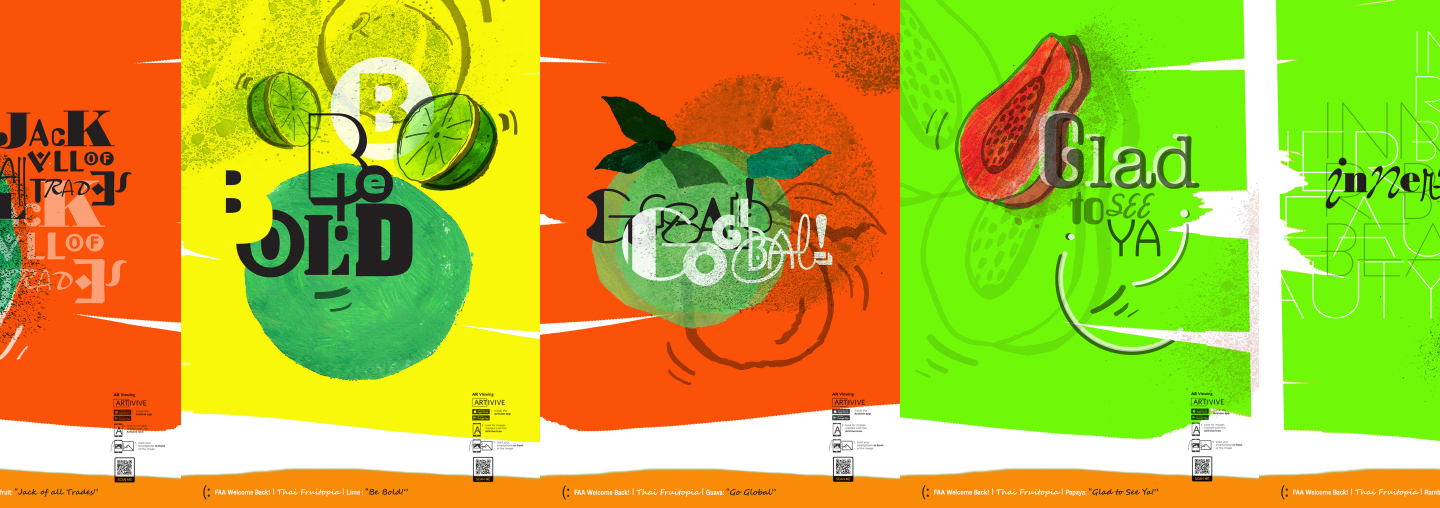
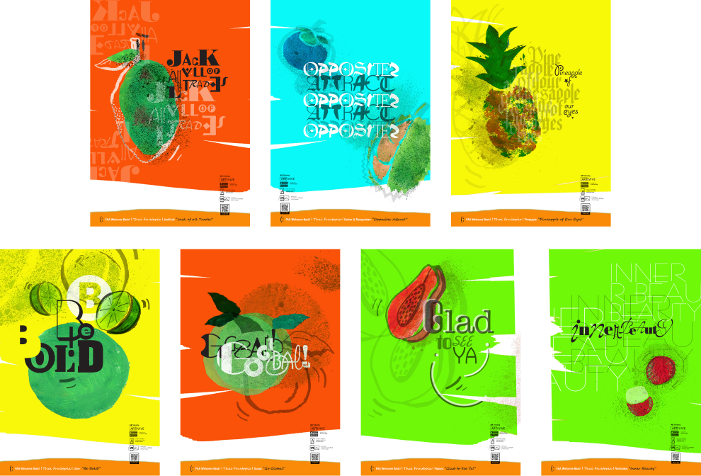
The series of AR banners created by the researchers integrate the research of Positive Psychology (Seligman, M., 2018), MUIC strategic planning, the design of an existing way-finding system on the 5th and 6th floors of the International College’s Aditayathorn building where the studio spaces are located in the building, and lastly in areas of study in the Fine and Applied Arts Division (FAA) through the very fun and approachable theme of “Thai Fruitopia.” Using well-known Thai fruit such as rambutan, mango, durian, mangosteen, and papaya with the conceptual headings related to the selected fruits that reflect students’ pain points and challenges of coming back to campus. These banners not only aim to communicate a series of encouraging messages cheering up the students and hopefully putting a smile on their faces, but also creating a positive learning environment among students and faculty.
Objectives:
To create a tool using visual language, a series of AR banners, replying to their post-pandemic campus experiences, pain points, and challenges, which helps communicate the key message to the students that “campus life is fun and worth it, even though it’s challenging sometimes.”

Methodology:
The process/methodology of this project covers;
1) Literature Review which includes the topics of; 1.1) Positive Psychology (PERMA model); the building blocks of well-being addressed by Dr.Martin Seligman (Seligman, M., 2018) to apply the PERMA model; Positive Emotions, Engagement, Positive Relationship, Meaning, and Accomplishment, into practice in the design process, especially in the creation of headings of all banners. 1.2) Vision / Mission and strategic planning of MUIC: the researchers looked into the vision / mission and strategic planning shown below in Figure 1, to be able to draw linkage to the overall concept of the design of each banner including choices of Thai fruit, headings, typography and lettering selections, color scheme, layout designs, and the movement of lettering in AR clips, as shown in Table 1.
2) The review of Best Practice projects of Environmental/ Experiential Graphic Design (EGD) from the Society for Experiential Graphic Design (SEGD) which is an online organization created as a platform for environmental / experiential graphic designers to showcase their works and be recognized through peer review global award-winning projects, as well as acting as a platform for open discussion, academically (https://segd.org/). Selected and award-winning projects that the researchers examined include “Northwestern University Common Spaces” designed by David Broz (head of the team) from Gensler. This project identifies how the design team systematically upgraded and unified the university’s diverse common spaces, focusing on a student-centered approach. The team developed a model to prioritize the usage of the spaces based on the analysis between the current and students’ desired state of the spaces on campus (SEGD, 2018). The researchers also reviewed two academic articles: one by Greg Nelson from the Altitude Design Office on “How Will Buildings and Places Communicate Following the Pandemic?” (Nelson, G., 2020) and another from Leigh Minning on “BrandCulture: The Future of Built Environments After COVID-19” (Minning, L., 2021) to analyze and understand the practices, as well as integrate what is essential to this project.
3) In-depth interviews with selected students and faculty members were conducted to gain knowledge on their pain points and challenges of fully coming back to campus, including how onsite teaching and learning are conducted and applied using the analysis of results leading to part of the conceptual / theme development and the design direction and execution of the works.
Design Process:
As part of the existing way-finding signage on the 5th and 6th floors of the International College’s Aditayathorn building which, in the making, has already focused on applying the visual representation of the architecture and areas of studies in the Communication Design Program (CDP) and the Fine and Applied Arts Division (FAA), as well as the vision / mission and strategic planning of the college as shown in Image 1: The existing way-finding signage and the overall view of the existing spaces. The design process includes the development of the use of customized typography, colors (FAA brand colors), graphic elements, layout design and super graphics.
The key message of the development of this series of AR banners is “campus life is fun and worth it, even though it’s challenging sometimes”. The researchers created a fun and approachable design theme from the key message above “Thai Fruitopia” using bright colors with a specific style of Thai fruit that includes pen-drawn images and acrylic paintings along with customized lettering from various typefaces (Google Fonts, 2023). The banners were then executed with AR lettering clips embedded as displayed in Image 2: Design elements sketches and Image 3: Example of storyboard of the AR lettering clip below.
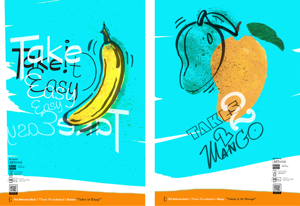
The selection of Thai fruits and headings which have a linkage to the college’s vision, mission, and strategic planning expressed through visual language (design elements) the theme of the banners, are listed below: 1) Banana with the heading, “Take It Easy!” links to the college’s mission of inspiring life-long learning through liberal arts education, 2) Durian and Mangosteen with the heading, “Opposites Attract” reflects the strategy of the Integration of arts and sciences, local and global, in an international environment (Foster global citizenship), 3) Pineapple with “Pineapple Of Our Eyes” connects to the college’s vision; Enriching students’ lives, Expanding their potentials, and Shaping their futures, 4) Papaya with “Glad To See Ya!” links to one of the strategies of enhancing creativity and innovation through campus experience.
5) Lime with “Be Bold!” heading leads to the college’s vision; Enriching Lives, Expanding Potentials, and Shaping Futures, 6) Rambutan with the heading “Inner Beauty” to reflect the inspiration of using innovation to foster human potential, research and service to answer the needs of society and to the benefit of humankind, 7) Jackfruit for “Jack Of All Trades” to illustrate life.long learning inspired through liberal arts education and the capitalization of diverse expertise and distinction through collaboration, and 8) Guava with the heading “Go Global!” to captures the development of a global mindset that embraces diversity in culture, heritage, and background, and 9) Mango with the heading “Takes 2 To Mango” to reflects the foster of being a global citizen with multicultural engagement and collaborations as shown in Image 4-5: Display of banners in the actual environment).
Techniques and Materials:
Graphic design and AR, hand-drawn line art and acrylic painting illustrations with customized lettering that reflects the heading of each banner. Creating AR clips to emphasize the heading of each banner with the “Artivive” application scan as shown in storyboards (Image 3).

Conclusion:
The final work created is the result of a collaborative effort by the researchers who brought together playful hand-rendered images of Thai fruit with creative lettering. In addition, the AR technology that was added and will be utilized by the viewers aims to make the work more dynamic and more interactive, especially considering that this series was created for the MUIC community, in particular the students and other faculty members. Conceptually, the specific location, including the existing way-finding signage was taken into account, and the adapted interpretation of the college’s mission and vision will help link the project to the environment where the work is displayed. The researchers anticipate that this colorful series can make the existing spaces on the 5th and 6th floors of the Aditayathorn Building more interesting and fun. The ultimate goal is to communicate the idea that others truly care about students and that their well-being is important in the post-pandemic transgenerational world.
References:
Broz, D. (2018). Northwestern University Common Spaces Design, SEGD Global Award, Society for Experiential Graphic Design (SEGD). Retrieved March 3, 2023 from https://segd.org/northwestern-university-common.spaces-0.
Harvard Medical School (2023): News on Positive Psychology, Harvard Health Publishing website. Retrieved March 3, 2023 from https://www.health.harvard.edu/topics/positive-psychology.
Minning, L. (2021): BrandCulture: The Future of Built Environments After COVID-19, Society for Experiential Graphic Design (SEGD). Retrieved March 3, 2023 from https://segd.org/blog/brandculture-future-built.environments-after-covid-19.
Nelson, G. (2020): How Will Buildings and Places Communicate Following the Pandemic, Society for Experiential Graphic Design (SEGD). Retrieved March 3, 2023 from https://segd.org/blog/how-will-buildings-and-places.communicate-following-pandemic.
Seligman, M. (2018): PERMA and the building blocks of well-being, The Journal of Positive Psychology, DOI: 10.1080/17439760.2018.1437466.