A Clean Design Emerged by the Integration of Minimalism and Sense of Place at ON Thapae Hotel
Assistant Professor Dr. Aviruth Charoensup
Introduction
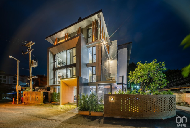
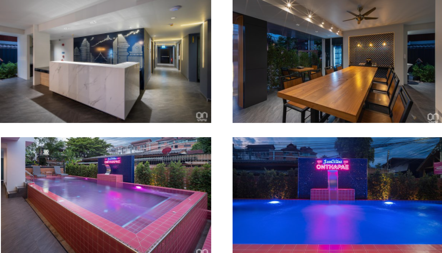
The ON THAPAE hotel is a city hotel which is situated in an urban and historic area of Chiang Mai, Thailand. It is only a 5 minutes-walk to Thapae Gate Plaza which is the center for major cultural and traditional ceremonies of the city. This tourist spot also gives many links to the inner ancient city. The hotel was just newly opened in 2021 with 27 guest rooms. It contains 5 room-types which are double-bed, twin-bed, suite, deluxe suite, and family for 4. The program was set to be a boutique hotel where the expected focus groups are international couples, and the length of stay is 3 days on average. On the ground floor, the hotel has only a multi-purpose space for breakfast in the morning and working space all day. The self-service coffee machine and free drinking water are ready to serve for guests all day. The swimming pool with pink-colored tiles intentionally gives hotel guests a freshness after being exhausted from the city exploration. The hotel guests who lie down or sit on the pool terrace can hear the sound of water that overflows from the swimming pool, can feel the breeze, and can see the green leaves of the garden. This sensory design helps stimulate people’s perception and creates a relaxing atmosphere for the hotel.
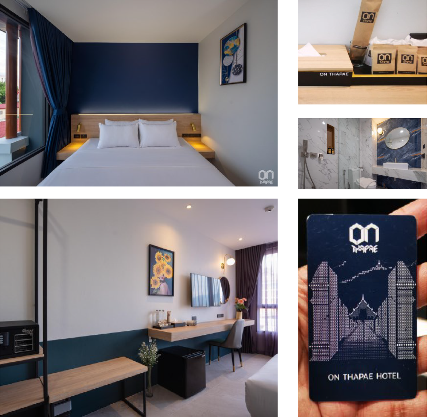
A clean design was involved in the design of ON THAPAE Hotel from the beginning of the project by using minimalism for architecture and interior design. The exterior of the hotel was designed in a simple geometric form, a typical modern language. The highest floor was differentiated from other floors in elevation by reducing its parameter and being painted in a darker color tone. The building top was installed by “Lanna Hip Roof” in gray color PVC roof tiles which could absorb the heat and produce lower noise than other popular materials. Then, the shape of the Lanna Roof was supported by round wooden-colored columns along the entire perimeter of the roof. This architectural design gives an international look that harmonizes with Lanna identities of the context. The design of furniture in guest rooms such as an open wardrobe, built-in bedhead walls, bedside table, and working desk is also in simple shape with wooden pattern. As the hotel offers free drinking water to any guest, a drinking water tap was installed at the corridor of the hotel each floor so that a guest can bring his own empty bottle to refill the drinking water himself. It is aimed to reduce plastic consumption.
Conclusion
As the “Clean Design” is a crucial approach to the design of not only the architecture but also the facilities, equipment, amenities, and other service items. The ON Thapae Hotel was designed to achieve this notion for exterior architecture by implementing minimalism plus local features. For interior issues, clean design was taken into account where the finishes were low-maintained or easy-to- clean. The elevator used in this hotel was installed with touchless buttons. The lobby and breakfast area was designed to be an open-air space, linked to the swimming pool terrace. The multi-sensory aspects were added to the design of the relaxing area beside the swimming pool, such as, sound of the water splash, smell of the leaves and flowers, vision of the green of the garden, feel of the breeze, and taste of the free-of-charge coffee service of the hotel.
Objectives Aims or Purposes
5.1 To explore the idea of how to use the “Clean Design” for a hotel case study which is “On Thapae Hotel”
5.2 To demonstrate the design outputs and outcomes of “On Thapae” in various aspects
Process or Methods
The “ON THAPAE” can be categorized as such a kind of real estate that its methodology may be broader than art, architecture, or any design works. It is described from the business start until the operation phase.
1. Business Values and Goals: Empathize goals of the owner, limitations of the local building codes, brand identities, and context of this hotel. The owner had set the goal that this hotel should have had a number of 25-30 rooms in total because of the practical module of service quarter and staff numbers. The price per room is at 2,000 Thai Baht, the hotel standard is set at about 3-star with a swimming pool. Foreign tourists, travelers, digital nomads (work online and travel), were set to be the target group.
2. Site and Context: The survey of the site and all physical settings was done firstly. Then, the data collection of the local context in terms of socio-economy, tradition and culture, as well as, significant architectural elements, including a few Chiang Mai’s specific regulations of this conservation area (ancient city’s boundary), was gathered in order to analyze the design constraints and opportunities. Because Chiang Mai is a touristic city that emphasizes crucially on cultural and traditional conservation, as shown by the control of the building form (Lanna architectural form required to be applied) and colors of the exterior. Eventually, on the other hand, it can be beneficial that this control was bounced back to be a selling point for the tourism industry.
3. Research and Case Study: After studying many cases of the city hotel in Chiang Mai experienced plenty of success, in terms of reputation and business by design, it was discovered that these were the most difficult parts to set an appropriate program and design for this type of city hotel, because of the high competitiveness. The result was that the uniqueness of the design might help penetrate the others to become outstanding, which inevitably had a contradiction between the budget and clean design. Many theoretical articles of “Sense of Place” were reviewed and decided how to adopt the design (Najafi and Shariff, Mustafa and Mina, 2011).
4. Building and Interior Design: Study of the improvisation of “clean design” and “sense of place” to achieve a philosophy of minimalism that could extend to the user’s perception of clean and hygiene environment, while representing “sense of place.”
Room Interior Design was implemented by minimal philosophy, less is more in the part of bed base, bed head wall, bedside table, were all built-in finished with wood pattern laminate on plywood panel to cover steel structure. The clean design was shown in the shape, form, and colors of furniture that were simple and flexible. The steel rack for clothes made the space in the room feel lighter, but wide enough for 2 day-stay, which was the average length of stay as the given data.
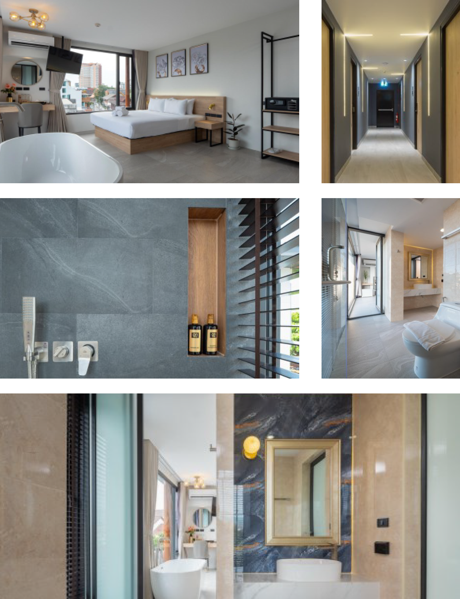
Public Space Design was fully intended to give a clear orientation to the users, and put in many efforts to be easily cleaned and low maintenance. At the corridor, floor finishing was all textured ceramic tiles which aimed to ensure safety of the users at various ages. The lighting was design to give focus.
Building Design; it was an attempt to maximize usable area but not more than 1,000 Sq.M as per the city’s land use code. There was also the regulation that the exterior of the building be controlled to use only a few colors (white, gray, brown) and architectural features which should be in harmony with Thai Lanna Style. Therefore, the design outcome was to mix the contemporary modern at the bottom part of the building from the 4th floor part with a Lanna Hip roof in gray color at the upper level of the roof part. (See figure 1.2)
5. Operation Phase The hotel was opened in April 2021 by the time of COVID-19 pandemic. According to the necessity to get certification from the Health authority to control the spread, the hotel needed to improve many physical settings and management. Fortunately, the elevator was equipped with touchless buttons already. The screen at the counter and social distancing marks were placed. All finishing surfaces of interior in the hotel building and furniture more often required cleaning services, thanks to the durable and easy-to-clean materials used by the clean design.
Techniques and materials
As one mentioned, the “Clean Design” is the source of a good and fulfilling life where human users can reach their hedonistic sustainability. A few rules of “clean design”
were picked up to define how the ON THAPAE hotel was achieved by design. These rules, according to “the 10 Principles of Good Design proposed by master product designer Dieter Rams” (Duvall, 2022), are “Less, But Better,” “Be Neutral,” “Go for Timelessness,” “Be Thorough,” “Be Understood,” and “Make It Pretty.” These notions, as architectural design, interior design, graphic design, and hotel operation, can be amplified to get more understanding as followings.
1. Branding: Firstly, the logo was designed to have an outlook on sharp/geometric and bold form of fonts that aimed to represent the strength of a hotel developer company. Using the color theme of the hotel branding, pink and navy blue to navigate the design. The color is shown in the guest room bed head panel to identify room type.
2. Sense of Place: The Perforated Foldable Panel expresses Thapae’s local identity. Thapae Gate is the name of the district of the hotel’s location which is used for the name of the hotel as well. The design of perforated foldable panels on the second floor is inspired by the view of Thapae Gate from a distance that is familiar to many people as they approach the main Chiang Mai city’s plaza. This road axis has also historical importance for the city as it is the axis from east to west side of the city where the end of this axis is placed by Wat Phrasingh and the figure of “Doi Suthep” mountain is in the background. These artistic panels can be instragramable that will help the hotel promote in social media.
3. Minimal Scale: Minimum size and scale of the hotel guestrooms was designed to respond to the business requirement of having a total rooms in the number of between 20-30 rooms. This number reflects many aspects of management and service quality. Therefore, the guest room design was merely sufficient to stay with comfort in an area about 20-24 Sq.M per room. The minimum size of public space is actually controlled by the code.
4. Hedonistic Environment: Hedonistic design was added in the hotel by creating a relaxing place for travelers who are always exhausted from walking to explore the city at the swimming pool terrace. The infinity edge pool was intended to allow overflow water to fall down to the gutter at floor level which will create sound of water splash and waterfall. The pool was placed at the west to get the most sunlight for sunbathing and attach to the garden. The swimming pool was intentionally designed in pink color together with navy blue color of the branding, which was expected to give a new fresh look and a relaxing environment of the hotel. Hotel guests can lie down beside the pool, listen to the sound of water flow, see the green leaves moving, and feel the breeze. After sunset, this pool and terrace is lightened up by lighting that dramatically enhances the atmosphere. This area is also for family and friends to hang out by the pool. It is a kind of hedonistic space.
5. Amenity Design: Hotel accessories and amenities were used recycle based color to represent the awareness of the hotel for sustainability.
Size or Mins.
1200PxX1200Px