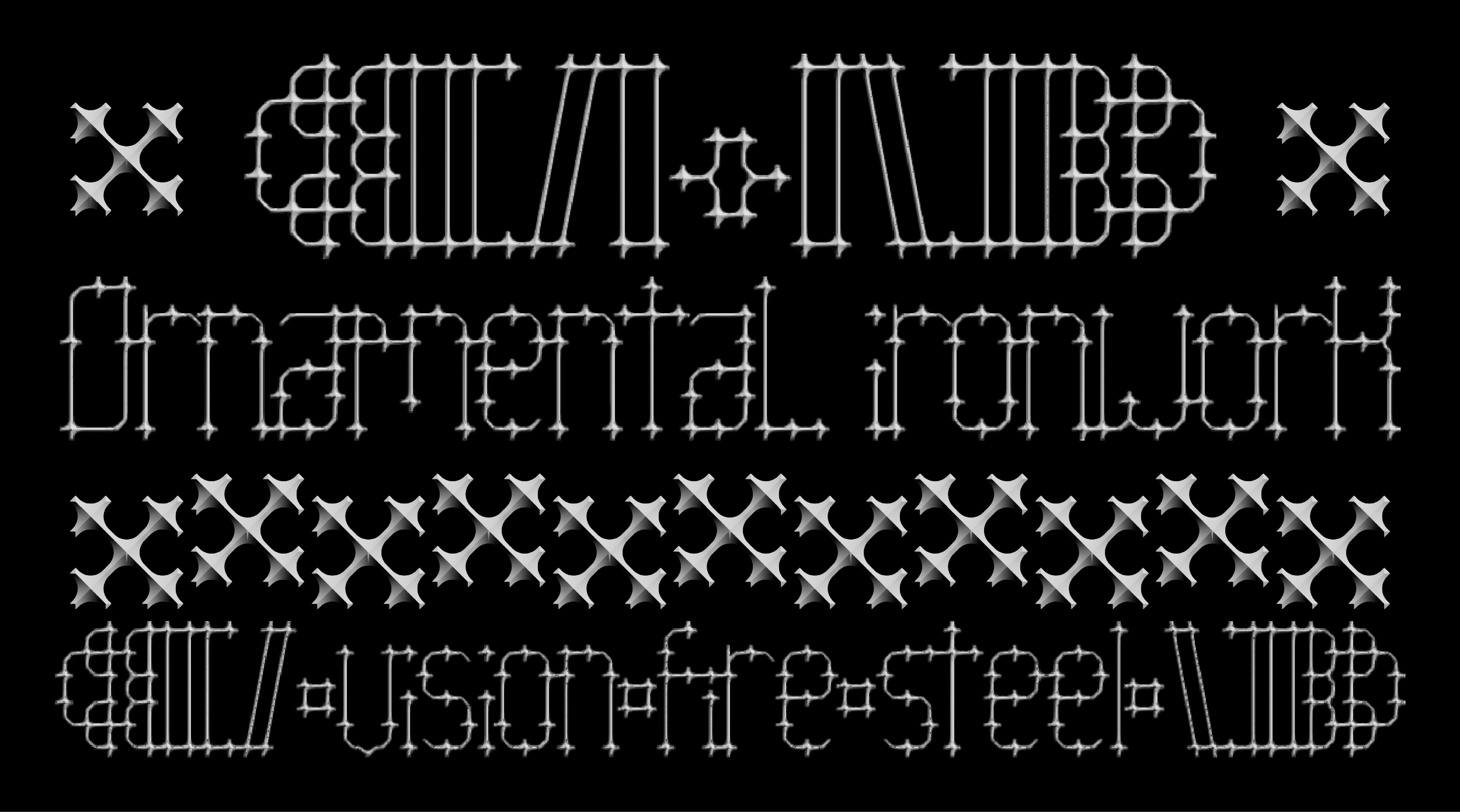
IronworkDeco typeface
College of Design, Rangsit University, Thailand
Asst. Prof. Akarapon Kritruenonwong
Abstract :
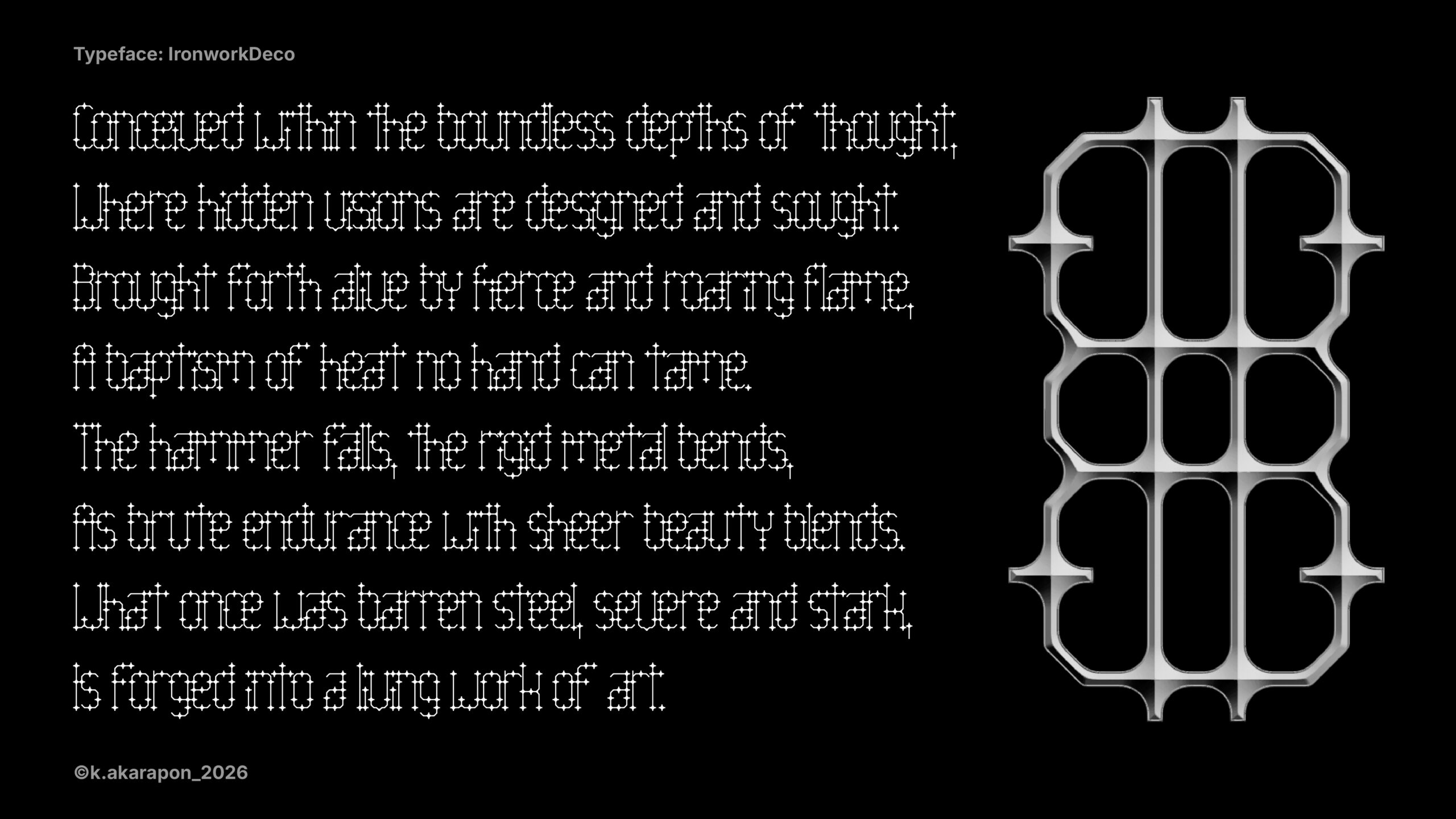
This typography project originates from a deep fascination with ornamental ironwork, commonly seen in gates and fences. These structures serve not only as strong barriers but also as works of intricate beauty and delicate craftsmanship. The perfect juxtaposition between the rigidity of the metal and its artistic elegance became the primary inspiration for “IronworkDeco”.
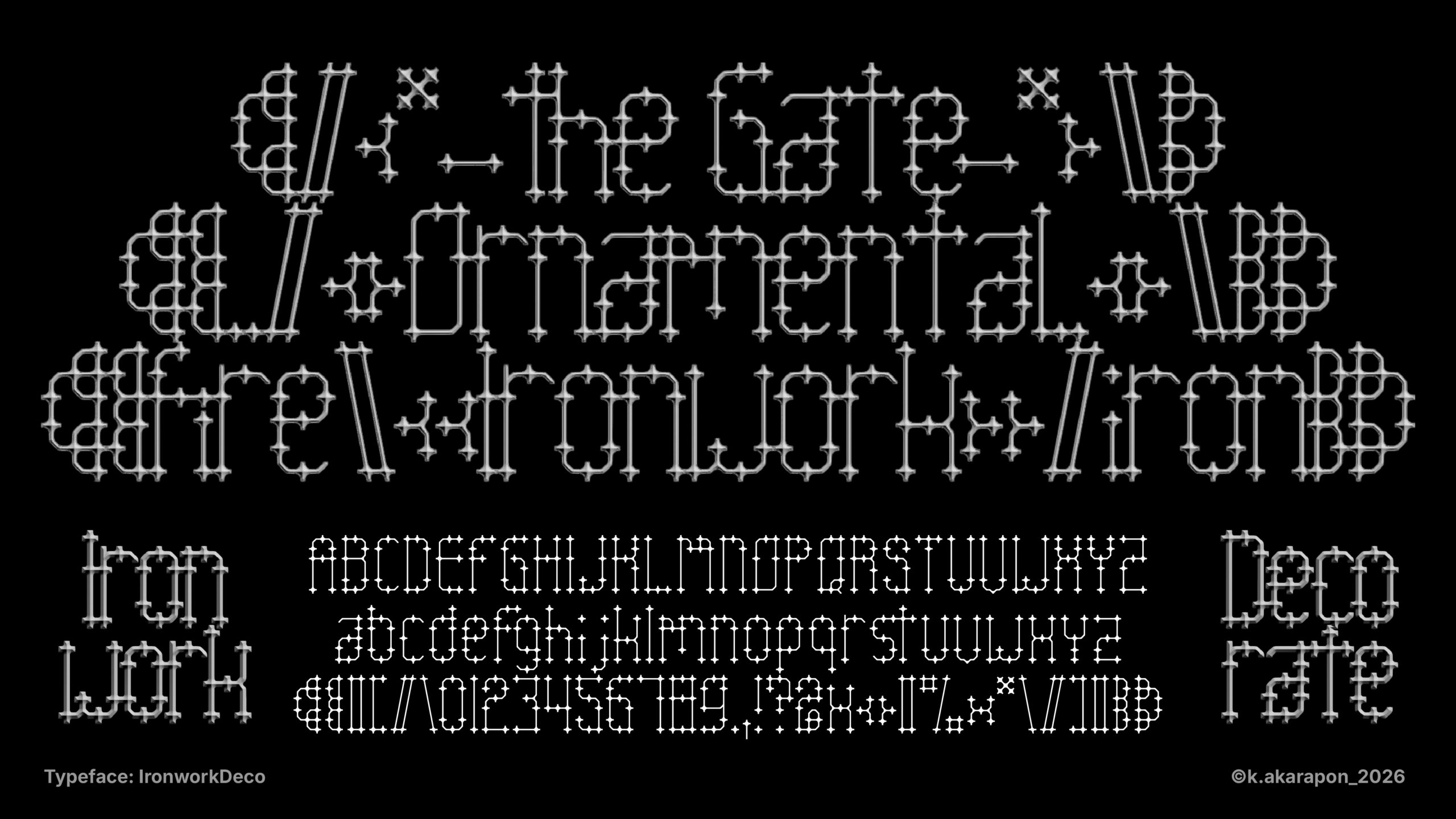
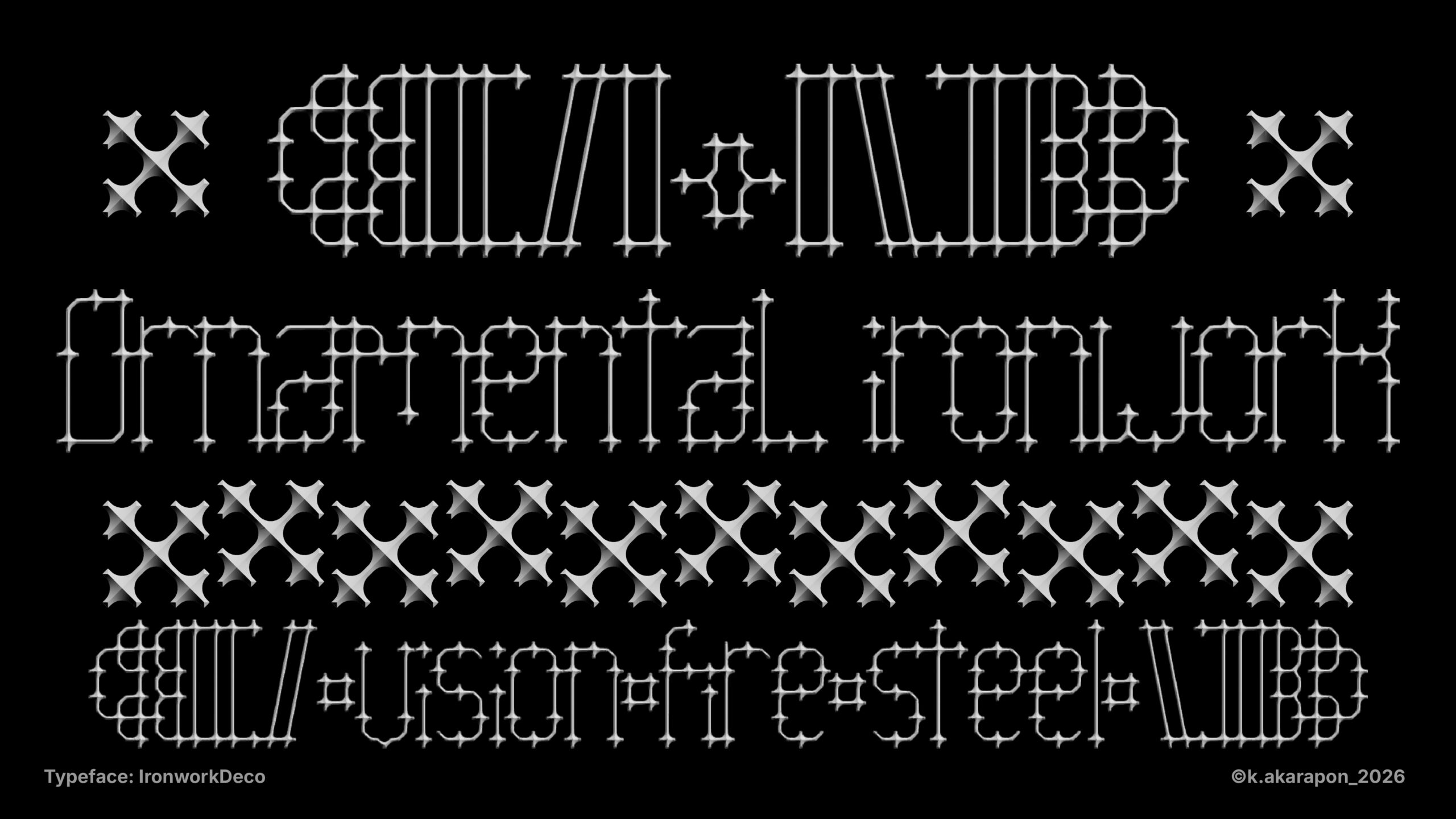
IronworkDeco decodes the essence of wrought iron into letterforms. The strokes are designed with angular sharpness, reminiscent of the precise joining and bending of metal. Details like joints and connection points on the lines mimic actual rivets or welds in ironwork, adding depth and realism to the typeface. Furthermore, the design draws heavily from Art Deco, reflected in the geometric shapes and symmetry embedded within its structure.
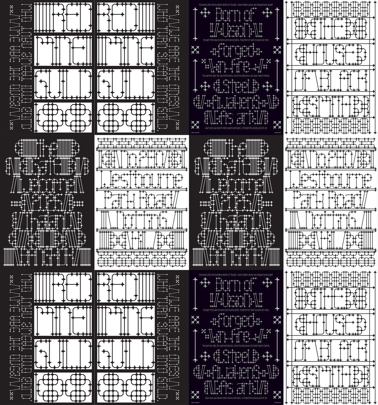
Beyond merely being a decorative pattern or graphic on a page, a core concept of IronworkDeco is its practical application in architecture. This typeface was conceived to be manufacturable as actual iron structures for gates or fences. This application allows architecture to communicate directly—whether it’s forming the name of a place, a house number, or a family name. This transforms ornamental ironwork from a simple decorative element into meaningful architecture that establishes a distinct identity for the residents.
This design, therefore, presents beauty seamlessly merged with function. IronworkDeco not only communicates through graphic design but also transcends into becoming a part of the living space, telling a story of strength, identity, and art.
Objectives :
1. To decode the aesthetics of ornamental ironwork into typographic design: To systematically analyze the structural anatomy, joints, and geometric proportions of ironwork alongside Art Deco influences, synthesizing a typeface that retains the material’s physical rigidity and artistic intricacy.
2. To expand typographic applications into architectural and interior decoration: To transcend two-dimensional media constraints by integrating typography into physical environments. This applies letterforms as functional decorative elements—such as spatial partitions or ornamental fixtures—enabling type to serve simultaneously as spatial art and visual communication.
3. To evaluate the potential of typography in establishing spatial identity: To examine the role of environmental graphics by utilizing custom typefaces to convey a site’s or resident’s identity, thereby forging a tangible connection between architecture, visual communication, and the end-user.
Conceptual Framework :
The “IronworkDeco” typeface lies in the integration of ornamental ironwork aesthetics with the geometric structures and symmetrical precision of the Art Deco movement. This design employs a process of “morphological decoding,” systematically translating the physical characteristics of metalworking—such as structural rigidity, welded joints, and rivets—into the typographic anatomy of the letterforms.
Beyond visual dimensionality, the concept emphasizes “expanded typography,” transcending the conventional limitations of two-dimensional media. The structural lines and patterns of the typeface are engineered with the potential for physical fabrication and spatial installation within architectural and interior design contexts. This allows the letterforms to be utilized as tangible components, such as decorative partitions, spatial dividers, or ornamental architectural fixtures.
Consequently, IronworkDeco functions not merely as a graphic medium for textual readability, but as an application of “environmental graphics” designed to establish spatial identity. By synthesizing artistic aesthetics, material characteristics, and visual communication, the typeface allows architectural spaces to tangibly reflect the identities of their inhabitants, creating a cohesive narrative between the physical environment and typographic art.
Process / Methodology :
1. Research & Analysis: Analyzing the structural anatomy of ornamental ironwork—specifically joints, welds, and rivets—alongside Art Deco geometric proportions to establish a foundational design framework.
2. Morphological Decoding & Drafting: Synthesizing physical material characteristics into typographic anatomy by drafting angular strokes and connective details that simulate actual metal bending and welding processes.
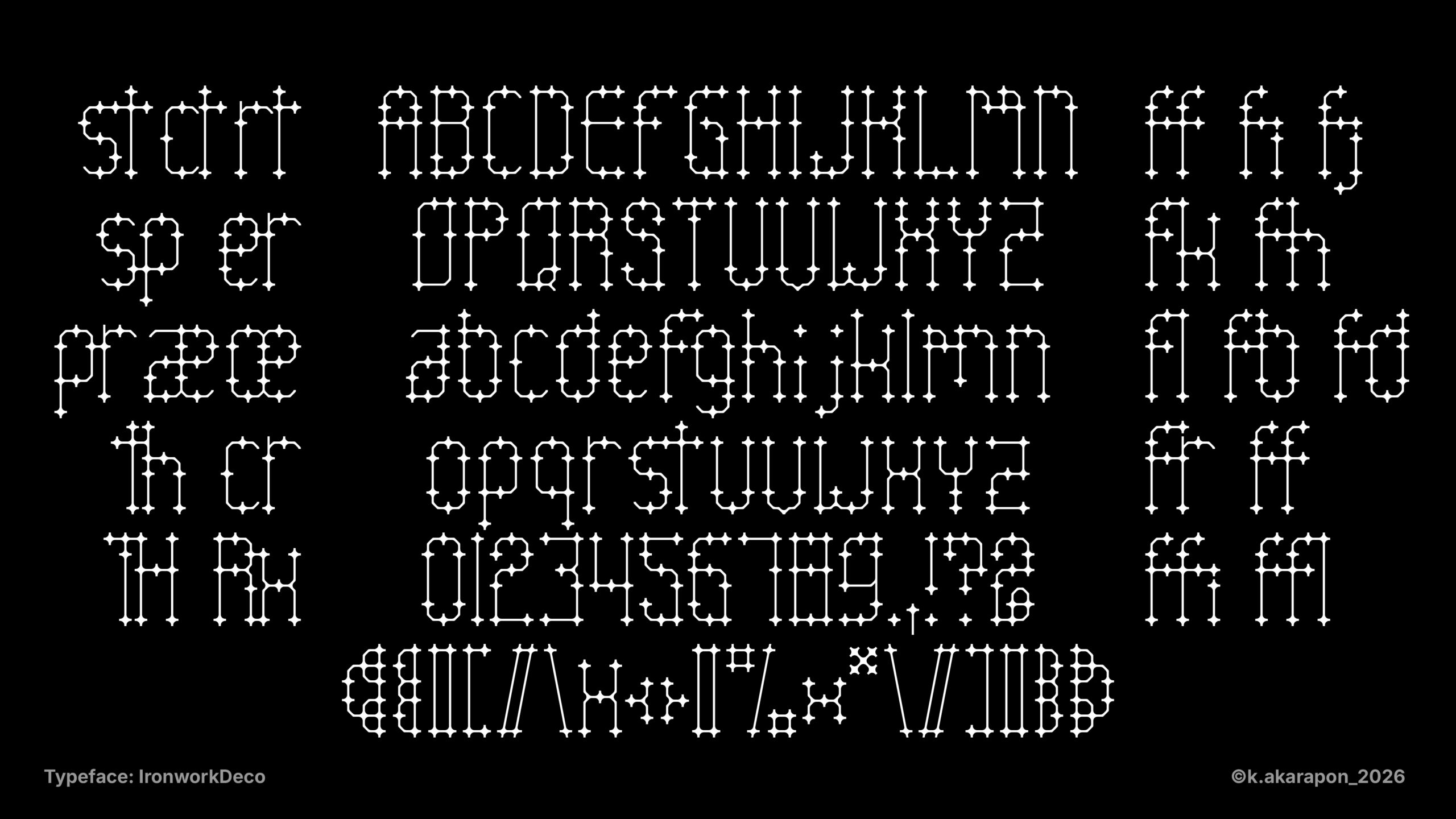
3. Typeface Development: Digitizing the drafts into the complete “IronworkDeco” typeface—encompassing alphabets, numerals, and punctuation—while refining proportions to achieve graphic balance and aesthetic precision.
4. Spatial Application Inspiration: Proposing conceptual guidelines for integrating the typeface into architectural and interior decoration, demonstrating the potential of environmental graphics to establish spatial identity and seamlessly connect typographic design with physical environments.
Techniques and Materials :
Result / Conclusion :
The study and morphological decoding of ornamental ironwork aesthetics, integrated with Art Deco geometric structures, culminated in the tangible creation of the digital typeface, “IronworkDeco.” The design process was executed to completion, resulting in a final deliverable generated as a fully functional font file, optimized for installation and practical application within professional design software.
The developed typeface features a comprehensive character set for the English language, comprising uppercase letters, lowercase letters, numerals (0-9), and basic punctuation marks. Furthermore, it encompasses custom ligatures and graphic ornaments to accommodate diverse typographic layouts and decorative arrangements. The structural integrity of every character consistently preserves the distinctive joints and angularity, accurately reflecting the physical characteristics of the metal fabrication process.
In conclusion, the production of the operational IronworkDeco font file fulfills the project’s primary objectives, both in facilitating textual communication via print media and demonstrating its practical potential as an architectural decorative component. This project provides empirical evidence that typography can transcend the constraints of two-dimensional print, functioning effectively as environmental graphics to establish spatial identity within architectural and interior design contexts.
References :
Gray, N. (1960). Lettering on buildings. Architectural Press.
Poulin, R. (2012). Graphic design and architecture, a 20th century history. Rockport Publishers.
Society for Experiential Graphic Design (SEGD). (n.d.). Bloomberg L.P. corporate headquarters. SEGD. https://segd.org/projects/bloomberg-lp-corporate-headquarters/